
Here is how to add GIF animation to the plot in R and draw extra attention. You can take a static ggplot2 plot and join it with GIF frames. As a result, you can create GIF in R with an infinite or finite loop.
Category: DataViz
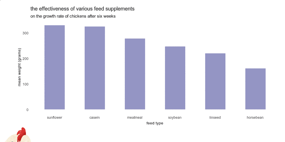
Plot mean by group in R using ggplot2 or use other measures

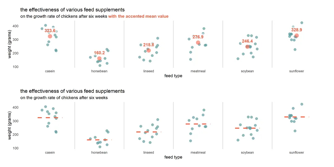
Here is how to plot mean by group in R using ggplot2 or try other measures to summarize values. To demonstrate that, I will use a jitter plot. A jitter plot is great if you want to look at all data points by categories, but additional statistics might be useful for evaluation.
How to create a jitter plot in R with ggplot2, plotly, and base

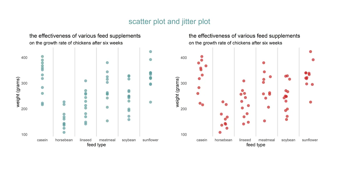
Here are 3 ways to create a jitter plot in R, also called a strip chart or a dot plot which is a one-dimensional scatter plot. A jitter plot in R makes it easier to view overlapping data points by categorical or discrete values. In that scenario, the scatter plot groups all data points in… Continue reading How to create a jitter plot in R with ggplot2, plotly, and base
How to use different colors in the ggplot2 title in R

Different colors in the ggplot2 title might be useful to emphasize part of that or as a substitute for the R plot legend. It is not very easy to do, but worth it if it helps to draw the necessary attention.
How to swap R plot axis or rotate axis labels in ggplot2
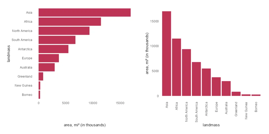
If it is necessary to swap the R plot axis, try to do that with the x and y arguments. Package ggplot2 allows you to swap the axis by using coord_flip, but it is mostly unnecessary. Try to fix the problem at the beginning.
Jitter chart in Excel with average line

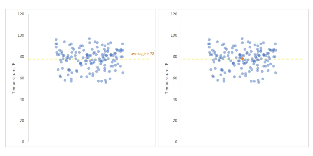
A jitter chart in Excel is a beautiful way to use a scatterplot and randomly distribute data points to make them more visible. In other words, if your problem is overlapping data points in Excel, this might be a good solution.
Add marginal distribution in R with rug plot from ggplot2
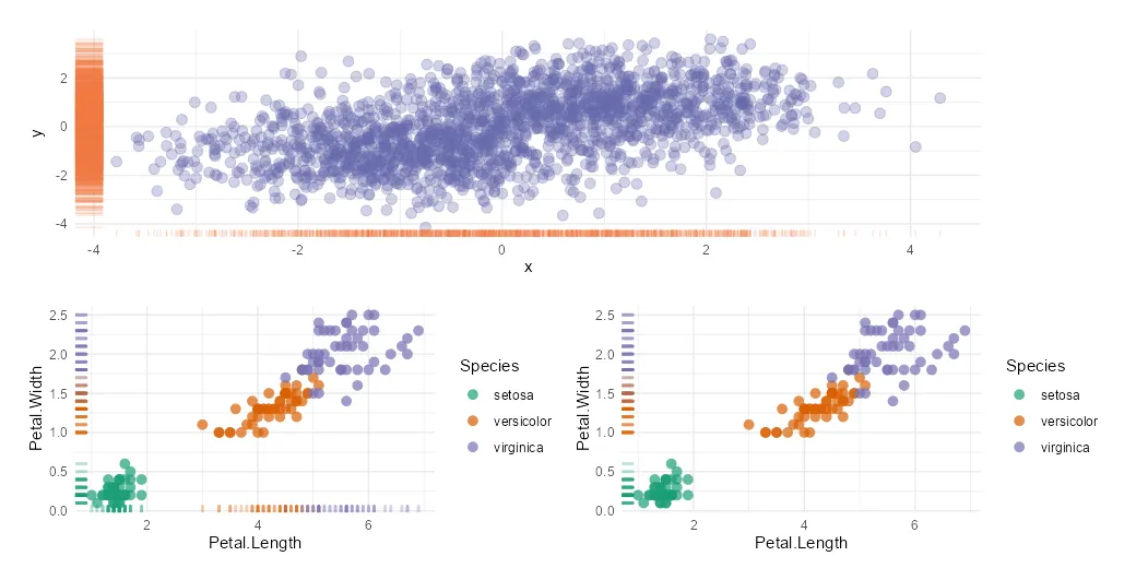
The R rug plot using the ggplot2 package is an interesting way to add one-dimension marginal distribution in R to the plot. There are multiple ways how to use that, and here are a couple of examples in combination with a scatter plot.
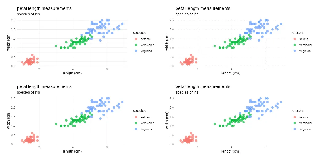
How to change marker shape in the R plot
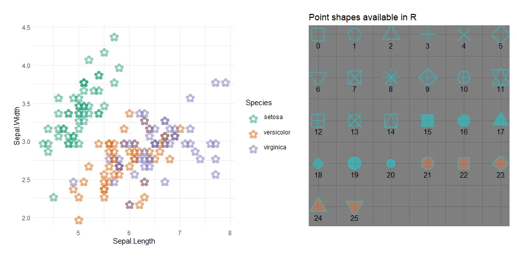
Sometimes you might wonder how to remove the border around dots in ggplot2, but all you have to do is change the marker shape in the R plot. When creating a plot in R that contains markers, it is possible to adjust the color, transparency, and also shape.
How to adjust R ggplot2 axis to start at 0 or set other limits
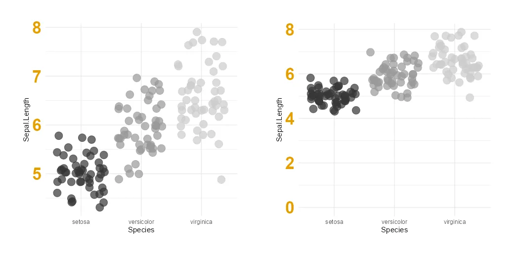
Here is how to change the beginning or end of the R plot axis or execute common adjustment – set the ggplot2 axis to start at 0. If it is not happening automatically, then you might want to force the origin of the R plot y-axis. A vertical axis beginning from zero is good practice… Continue reading How to adjust R ggplot2 axis to start at 0 or set other limits