
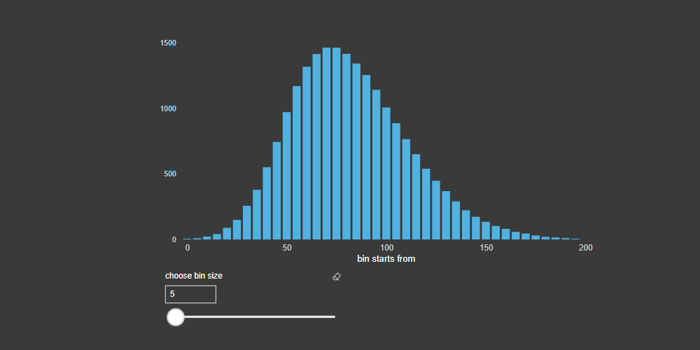
Here is how to create a dynamic histogram in Power BI. It changes with the help of a slicer that regulates data distribution groups (adjustable bins).
Category: DataViz
How to make Power BI line chart with accented last data point

Here is my approach on how to make Microsoft Power BI line chart with accented last data point. It is flexible and can be used with filters.
Clustered and stacked columns in one Excel chart – 5 easy steps

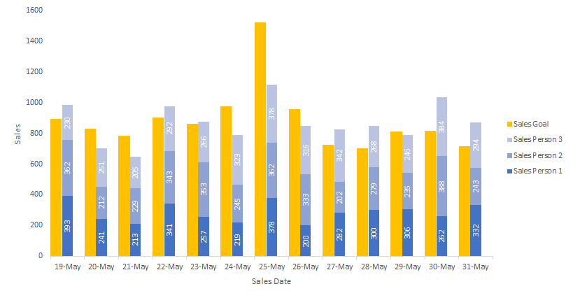
If you want to create an Excel chart that contains clustered columns and stacked columns altogether, this post is for you.
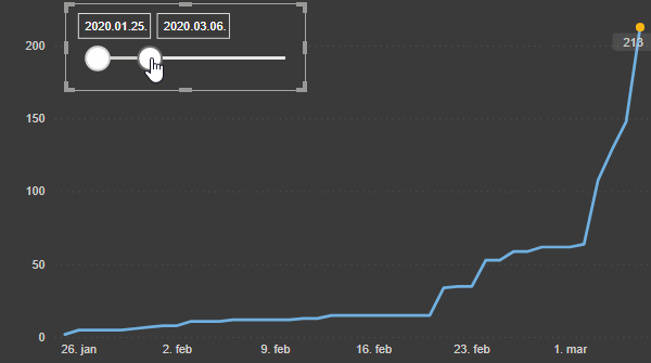
Dynamic Power BI map visualization with coronavirus data

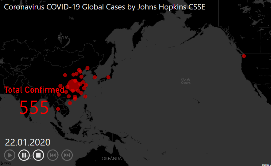
With the help of additional custom visualization, it is possible to create pretty awesome dynamic Power BI map visualization to see how things are changing during a time.
How to create BoxPlot in R and extract outliers

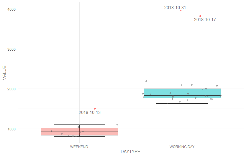
Outlier detection is a very broad topic, and boxplot is a part of that. Here is how to create a boxplot in R and extract outliers. There are few things to consider when creating a boxplot in R or anywhere else. Is boxplot showing all the necessary information? Sometimes it is important how many data… Continue reading How to create BoxPlot in R and extract outliers