Here is how to plot mean by group in R using ggplot2 or try other measures to summarize values. To demonstrate that, I will use a jitter plot. A jitter plot is great if you want to look at all data points by categories, but additional statistics might be useful for evaluation.
If you want to get mean by a group in a data frame, look at this post from this blog.
Plot mean by group in R using ggplot2
You can plot means in ggplot2 using the stat_summary by itself or over another plot. By using the line type argument, you can modify gridlines or use them for similar plot elements.
require(ggplot2)

set.seed(123)

ggplot(chickwts, aes(x = feed, y = weight)) +
  geom_jitter(
    size = 3,
    alpha = 0.7,
    shape = 16,
    width = 0.2,
    color = "cadetblue") +
  geom_vline(
    xintercept = seq(1.5, length(unique(chickwts$feed)), by = 1),
    color = "gray90",
    size = 1) +
  stat_summary(
    fun = "mean",
    geom = "crossbar",
    width = 0.5,
    color = "tomato",
    linetype = 2) +
  labs(
    title = "the effectiveness of various feed supplements",
    subtitle = "on the growth rate of chickens after six weeks",
    x = "feed type",
    y = "weight (grams)") +
  theme_minimal() +
  theme(panel.grid = element_blank())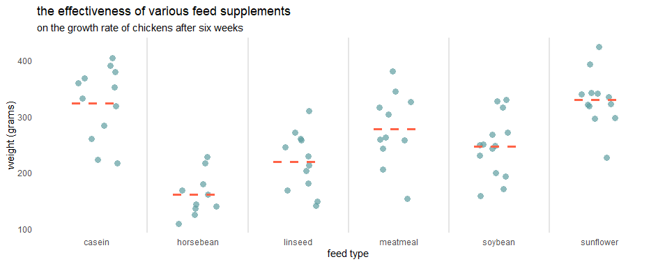
In the stat_summary, you can use other geoms as “point” and plot mean by a group in R differently.
set.seed(123)

ggplot(chickwts, aes(x = feed, y = weight)) +
  geom_jitter(
    size = 3,
    alpha = 0.7,
    shape = 16,
    width = 0.2,
    color = "cadetblue") +
  geom_vline(
    xintercept = seq(1.5, length(unique(chickwts$feed)), by = 1),
    color = "gray90",
    size = 1) +
  stat_summary(
    fun = "mean",
    geom = "point",
    size = 5,
    color = "tomato",
    alpha = 0.7, show.legend = TRUE) +
  labs(
    title = "the effectiveness of various feed supplements",
    subtitle = "on the growth rate of chickens after six weeks",
    x = "feed type",
    y = "weight (grams)") +
  theme_minimal() +
  theme(panel.grid = element_blank())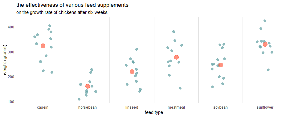
If you want to explain this measurement to your audience, use the technique that is described in this post. With help of the ggtext, you can substitute the legend and add an explanation in the subtitle.
require(ggtext)

set.seed(123)

ggplot(chickwts, aes(x = feed, y = weight)) +
  geom_jitter(
    size = 3,
    alpha = 0.7,
    shape = 16,
    width = 0.2,
    color = "cadetblue") +
  geom_vline(
    xintercept = seq(1.5, length(unique(chickwts$feed)), by = 1),
    color = "gray90",
    size = 1) +
  stat_summary(
    fun = "mean",
    geom = "point",
    size = 5,
    alpha = 0.6,
    shape = 16,
    color = "tomato") +
  labs(
    title = "the effectiveness of various feed supplements",
    subtitle = "on the growth rate of chickens after six weeks
 <span style = 'color:tomato;'>**with the accented mean value**</span>",
    x = "feed type",
    y = "weight (grams)") +
  theme_minimal() +
  theme(panel.grid = element_blank(),
        plot.subtitle = element_markdown())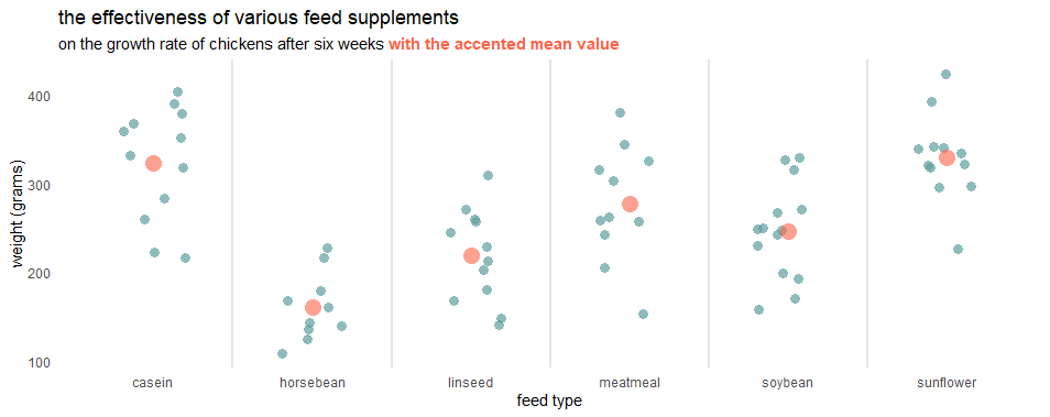
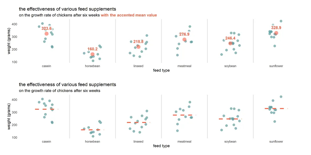
Add a data label to the stat_summary result
To add a data label to the result of stat_summary, you can use another stat_summary with a different geom like this.
set.seed(123)

ggplot(chickwts, aes(x = feed, y = weight)) +
  geom_jitter(
    size = 3,
    alpha = 0.7,
    shape = 16,
    width = 0.2,
    color = "cadetblue") +
  geom_vline(
    xintercept = seq(1.5, length(unique(chickwts$feed)), by = 1),
    color = "gray90",
    size = 1) +
  stat_summary(
    fun = "mean",
    geom = "point",
    size = 5,
    alpha = 0.6,
    shape = 16,
    color = "tomato") +
  stat_summary(
    aes(label = round(..y.., 1), fontface = "bold"),
    fun = mean,
    geom = "label", #try text if you want
    size = 4,
    alpha = 0.6,
    label.size = NA, # remove border around label
    vjust = -0.5,
    color = "tomato") +
  labs(
    title = "the effectiveness of various feed supplements",
    subtitle = "on the growth rate of chickens after six weeks
 <span style = 'color:tomato;'>**with the accented mean value**</span>",
    x = "feed type",
    y = "weight (grams)") +
  theme_minimal() +
  theme(panel.grid = element_blank(),
        plot.subtitle = element_markdown())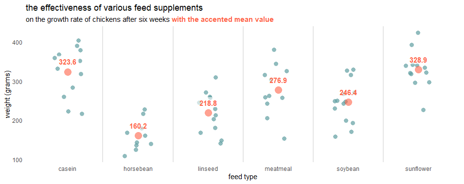
You can modify summary labels similarly to what you would do with geom_text and geom_label. For me, the data label background works very well, but if you like without that, try “text” geom.
Here are other examples of how to add data labels in ggplot2.
Please look at other visualizations in this blog made using R. For example, gradient line chart, glowing line chart, and gradient word cloud.
Leave a Reply