Here are multiple examples of how to add data labels to the column or bar chart in R if you are using the ggplot2 or plotly packages. You can add them in various positions, and it is good to know typical ones. In the case of plotly, interactivity and tooltips might be enough, but you can also add data labels.
I will be using the R dataset with chicken weight by feed type. In the preparation, I’m calculating the mean chicken weight by each feed group. It is important to encode categorical values as factors in the necessary order. It ensures that columns in the diagram are in a certain order, and you can read about that more in another post in this blog.
require(dplyr)
require(ggplot2)


cw <- chickwts %>%
  group_by(feed) %>%
  summarise('mean_weight' = round(mean(weight), digits = 0)) %>%
  arrange(desc(mean_weight)) %>%
  mutate('feed' = factor(feed, levels = feed))

cw

## A tibble: 6 x 2
#  feed      mean_weight
#
#1 sunflower         329
#2 casein            324
#3 meatmeal          277
#4 soybean           246
#5 linseed           219
#6 horsebean         160
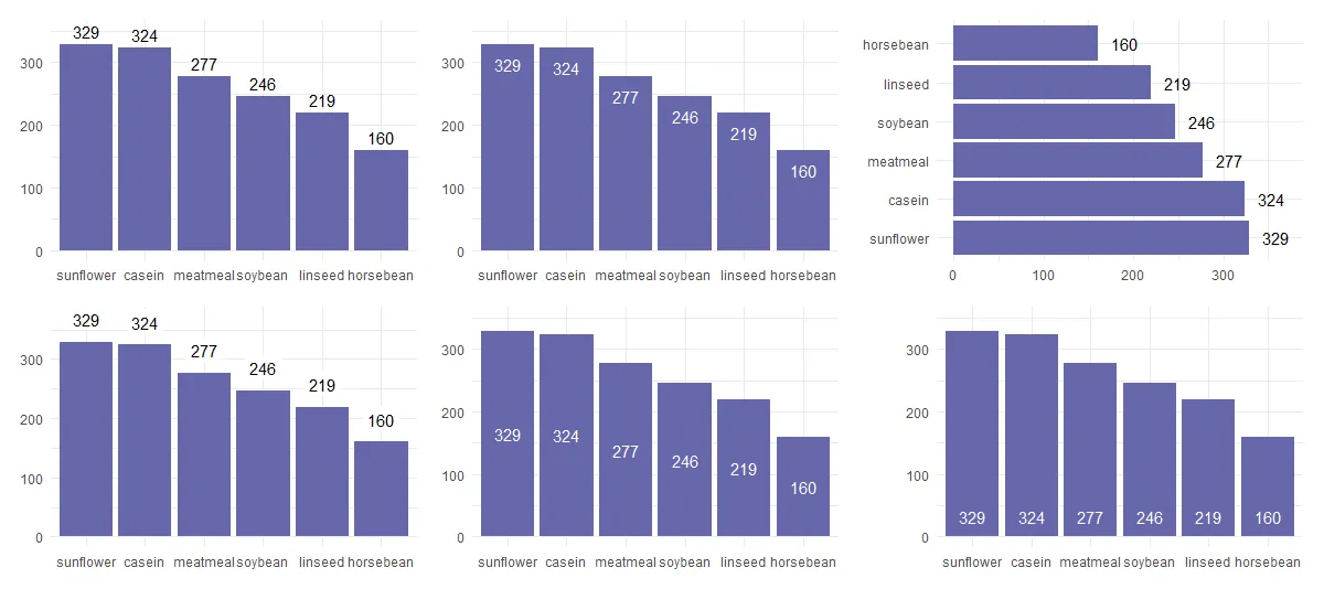
Add data labels to chart columns in R (ggplot2 and plotly)
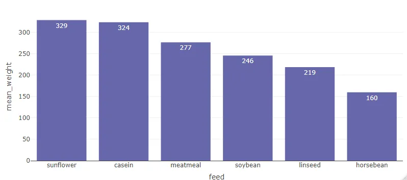
If you are using the ggplot2 package, then there are two options to add data labels to columns in the chart. The first of those two is by using geom_text.
If your columns are vertical, use the vjust argument to put them above or below the tops of the bars. Here is an example with the data labels above the bars.
cw %>%
  ggplot(aes(x = feed, y = mean_weight)) +
  geom_col(fill = "#6667AB") +
  geom_text(aes(label = mean_weight), vjust = -0.5) +
  theme_minimal()
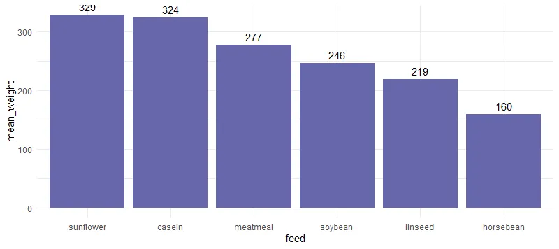 As you can see, sometimes the background grid may interfere with the data label. Below is a solution to solve that.
Here is an example with data labels inside bars.
cw %>%
  ggplot(aes(x = feed, y = mean_weight)) +
  geom_col(fill = "#6667AB") +
  geom_text(aes(label = mean_weight), vjust = 2, colour = "white") +
  theme_minimal()

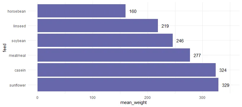
Map categorical values to y argument to flip the column orientation to horizontal. In that scenario, you can adjust the data label position with the argument hjust. I adjusted the x-axis because otherwise some of the data labels are cut off.
cw %>%
  ggplot(aes(x = mean_weight, y = feed)) +
  geom_col(fill = "#6667AB") +
  geom_text(aes(label = mean_weight), hjust = -0.5) +
  xlim(0, 350) +
  theme_minimal()
If you want your data labels outside columns or add a background for better contrast try geom_label. I adjusted the y-axis because otherwise some of the data labels are cut off.
cw %>%
  ggplot(aes(x = feed, y = mean_weight)) +
  geom_col(fill = "#6667AB") +
  geom_label(
    aes(label = mean_weight),
    vjust = -0.5,
    fill = "white",
    label.size = 0
  ) +
  ylim(0, 350) +
  theme_minimal()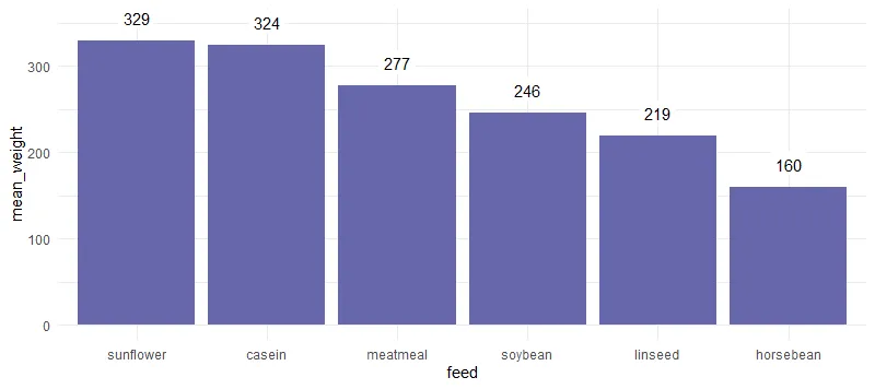
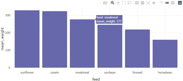
Transform result from ggplot2 to plotly
If you want to create a plotly plot and already have something useful in ggplot2, you can transform that.
plotly::ggplotly(cw %>%
                   ggplot(aes(x = feed, y = mean_weight)) +
                   geom_col(fill = "#6667AB") +
                   theme_minimal())
Plotly has interactivity that provides tooltips on hover that contains data labels. Sometimes that is enough.
Add bar chart data labels in plotly
If you want to build a plotly bar chart from scratch and add data labels then here is how to do that by using the textposition argument.
require(plotly)


plot_ly(
  cw,
  x = ~ feed,
  y = ~ mean_weight,
  type = "bar",
  text = ~ mean_weight,
  textposition = 'inside',
  marker = list(color = "#6667AB")
)
Add data labels inside the bar chart in R
There is various position where to put data label inside the bar chart, and here are two of them. You don’t always want to rely on vjust or hjust arguments in the case of ggplot2.
Put the labels in the middle of each bar or column in R
cw %>%
  ggplot(aes(x = feed, y = mean_weight)) +
  geom_col(fill = "#6667AB") +
  geom_text(aes(label = mean_weight),
            position = position_stack(vjust = 0.5),
            colour = "white") +
  theme_minimal()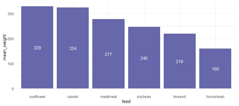
Adding data labels to the bottom of a bar plot in R
cw %>%
  ggplot(aes(x = feed, y = mean_weight)) +
  geom_col(fill = "#6667AB") +
  geom_text(aes(y = 0, label = mean_weight),
            vjust = -1,
            colour = "white") +
  theme_minimal()
Of course, that is not all you can do with labeling bar or column charts in R. Here you can find out other beautiful examples and explanations.
Leave a Reply