The gradient line chart in R is a little bit artistic approach to emphasize ups and downs or progression. A gradient line chart will be made with two directions of the color gradient using ggplot2. The first one will be vertical and the second horizontal.
By the way, here is a similar good-looking gradient line chart in Excel.
For me, it was a challenge to create a similar effect in R.
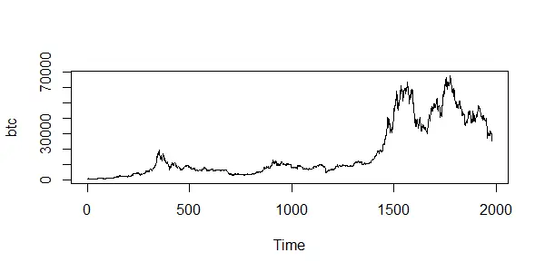
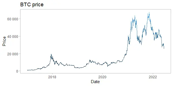
In this post, I used Bitcoin price data with the help of the coindeskr package. Here is how it looks in a simple line chart without special formatting.
require(coindeskr)

btc <- get_historic_price(start = "2017-01-01")

ts.plot(btc)

btc$Date <- as.Date(row.names(btc))
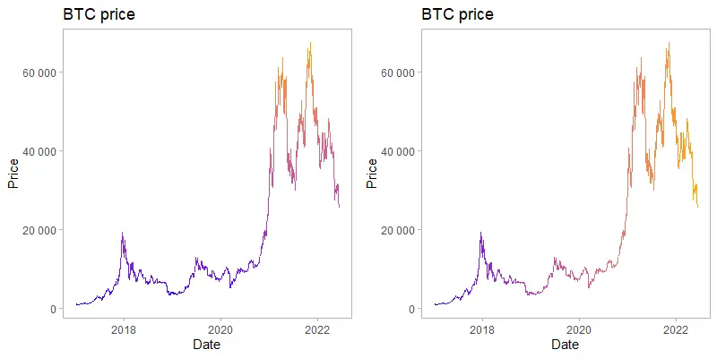
Vertical gradient line chart in R
The first version of the gradient line chart in R is with the vertically oriented color gradient. The higher the Bitcoin price goes, the more pronounced color changes.
There are different scale_colour_gradient functions, but the simple scale_colour_gradient works pretty well in this situation.
As a result, I don’t need to see a legend. Take a look at this post if you’re interested in how to remove legend in ggplot2. You can do that in various ways.
require(ggplot2)

ggplot(btc, aes(x = Date, y = Price, color = Price)) +
  geom_line() +
  scale_y_continuous(
    labels = function(x)
      format(x, big.mark = " ", scientific = FALSE)
  ) +
  scale_colour_gradient(low = "blue", high = "orange", guide = "none") +
  theme_light() +
  theme(panel.grid = element_blank()) +
  ggtitle("BTC price")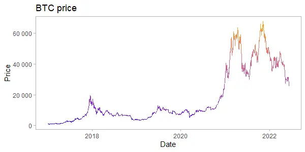
This piece of code is used to format ggplot2 Y-axis values with a thousand separators.
  scale_y_continuous(
    labels = function(x)
      format(x, big.mark = " ", scientific = FALSE)
  )
Here is an alternative way how to get the same effect without scale_colour_gradient.
ggplot(btc, aes(x = Date, y = Price, color = Price)) +
  geom_line(show.legend = FALSE) +
  scale_y_continuous(
    labels = function(x)
      format(x, big.mark = " ", scientific = FALSE)
  ) +
  theme_light() +
  theme(panel.grid = element_blank()) +
  ggtitle("BTC price")
Horizontal gradient line chart in R
Another version is with the horizontally oriented color gradient. In this situation, more recent data have more pronounced color changes. It might be useful to emphasize the latest data. In this situation, I can achieve that by using the date in the color argument.
ggplot(btc, aes(x = Date, y = Price, color = as.numeric(Date))) +
  geom_line() +
  scale_y_continuous(
    labels = function(x)
      format(x, big.mark = " ", scientific = FALSE)
  ) +
  scale_colour_gradient(low = "blue", high = "orange", guide = "none") +
  theme_light() +
  theme(panel.grid = element_blank()) +
  ggtitle("BTC price")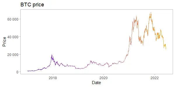
Here is an alternative way how to get the same effect without scale_colour_gradient.
ggplot(btc, aes(x = Date, y = Price, color = as.numeric(Date))) +
  geom_line(show.legend = FALSE) +
  scale_y_continuous(
    labels = function(x)
      format(x, big.mark = " ", scientific = FALSE)
  ) +
  theme_light() +
  theme(panel.grid = element_blank()) +
  ggtitle("BTC price")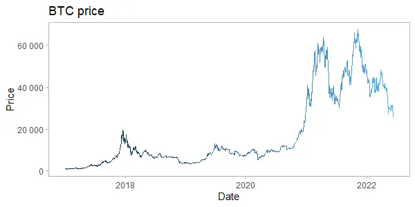
Take a look at other posts on this blog that contains data visualization tutorials.
Leave a Reply