If it is necessary to swap the R plot axis, try to do that with the x and y arguments. Package ggplot2 allows you to swap the axis by using coord_flip, but it is mostly unnecessary. Try to fix the problem at the beginning.
Swapping the ggplot2 axis might be useful to deal with lengthy text, and that is a good reason to do that.
Here is my dataset with the world’s major landmasses in thousands of square miles.
x <- as.data.frame(islands)
x <- data.frame("landmass" = rownames(x), "area" = x$islands)
head(x)
# landmass area
# 1 Africa 11506
# 2 Antarctica 5500
# 3 Asia 16988
# 4 Australia 2968
# 5 Axel Heiberg 16
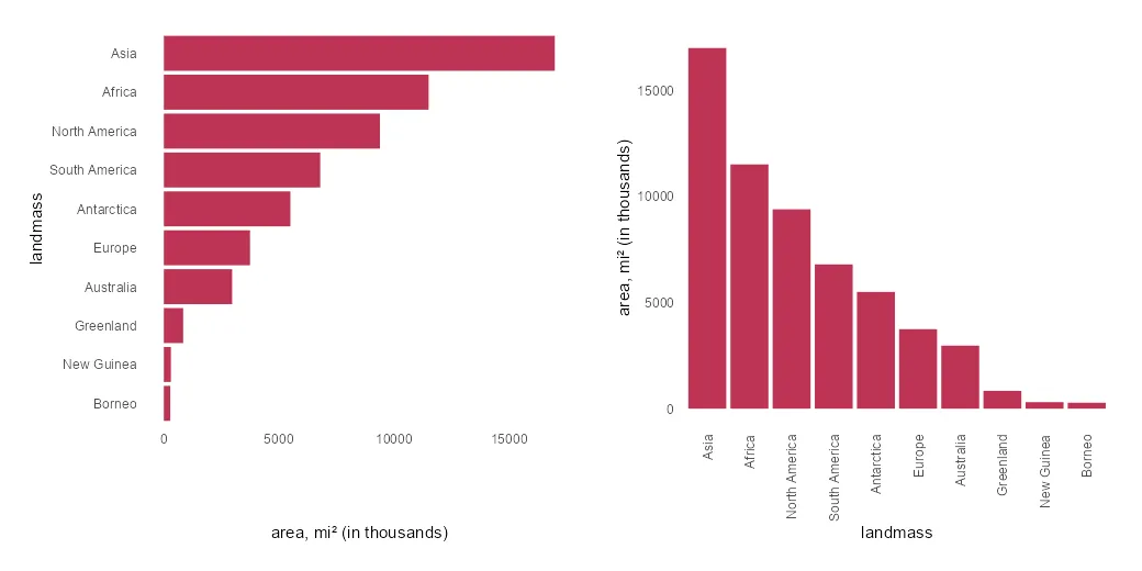
# 6 Baffin 184It is necessary to get landmass names ordered on the axis. To visualize only the biggest ones, I selected only the top 10 by using the dplyr functionality.
require(dplyr)

x <- x %>%
  arrange(desc(area)) %>%
  slice_max(area, n = 10) %>%
  mutate("landmass" = factor(landmass, levels = landmass))
In the column chart, the results look like this. X-axis labels are overlapping, and it is necessary to make some adjustments.
require(ggplot2)

x %>%
  ggplot(aes(x = landmass, y = area)) +
  geom_col(fill = "#BE3455") +
  ylab("area, mi² (in thousands)") +
  theme_minimal() +
  theme(panel.grid = element_blank())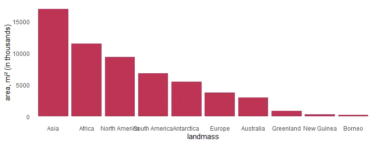
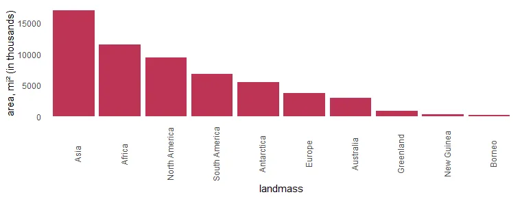
Swap R plot axis in ggplot2
As I mentioned earlier, flipping the R plot axis might be useful to deal with lengthy text. Here the solution is to swap x and y arguments inside the aes.
x %>%
  ggplot(aes(x = area, y = landmass)) +
  geom_col(fill = "#BE3455") +
  xlab("area, mi² (in thousands)") +
  theme_minimal() +
  theme(panel.grid = element_blank())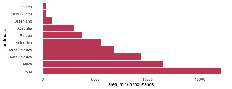
If you want to order the R plot bars differently, here is how to do that. In this scenario, there are categorical values as factors. Otherwise, you can use the scale_x_reverse from ggplot2.
x %>%
  ggplot(aes(x = area, y = landmass)) +
  geom_col(fill = "#BE3455") +
  xlab("area, mi² (in thousands)") +
  scale_y_discrete(limits = rev(levels(x$landmass))) +
  theme_minimal() +
  theme(panel.grid = element_blank())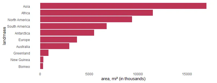
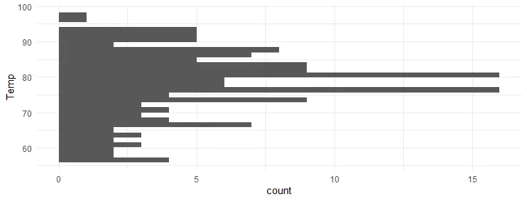
Swap R plot axis with coord_flip from ggplot2
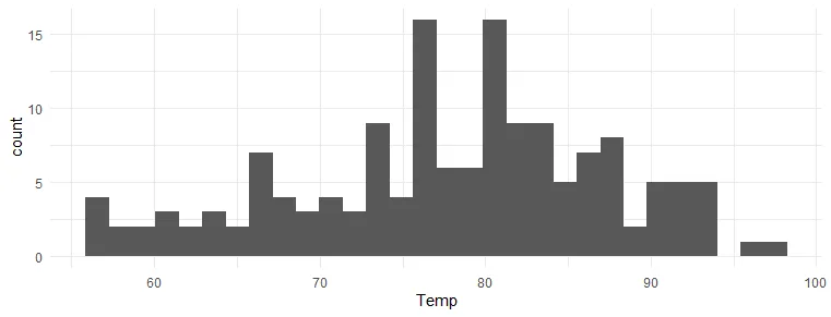
The option to use coord_flip from ggplot2 is useful in a visualization like a histogram when you don’t specify x and y separately.
airquality %>%
  ggplot(aes(Temp)) +
  geom_histogram() +
  theme_minimal()
airquality %>%
  ggplot(aes(Temp)) +
  geom_histogram() +
  coord_flip() +
  theme_minimal()
Rotate ggplot2 axis labels
If you want to show categories on the x-axis, there is another thing you can do to avoid overlapping labels. Try to rotate axis labels in ggplot2 like this.
x %>%
  ggplot(aes(x = landmass, y = area)) +
  geom_col(fill = "#BE3455") +
  ylab("area, mi² (in thousands)") +
  scale_x_discrete(guide = guide_axis(angle = 90)) +
  theme_minimal() +
  theme(panel.grid = element_blank())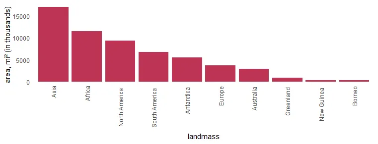
Another way to rotate x-axis labels is by using theme components.
x %>%
  ggplot(aes(x = landmass, y = area)) +
  geom_col(fill = "#BE3455") +
  ylab("area, mi² (in thousands)") +
  theme_minimal() +
  theme(axis.text.x = element_text(angle = 90),
        panel.grid = element_blank())
Adjust the positioning of the x-axis labels to get them closer to the axis.
x %>%
  ggplot(aes(x = landmass, y = area)) +
  geom_col(fill = "#BE3455") +
  ylab("area, mi² (in thousands)") +
  theme_minimal() +
  theme(axis.text.x = element_text(
    angle = 90,
    vjust = 0.5,
    hjust = 1.1
  ),
  panel.grid = element_blank())
If you want to add data labels R plot, then here is a helpful post from this blog.
Leave a Reply