A jitter chart in Excel is a beautiful way to use a scatterplot and randomly distribute data points to make them more visible. In other words, if your problem is overlapping data points in Excel, this might be a good solution.
Below are the main steps in creating a jitter chart in Excel, and here is the result for downloading.
If you need to understand this process in more detail, look at his post with similar data visualization.
In this example, I’m using data from this data set that contains daily temperature measurements in New York from May to September 1973.
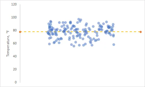
Jitter chart in Excel
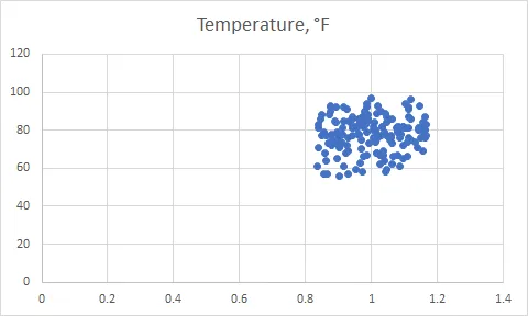
The first step is to offset data points in a separate Excel column. I don’t have categories for the x-axis, and I created a column with random numbers like this.
=1 + (RAND() - 0.5) / 3
In my case, divisor 3 will regulate the dispersion of data points. As a result jitter chart look like this.
After that, I made adjustments to the x-axis. Data points are visible at the center of the scatter plot. The main title was removed and added to the y-axis.
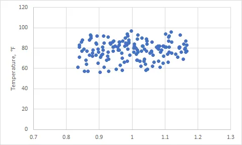
You can remove the x-axis labels, and the previous settings stay the same. Knowing that there will be average line gridlines is not necessary.

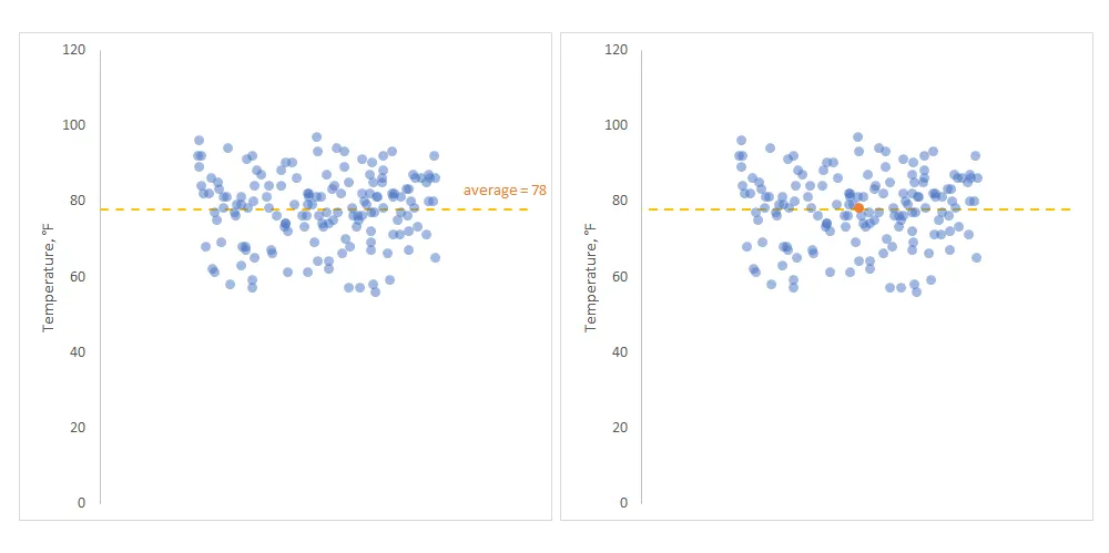
Add the average line to the jitter chart in Excel
If you have a pool of data points, it might be useful to see the average and how data points are distributed around that. There are two methods how to do that.
In both of them, it might be useful to define the boundaries of the x-axis. For me, the minimum is 0.7, and the maximum is 1.3.
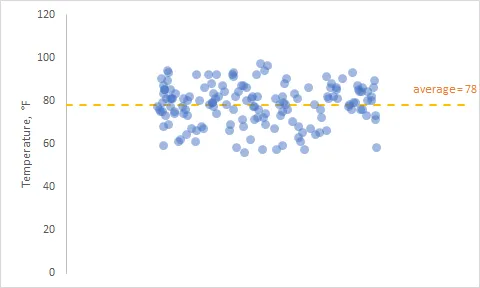
The average line from one data point to another
This method is great because you can also add data labels. First of all, it is necessary to add a data column with average values for the x-axis minimum and maximum.
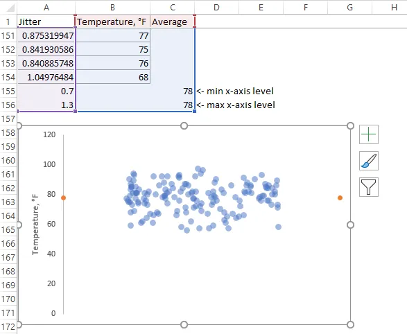
After that, you can add and format a line between those two data points. By default scatter plot line is opted out but possible to use.
As I mentioned previously, you can add a data label to show what is average. Data labels are editable, and you can add additional text.
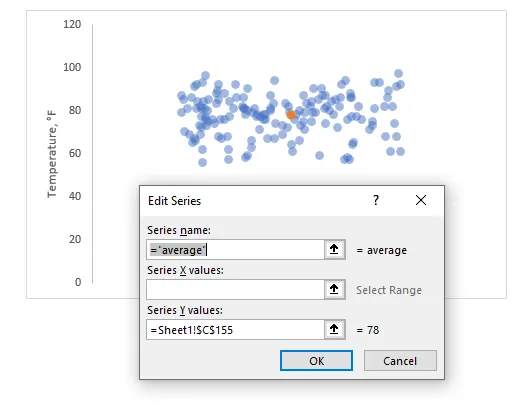
The average line with the error bar
The next method is using error bars to get the average line in an Excel scatter plot. You can add a single data point to the Excel scatter plot like this and use the cell where the average is.
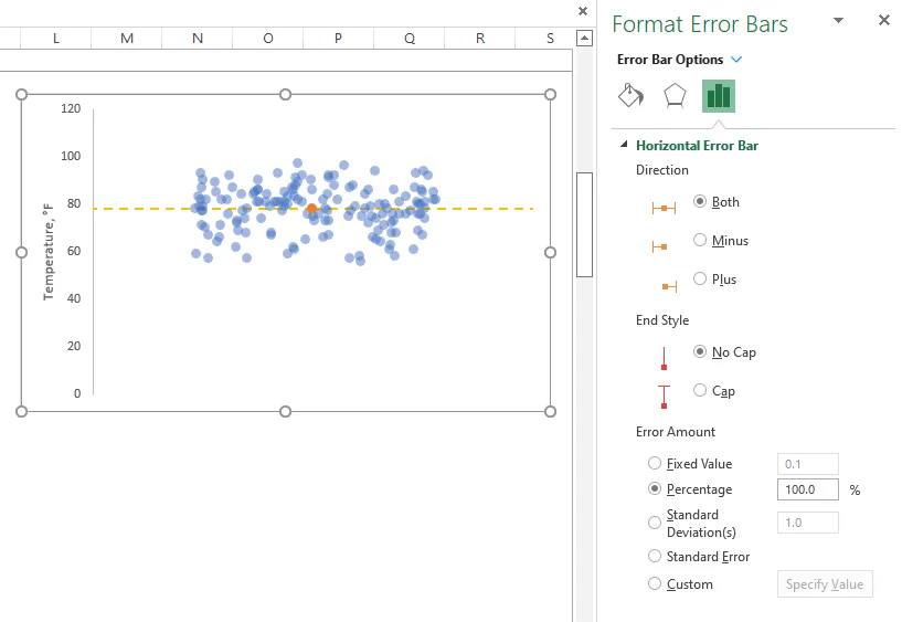
Select this single data point and add a new chart element – error bar. After that, you can format the error bar, and here is the main configuration besides line formatting.
If it is necessary to use a jitter plot by categories, look at this post.
Take a look at other Excel data visualizations in this blog: magic quadrant chart, gradient line chart, Pac man chart, glowing line chart, and others.
Leave a Reply