Stripchart in Excel is a great way to compare data points between multiple categories. It might be with or without additional jitter. Jitter in Excel chart helps to see overlapping data points more clearly. Here is how to create one step by step.
Here you can download the result.
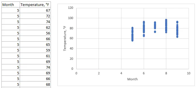
In this example, I’m using data from this data set that contains daily temperature measurements in New York from May to September 1973.
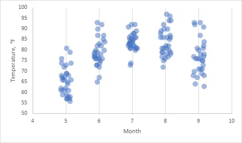
If I try to visualize that in scatter char, it is not easy to review overlapping data points.
Jitter data in Excel
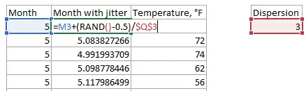
Jitter in Excel is acquired by using the RAND function that can generate random numbers between 1 and 0. In order to locate data points on both sides of the category, it is necessary to subtract 0.5. You can divide jitter or multiply with a decimal number to acquire optimal dispersion. For me, it is easier to locate that in a separate cell to make further adjustments.
Create stripchart in Excel, scatter chart with jitter
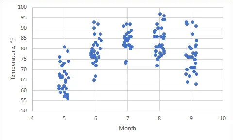
You can use calculated data point categories with jitter instead of previous ones. By using X un Y-axis adjustments, you can get a scatter chart with jitter in Excel.
Show overlapping data in Excel
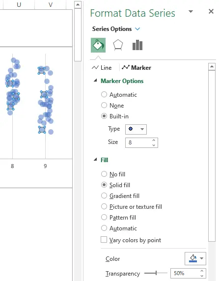
If you are dealing with overlapping data points in Excel, try to use transparency options. Select any of the data points, press Cltr+1, and change marker transparency settings.
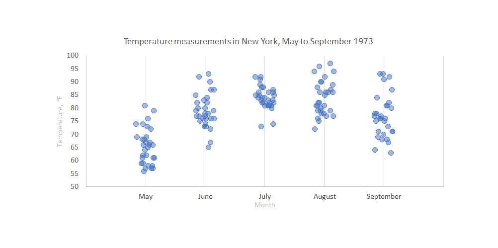
Here is the result with jittered stripchart in Excel.
The hardest part is adding the text labels on the Excel scatter chart axis to look at the data like below. Here is a post that explains the process behind getting custom text on the scatter chart axis.
You can download the file with the result right here.
Take a look at other Excel data visualizations in this blog: magic quadrant chart, gradient line chart, Pac man chart, glowing line chart, and others.
Leave a Reply