
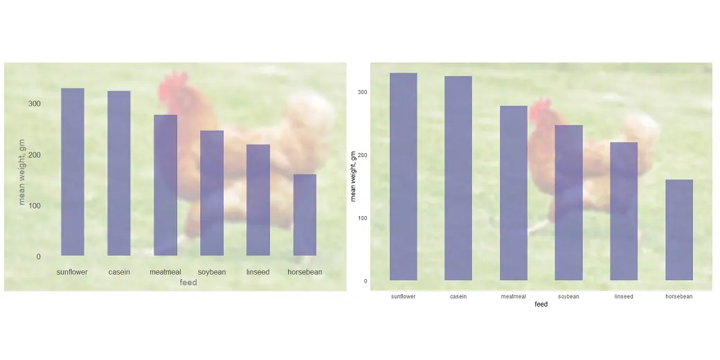
There are different ways how to use an image as the chart background in R. You can add that only in the panel background or plot background, or you can put the plot on top of the image.
Category: DataViz
Excel chart axis conditional formatting

Here is how to create an Excel chart axis conditional formatting for necessary values using format code. It is relatively easy to do for the vertical axis, but it is also possible for the horizontal axis.
Add data labels to column or bar chart in R

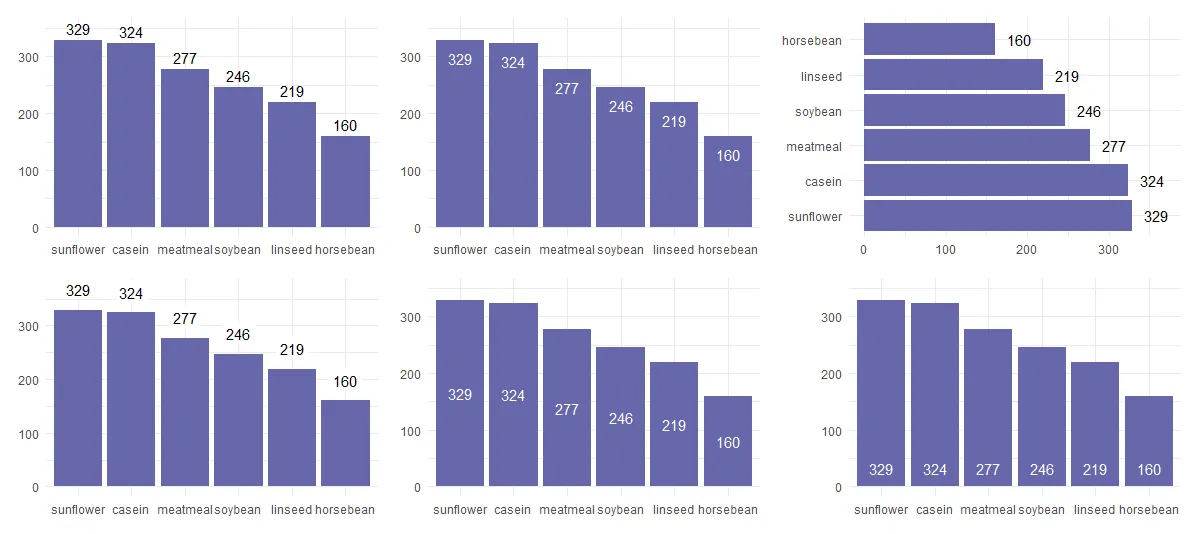
Here are multiple examples of how to add data labels to the column or bar chart in R if you are using the ggplot2 or plotly packages. You can add them in various positions, and it is good to know typical ones. In the case of plotly, interactivity and tooltips might be enough, but you… Continue reading Add data labels to column or bar chart in R
How to save R plots or other results temporarily

If you want to save R plots or other script results temporarily, here is a simple way to do that. It might be helpful if it is necessary to save them outside the R environment, but you don’t want to clean up secondary results. For example, by converting plots to another image format. Here is… Continue reading How to save R plots or other results temporarily
How to create gradient shade under the line chart in R

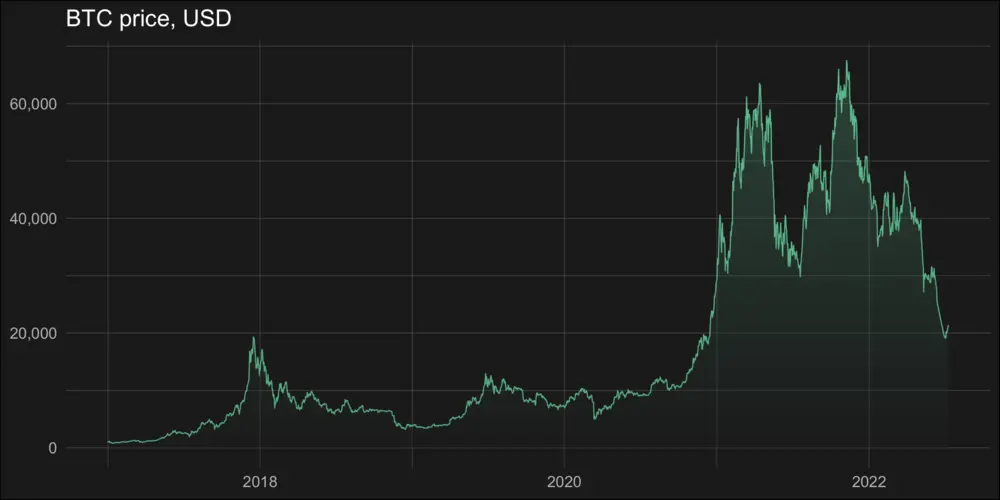
Here is how to create a vertical gradient shade under a line chart in R. It is a trickier task than using the gradient effect in a line chart or word cloud. Actually, it is a gradient area chart with accented line. In the beginning, I was looking at this from somehow a weird perspective.
How to add glow effect in R plot

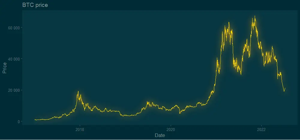
The glow effect in the R plot might be one of those adjustments that someone uses rarely. Meanwhile, neon luminescence adds a special feel to the diagram. Almost like from sci-fi movie. Here is how to add the glow effect in the R plot by using two solutions.
Stripchart in Excel, onedimensional scatter chart with or without jitter

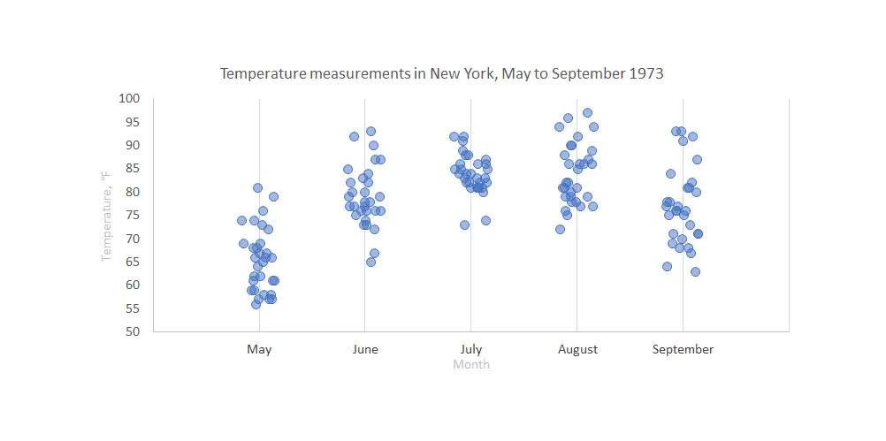
Stripchart in Excel is a great way to compare data points between multiple categories. It might be with or without additional jitter. Jitter in Excel chart helps to see overlapping data points more clearly. Here is how to create one step by step.

4 ways how to create a gradient word cloud in R

If you have a gradient word cloud in R, then besides the size of each word representing results, an additional indicator is also the color. Here are 4 ways how to create that kind of word cloud in R using packages like ggplot2, quanteda, wordcloud, and wordcloud2.
How to create and preview hex color code sequence in R
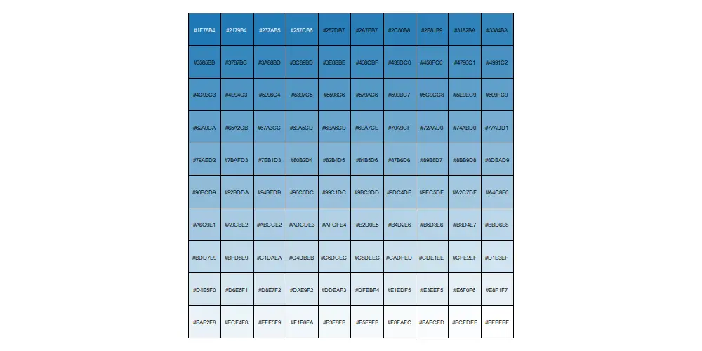
By creating a hex color code sequence in R, you can use that for the color gradient in visualizations. There are multiple ways how to achieve that.