Here is how to create a vertical gradient shade under a line chart in R. It is a trickier task than using the gradient effect in a line chart or word cloud. Actually, it is a gradient area chart with accented line. In the beginning, I was looking at this from somehow a weird perspective.
The key ingredient in creating this visualization is this tutorial.
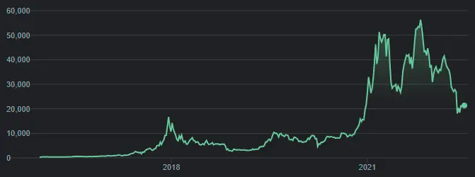
The inspiration comes from charts that Google uses to show time series in dark mode. For example, the Bitcoin price.
To get the necessary data, I will get Bitcoin price data with the help of the coindeskr package.
require(coindeskr)

btc <- get_historic_price(start = "2017-01-01")

btc$Date <- as.Date(row.names(btc))
Here is how it looks in an area chart with little transparency.
require(ggplot2)

ggplot(btc, aes(x = Date, y = Price)) +
  geom_area(fill = "#63CB99",
            color = "#63CB99",
            alpha = 0.5)
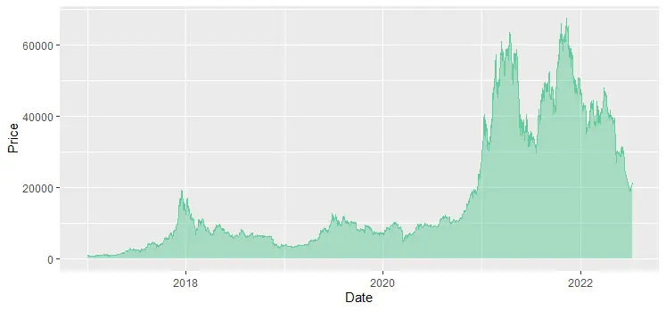
The gradient shade under the line chart in R is created using a gradient area chart.
Gradient shade under line chart in R
To create the line chart with the shaded area in R, I will use the dark theme from the ggdark package and formatting adjustments you can find in this link. The initial code comes from this vignette which recreates a ridgeline plot with a vertical color gradient.
The first step is the creation of an SVG gradient pattern.
library(minisvg)
library(devout)
library(devoutsvg)
library(poissoned)
library(svgpatternsimple)

require(ggplot2)
require(ggdark)


gradient_pattern  <- create_pattern_gradient(
  id = "p1",
  angle = 90,
  colour1 = "#1A1A1A",
  colour2 = "#63CB99",
  alpha = 0.8
)

gradient_pattern$show()

The next is a definition of the result file, patterns, and size of the result.
Height and width in the function svgout should be in inches. By default, the size is 10×8 inches. In my case, it is important to maintain an aspect ratio of 2:1. The result will be available in the working directory, but you can choose something specific.
my_pattern_list <- list(`#000001` = list(fill = gradient_pattern))

svgout(
  filename = "line-chart-with-gradient-shade.svg",
  pattern_list = my_pattern_list,
  width = 10,
  height = 5
)
After the next piece of code result will be rendered and available in the previously defined SVG file.
ggplot(btc, aes(x = Date, y = Price)) +
  geom_line(color = "#63CB99",
            size = 0.4,
            alpha = 0.9) +
  geom_area(alpha = 0.3,
            fill = "#000001",
            color = alpha(0.1)) +
  ggtitle("BTC price, USD") +
  scale_y_continuous(labels = scales::comma) +


  dark_theme_gray(base_family = "Fira Sans Condensed Light", base_size = 14) +
  theme(
    plot.title = element_text(family = "Fira Sans Condensed"),
    plot.background = element_rect(fill = "grey10"),
    panel.background = element_blank(),
    panel.grid.major = element_line(color = "grey30", size = 0.2),
    panel.grid.minor = element_line(color = "grey30", size = 0.2),
    legend.background = element_blank(),
    axis.ticks = element_blank(),
    legend.key = element_blank(),
    legend.position = c(0.815, 0.27),
    axis.title.x = element_blank(),
    axis.title.y = element_blank()
  )


invisible(dev.off())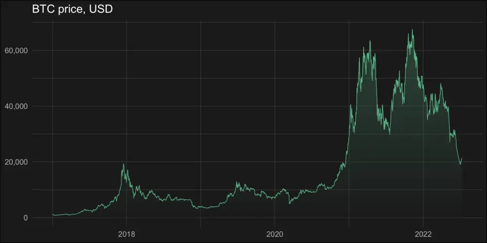
Here is another solution with gradient shade under the line chart in R.
Look at other visualizations in this blog made using R. For example, gradient line chart, glowing line chart, and gradient word cloud.
Leave a Reply