Category: R
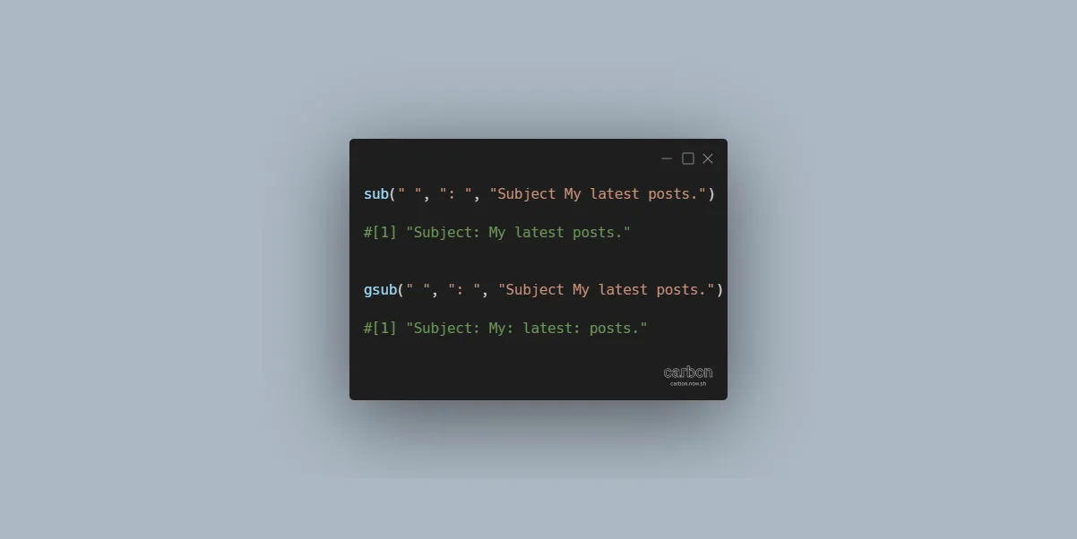
Replace the first occurrence of a character or string in R
Here is how to find and replace the first occurrence of a character or string in R. It will help you to separate words in multiple lines in ggplot2 visualizations or do other tasks.
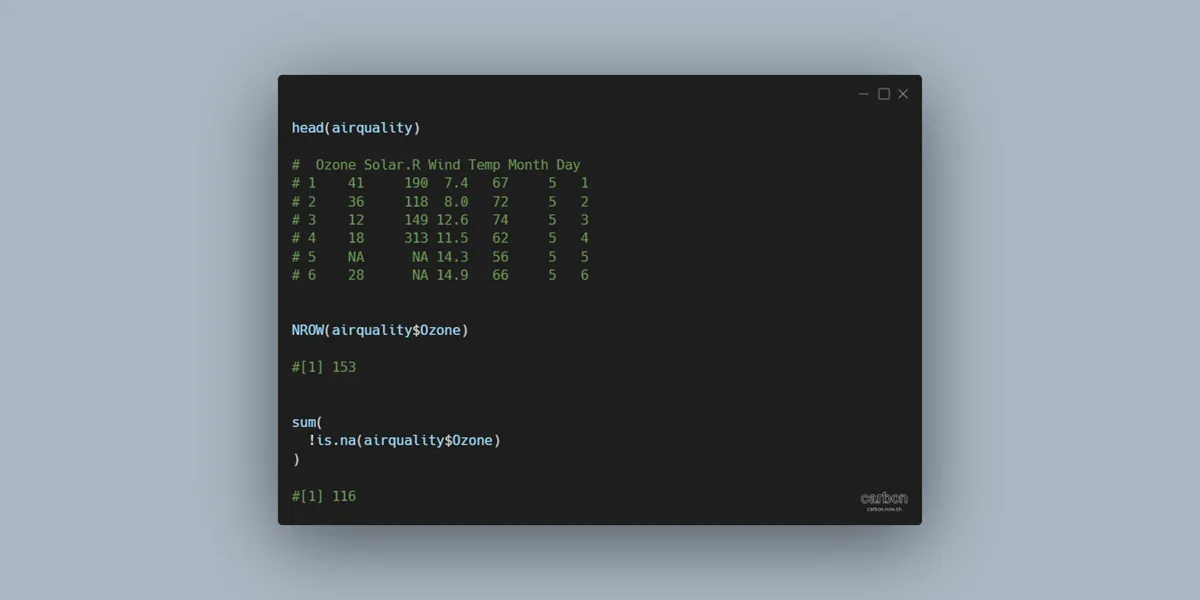
Count excluding NA in R
If you want to count values excluding NA in R, here is a simple way to do that. You can detect non-NA values and get results as TRUE or FALSE that can be used by the sum function to get the result.
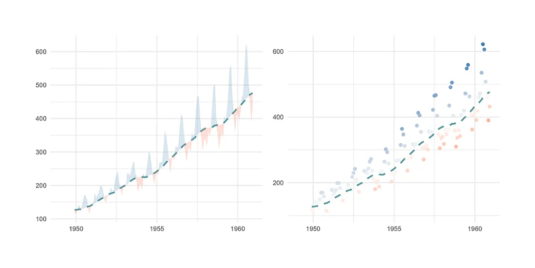
Plot moving average in R using ggplot2
Here is how to plot the moving average (rolling average or running average) in R using ggplot2 and add actual data in different ways. In that way, you can track the moving average and look at the data around that. Sometimes it helps to spot anomalies in time series.
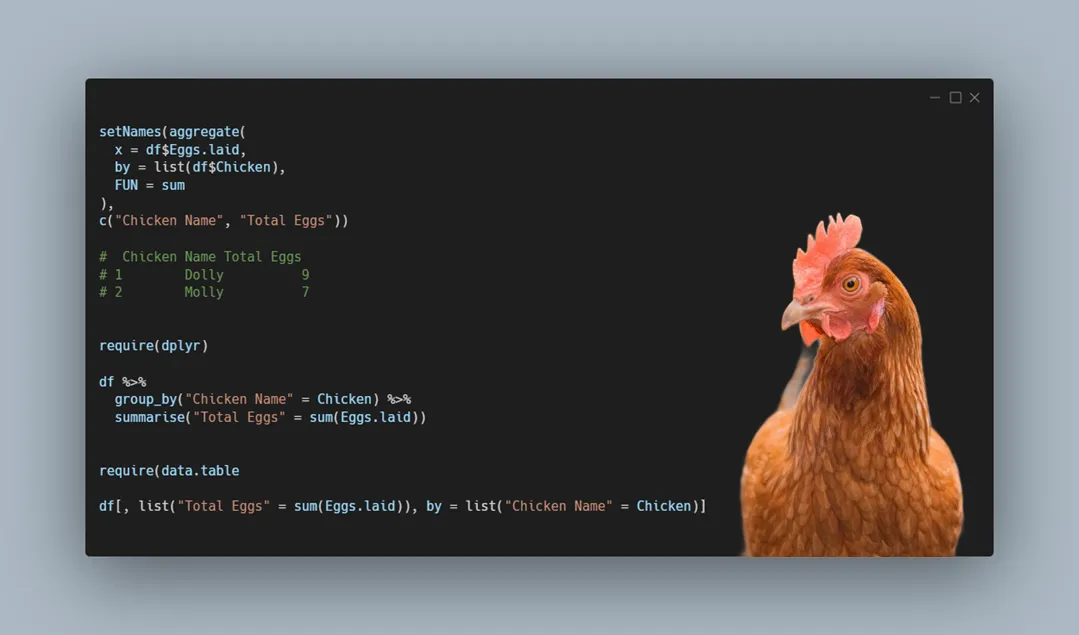
How to get the sum by group in R
Here are multiple examples of getting the sum by group in R using the base, dplyr, and data.table capabilities. Depending on the situation, you can choose in your scenario what is the best solution.
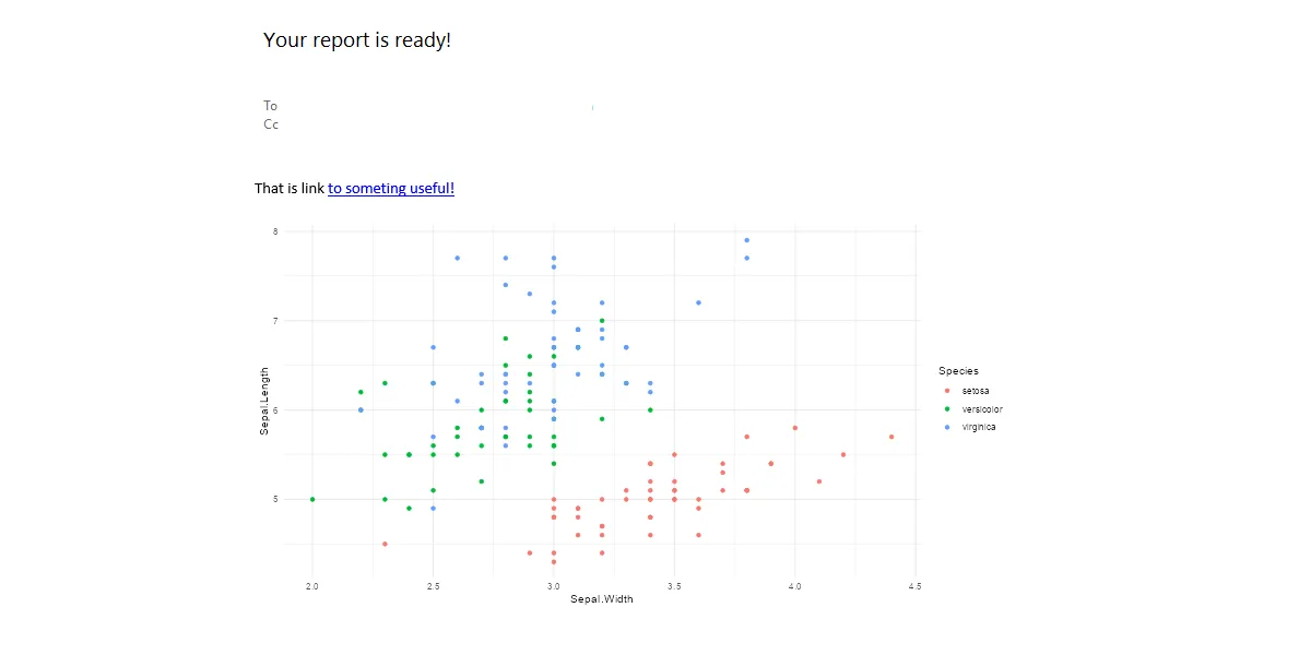
Multi-level axis labels in R plot using ggplot2
Here is an example of how to create multi-level axis labels in an R plot using ggplot2. You can separate them into 2 levels on a plot x-axis or more. It depends on the situation.
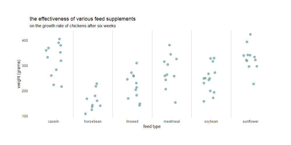
Color gradient in R jitter plot using midpoint or group
Here is how to use the color gradient in R jitter plot using midpoints or different gradients by a group. A good jitter plot in R makes it easier to view overlapping data points by categories. Color gradients might help to see differences better.
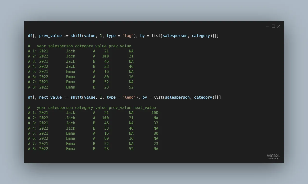
Value from next or previous row in R data frame using data.table
If you are working with large datasets and want to get value from the next or previous row in R, try to use the data.table. It is possible to do the same with base R or dplyr, but it might be too slow. Basically, this approach with the data.table to get value from the next…
How to modify plot title in R using ggplot2
Here is how to add and modify the plot title in R using ggplot2 in many ways. After adding the ggplot2 title and subtitle, you might want to change the alignment, color, and size, add a bold effect to all or a few words, and do other customizations. Here are multiple examples of that.
How to add GIF animation to plot in R
Here is how to add GIF animation to the plot in R and draw extra attention. You can take a static ggplot2 plot and join it with GIF frames. As a result, you can create GIF in R with an infinite or finite loop.