Here is how to plot the moving average (rolling average or running average) in R using ggplot2 and add actual data in different ways. In that way, you can track the moving average and look at the data around that. Sometimes it helps to spot anomalies in time series.
Here is data from the AirPassengers dataset.
df <- data.frame(Year = as.numeric(trunc(time(AirPassengers))),
                 Month = month.abb[cycle(AirPassengers)],
                 AirPassengers = as.numeric(AirPassengers))

df$Month <- factor(df$Month, levels = unique(df$Month))

require(lubridate)

df$date <- make_date(df$Year, df$Month, 1)

head(df)

#  Year Month AirPassengers       date
# 1 1949   Jan           112 1949-01-01
# 2 1949   Feb           118 1949-02-01
# 3 1949   Mar           132 1949-03-01
# 4 1949   Apr           129 1949-04-01
# 5 1949   May           121 1949-05-01
# 6 1949   Jun           135 1949-06-01
This data shows monthly totals of international airline passengers. There is seasonality, and I will calculate the moving average with a 12-month window.
I will be calculating simple moving averages using the function rollmean from the package zoo. It is also a good idea to try Tidyquant, which has geoms for moving averages and different types of moving averages.
Plot moving average in R using ggplot2
Here is a simple way how to plot the moving average using ggplot2 and the function rollmean.
require(ggplot2)
require(zoo)

ggplot(df, aes(x = date,
               y = AirPassengers)) +
  geom_line(color = "cadetblue", linewidth = 1) +
  geom_line(aes(y = rollmean(
    AirPassengers, 12, na.pad = TRUE, align = "right")), linewidth = 1) +
  theme_minimal() +
  theme(axis.title = element_blank())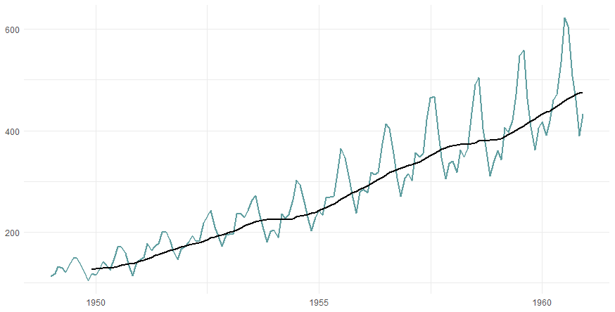
If you want to show actual data above and below the moving average in different colors, you can use the geom_ribbon.
Before that, it is necessary to add the necessary calculations to the data frame. There will be two ribbons. The first one is for the data above the rolling average, and the second one is for the values below.
df$MA <- rollmean(df$AirPassengers, 12, na.pad = TRUE, align = "right")

df$above_MA <- ifelse(df$AirPassengers >= df$MA, df$AirPassengers, df$MA)
df$below_MA <- ifelse(df$AirPassengers < df$MA, df$AirPassengers, df$MA)

df[10:15, ]

#   Year Month AirPassengers       date       MA above_MA below_MA
# 10 1949   Oct           119 1949-10-01       NA       NA       NA
# 11 1949   Nov           104 1949-11-01       NA       NA       NA
# 12 1949   Dec           118 1949-12-01 126.6667 126.6667 118.0000
# 13 1950   Jan           115 1950-01-01 126.9167 126.9167 115.0000
# 14 1950   Feb           126 1950-02-01 127.5833 127.5833 126.0000
# 15 1950   Mar           141 1950-03-01 128.3333 141.0000 128.3333
The result visually looks like this.
ggplot(df, aes(x = date,
               y = MA)) +
  geom_line(color = "cadetblue",
            linewidth = 1,
            linetype = 2) +
  geom_ribbon(aes(ymin = below_MA, ymax = MA),
              alpha = 0.2,
              fill = "tomato") +
  geom_ribbon(aes(ymin = MA, ymax = above_MA),
              alpha = 0.2,
              fill = "steelblue") +
  theme_minimal() +
  theme(axis.title = element_blank())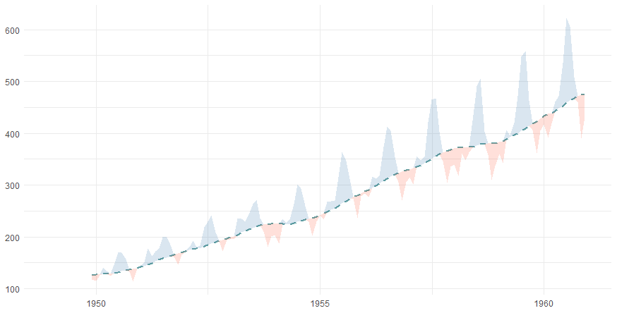
Plot data points around the rolling average in R
It is possible to put behind the moving average line markers that represent values of actual data. By using a color gradient, you can show how much something is below or above the moving average. To do that, calculate the difference between the actual data and the moving average.
df$diff <- df$AirPassengers - df$MA
After that, you can use that in the geom_point.
ggplot(df, aes(x = date, y = MA)) +
  geom_point(aes(x = date, y = AirPassengers, color = diff),
             size = 2,
             shape = 16) +
  scale_colour_gradient2(
    midpoint = 0,
    low = "tomato",
    high = "steelblue",
    na.value = "transparent",
    guide = "none") +
  geom_line(color = "cadetblue",
            linewidth = 1,
            linetype = 2) +
  theme_minimal() +
  theme(axis.title = element_blank())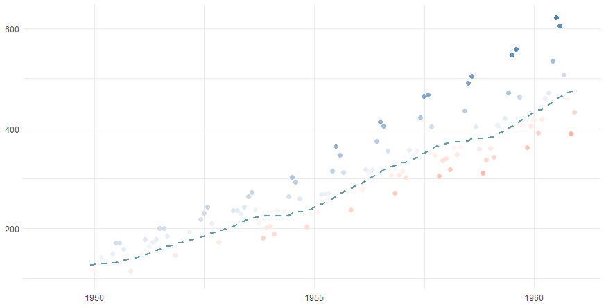
If you want to see more examples of how to implement color gradients in ggplot2, look at this post about color gradients in the jitter plot or gradient line chart.
Leave a Reply