Here is how to use the color gradient in R jitter plot using midpoints or different gradients by a group. A good jitter plot in R makes it easier to view overlapping data points by categories. Color gradients might help to see differences better.
Here is my data set with the month name from the month number and formatted as a factor to ensure the right order on the plot axis.
airquality$MonthName <- month.name[airquality$Month]

airquality$MonthName <-
  factor(airquality$MonthName, levels = unique(airquality$MonthName))

head(airquality)

#  Ozone Solar.R Wind Temp Month Day MonthName
#1    41     190  7.4   67     5   1       May
#2    36     118  8.0   72     5   2       May
#3    12     149 12.6   74     5   3       May
#4    18     313 11.5   62     5   4       May
#5    NA      NA 14.3   56     5   5       May
#6    28      NA 14.9   66     5   6       May
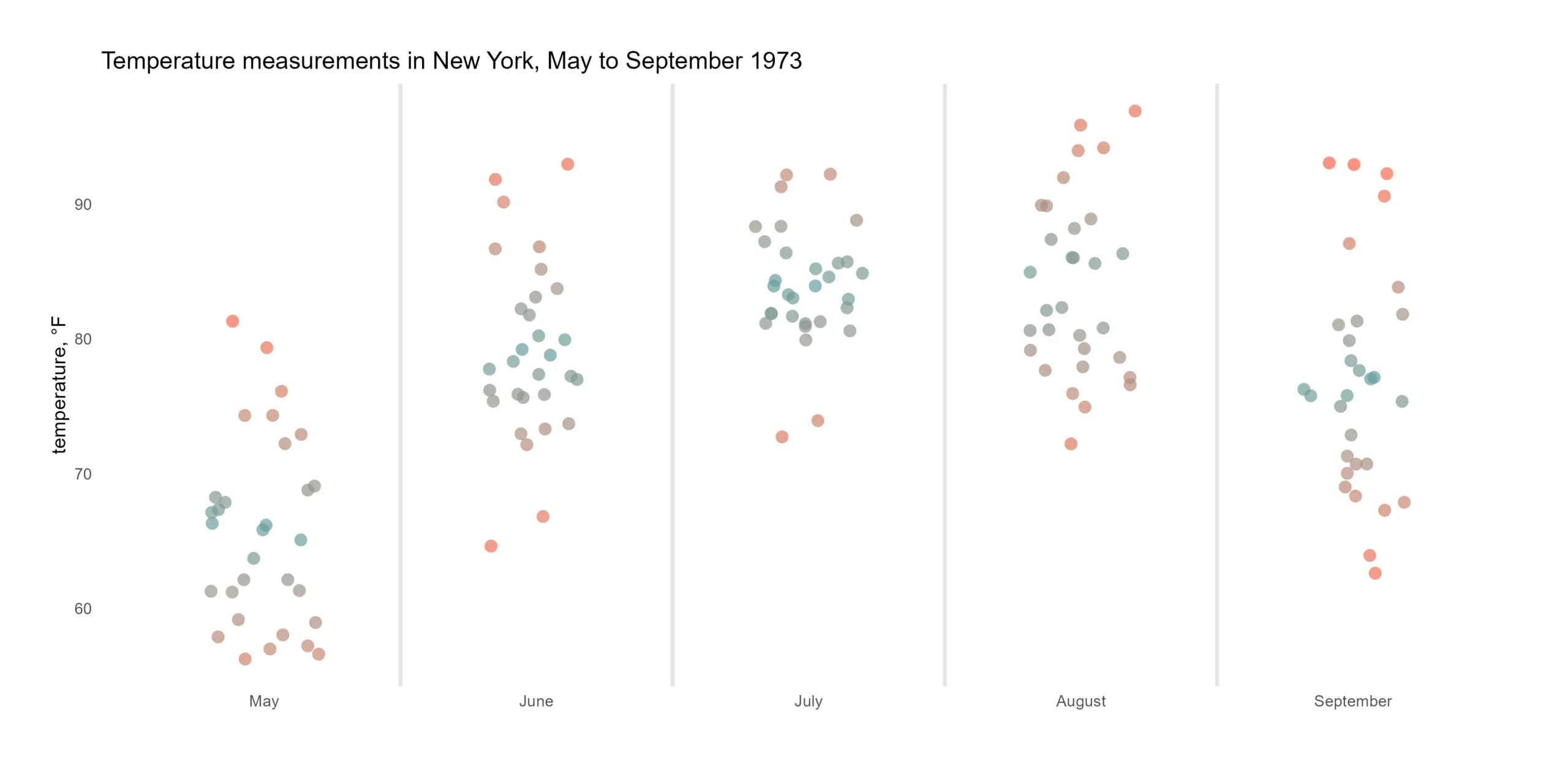
Color gradient in R using the common midpoint
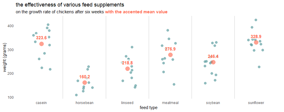
In one of the latest posts, I created in the ggplot2 a jitter plot with the accented mean value.
By using the scale_color_gradient2 from ggplot2, it is possible to specify the common midpoint of the gradient scale. It might be median or mean in my case.
require(ggplot2)

set.seed(123)

ggplot(airquality, aes(x = MonthName, y = Temp, color = Temp)) +
  geom_jitter(
    size = 3,
    alpha = 0.7,
    shape = 16,
    width = 0.2) +
  geom_vline(
    xintercept = seq(1.5, length(unique(airquality$MonthName)), by = 1),
    color = "gray90",
    size = 1) +
  scale_color_gradient2(midpoint = mean(airquality$Temp),
                        low = "tomato", mid = "cadetblue",
                        high = "tomato", guide = "none") +
  labs(
    title = "Temperature measurements in New York, May to September 1973",
    y = "temperature, °F",
    x = "") +
  theme_minimal() +
  theme(panel.grid = element_blank())
Color gradient in R using the midpoint of each group
If the common midpoint for all the groups is not useful, you can do the additional calculation to obtain the midpoint for each group. Here is the calculation of the mean by each group using dplyr and the difference between other data points.
require(dplyr)

airquality <- airquality %>%
  group_by(MonthName) %>%
  mutate(mean_temp = mean(Temp),
         diff_temp = mean_temp - Temp)
This difference will define the color and help to adjust the color gradient around the mean value. If the data point matches mean value difference is 0.
set.seed(123)

ggplot(airquality, aes(x = MonthName, y = Temp, color = diff_temp)) +
  geom_jitter(
    size = 3,
    alpha = 0.7,
    shape = 16,
    width = 0.2) +
  geom_vline(
    xintercept = seq(1.5, length(unique(airquality$MonthName)), by = 1),
    color = "gray90",
    size = 1) +
  scale_color_gradient2(midpoint = 0, low = "tomato", mid = "cadetblue",
                        high = "tomato", guide = "none") +
  labs(
    title = "Temperature measurements in New York, May to September 1973",
    y = "temperature, °F",
    x = "") +
  theme_minimal() +
  theme(panel.grid = element_blank())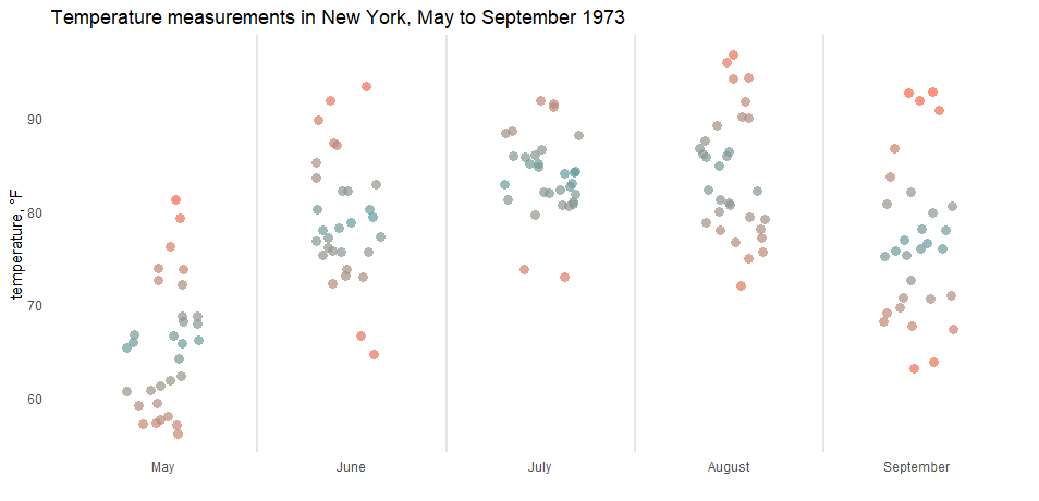
Different ggplot2 color gradient by group
Here is another scenario that is helpful if you want to use a different color gradient for categories using ggplot2.
With the help of the ggnewscale package, you can reset the color scale when necessary. To do that in the jitter plot, I reused the same ggplot2 geom multiple times. The geom_blank ensures that there is a common scale for all the plots.
set.seed(123)

ggplot(airquality) +
  geom_blank(aes(x = MonthName, y = Temp)) +
  geom_vline(
    xintercept = seq(1.5, length(unique(airquality$MonthName)), by = 1),
    color = "gray90",
    size = 1) +

  geom_jitter(aes(x = MonthName, y = Temp, color = diff_temp),
              filter(airquality, Month %in% 6:8),
              size = 3,
              alpha = 0.7,
              shape = 16,
              width = 0.2) +
  scale_color_gradient2(midpoint = 0, low = "tomato", mid = "limegreen",
                        high = "tomato", guide = "none") +

  ggnewscale::new_scale_color() +

  geom_jitter(aes(x = MonthName, y = Temp, color = diff_temp),
              filter(airquality, Month %in% c(5, 9)),
              size = 3,
              alpha = 0.7,
              shape = 16,
              width = 0.2) +
  scale_color_gradient2(midpoint = 0, low = "tomato", mid = "cadetblue",
                        high = "tomato", guide = "none") +

  labs(
    title = "Temperature measurements in New York, May to September 1973",
    y = "temperature, °F",
    x = "") +
  theme_minimal() +
  theme(panel.grid = element_blank())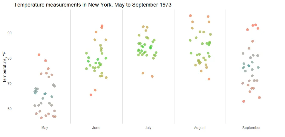
If you like using color gradients in ggplot2, here are examples with a gradient line chart and gradient shade under the line chart.
Leave a Reply