Here is an example of how to create multi-level axis labels in an R plot using ggplot2. You can separate them into 2 levels on a plot x-axis or more. It depends on the situation.
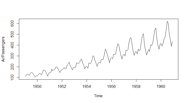
I will visualize part of the AirPassengers dataset.
plot(AirPassengers)
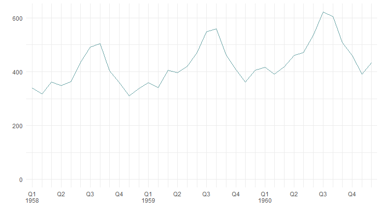
Here is a sample of the last 36 months with month names and quarters.
require(lubridate)

df <- data.frame(Year = as.numeric(trunc(time(AirPassengers))),
                 Month = month.abb[cycle(AirPassengers)],
                 AirPassengers = as.numeric(AirPassengers))

df$Month <- factor(df$Month, levels=unique(df$Month))

df$Quarter <- quarters(make_date(df$Year, df$Month, ))

df <- tail(df, n = 36)

head(df)

#   Year Month AirPassengers Quarter
# 109 1958   Jan           340      Q1
# 110 1958   Feb           318      Q1
# 111 1958   Mar           362      Q1
# 112 1958   Apr           348      Q2
# 113 1958   May           363      Q2
# 114 1958   Jun           435      Q2
To create a plot axis with labels in two levels, I will add two calculations in separate columns. Each of the columns contains the first appearance of the year or quarter. That is what will be on the axis.
require(dplyr)

df <- df %>%
  mutate(
    Q = ifelse(lag(Quarter) != Quarter |
                 is.na(lag(Quarter)), Quarter, ""),
    Y = ifelse(lag(Year) != Year |
                 is.na(lag(Year)), Year, "")
  )

head(df)

#   Year Month AirPassengers Quarter  Q    Y
# 109 1958   Jan           340      Q1 Q1 1958
# 110 1958   Feb           318      Q1
# 111 1958   Mar           362      Q1
# 112 1958   Apr           348      Q2 Q2
# 113 1958   May           363      Q2
# 114 1958   Jun           435      Q2
The main principle of the solution is that you can use custom x-axis labels that are separated with newline characters. You can use the same approach to split the ggplot2 title into multiple rows.
Multi-level axis labels in R
There are multiple ways to create multi-level axis labels in the R plot. In this case, the goal is achieved by using scale_x_discrete with custom labels that are separated by a new line character.
require(ggplot2)

ggplot(df, aes(
  x = interaction(Month, Year),
  y = AirPassengers,
  group = 1
)) +
  geom_line(color = "cadetblue") +
  ylim(0, NA) +
  scale_x_discrete(labels = paste(df$Q , df$Y, sep = "\n")) +
  labs(x = "", y = "") +
  theme_minimal()
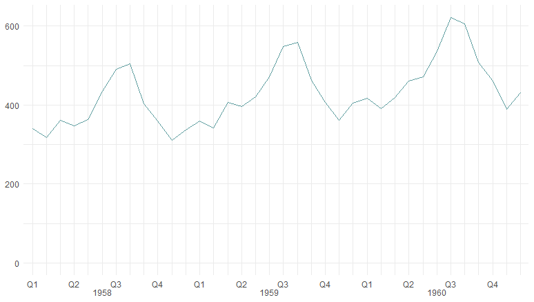
Let’s say you want to put the year in a different position. For example, in the middle of the month series. Here is how it’s done, by detection position in the middle.
dfY <- df %>%
  select(Month, Year) %>%
  group_by(Year) %>%
  filter(row_number() == ceiling(n() / 2)) %>%
  mutate(Y2 = Year)

df <- left_join(df, dfY)

df$Y2 <- ifelse(is.na(df$Y2), "", as.character(df$Y2))

head(df)


#  Year Month AirPassengers Quarter  Q    Y   Y2
# 1 1958   Jan           340      Q1 Q1 1958
# 2 1958   Feb           318      Q1
# 3 1958   Mar           362      Q1
# 4 1958   Apr           348      Q2 Q2
# 5 1958   May           363      Q2
# 6 1958   Jun           435      Q2         1958
Here is how it looks as a result.
ggplot(df, aes(
  x = interaction(Month, Year),
  y = AirPassengers,
  group = 1
)) +
  geom_line(color = "cadetblue") +
  ylim(0, NA) +
  scale_x_discrete(labels = paste(df$Q , df$Y2, sep = "\n")) +
  labs(x = "", y = "") +
  theme_minimal() +
  theme(axis.title = element_blank())
If the space allows, you can show x-axis labels on three levels. Here is a little tweak for using multiple colors for labels. If the year is an odd number, it will appear in one color, otherwise in a different one.
df$AxisColor <- ifelse(df$Year %% 2 == 0, "gray50", "gray")

head(df)

#  Year Month AirPassengers Quarter  Q    Y   Y2 AxisColor
# 1 1958   Jan           340      Q1 Q1 1958         gray50
# 2 1958   Feb           318      Q1                 gray50
# 3 1958   Mar           362      Q1                 gray50
# 4 1958   Apr           348      Q2 Q2              gray50
# 5 1958   May           363      Q2                 gray50
# 6 1958   Jun           435      Q2         1958    gray50
As a result, it looks like this.
ggplot(df, aes(
  x = interaction(Month, Year),
  y = AirPassengers,
  group = 1
)) +
  geom_line(color = "cadetblue", linewidth = 1) +
  ylim(0, NA) +
  geom_vline(
    xintercept = seq(1, length(df$Month), by = 3),
    color = "lightgray",
    linewidth = 0.75,
    linetype = 3) +
  scale_x_discrete(labels = paste(df$Month, df$Q , df$Y2, sep = "\n")) +
  labs(x = "", y = "") +
  theme_minimal()+
  theme(axis.text.y = element_text(color = "gray50"),
        axis.text.x = element_text(color = df$AxisColor),
        axis.line.x = element_line(linewidth = 0.5, color = "lightgray"),
        axis.ticks.x = element_line(linewidth = 0.5, color = df$AxisColor),
        panel.grid = element_blank(),
        axis.title = element_blank())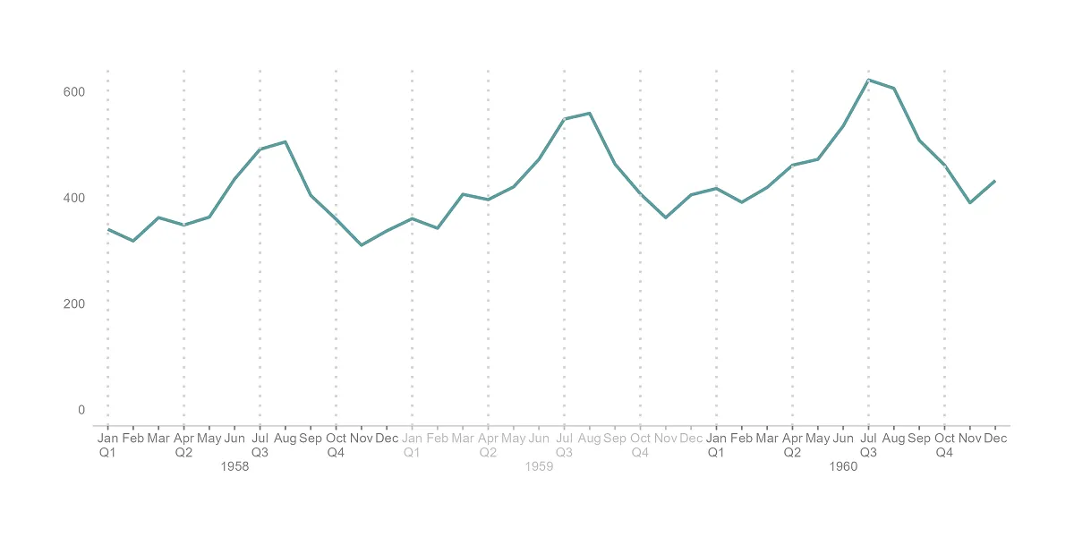
Please look at other visualizations in this blog made using R. For example, gradient line chart, glowing line chart, and gradient word cloud.
Leave a Reply