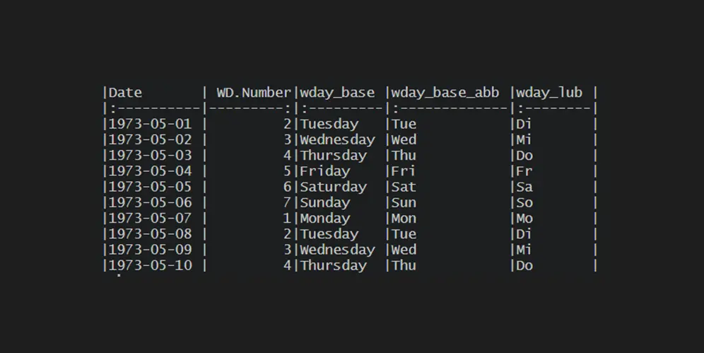
How to get the weekday name from the date or number in R
There are multiple scenarios where you would like to get the weekday name from the date or number in R. Here are four solutions to get that depending on available content. The weekday number might already be in a separate column or obtainable from the date. It is not so easy as getting the month…
in
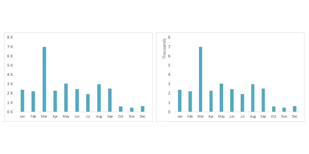
Show numbers in thousands in Excel as K in table or chart
You can show numbers in thousands in Excel as K by using format code or additional calculations. It makes it easier to read large numbers in a table or chart. In the same way, you can display numbers in millions in Excel as M. If you can use calculations, you can divide numbers by 1000…
in
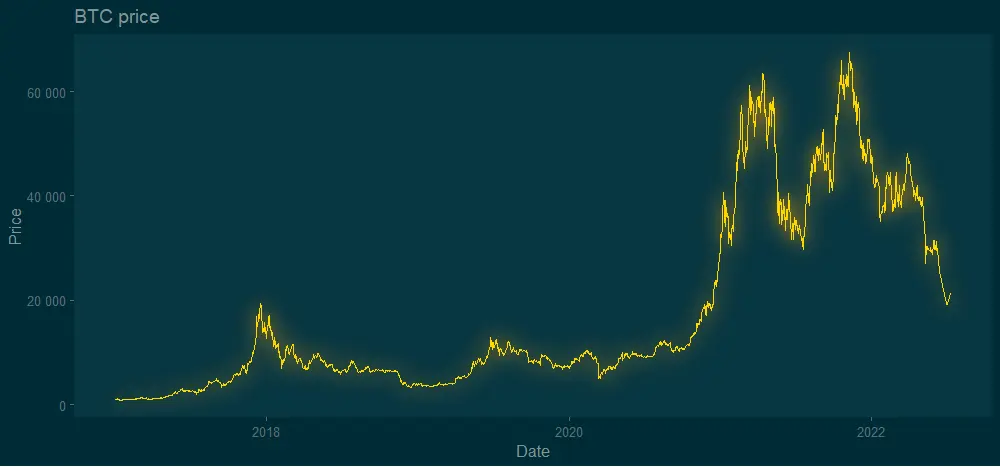
How to create gradient shade under the line chart in R
Here is how to create a vertical gradient shade under a line chart in R. It is a trickier task than using the gradient effect in a line chart or word cloud. Actually, it is a gradient area chart with accented line. In the beginning, I was looking at this from somehow a weird perspective.
Mean by a group in R
Here is how to calculate the mean by a group in R. If you are an Excel, user you might prefer to say average by a group in R. This post contains multiple scenarios that will ensure that you know some of the pitfalls and tricks.
in
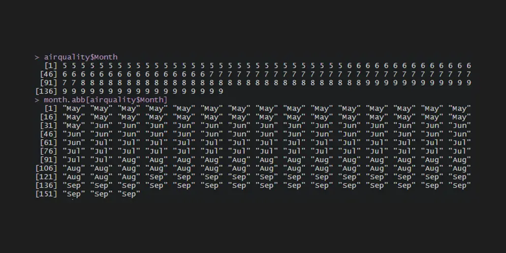
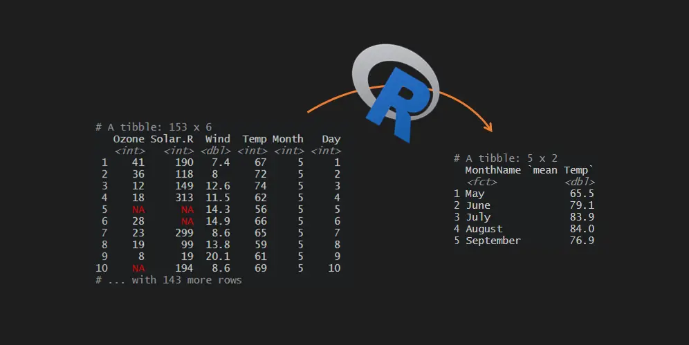
How to get the month name from the number in R
There are multiple scenarios where you would like to get the month name from the number in R. Here are two solutions to get that depending on the month number location. The month number might already be in a separate column or date.
in
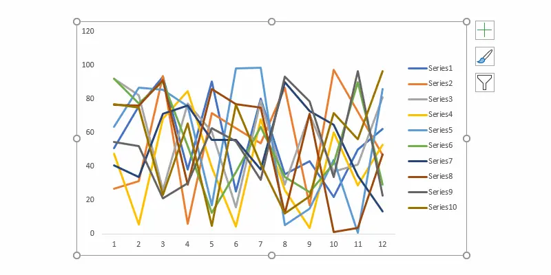
How to change weight for all series in an Excel line chart or do other formatting
If you have a line chart with a lot of series, it is time-consuming to format all of them separately. Here are a couple of approaches to quickly change the weight for all series in an Excel line chart or do another formatting. For example, change all series colors at once or change dash type.
in

How to move Excel chart axis labels to the bottom or top
Here is how to move Excel chart axis labels to the bottom or top of the chart. It is helpful modification if an Excel chart horizontal axis labels overlap with series. Overlapping is a typical situation if your data have positive and negative values like, for example, air temperature or other measures.
in
How to add glow effect in R plot
The glow effect in the R plot might be one of those adjustments that someone uses rarely. Meanwhile, neon luminescence adds a special feel to the diagram. Almost like from sci-fi movie. Here is how to add the glow effect in the R plot by using two solutions.

How to detect data type in R and change it if necessary
Here is how to detect data type in R and change it when necessary. Further data manipulations may require checking of that. For example, if you want to join two data frames, the data type of the key columns must match.
in
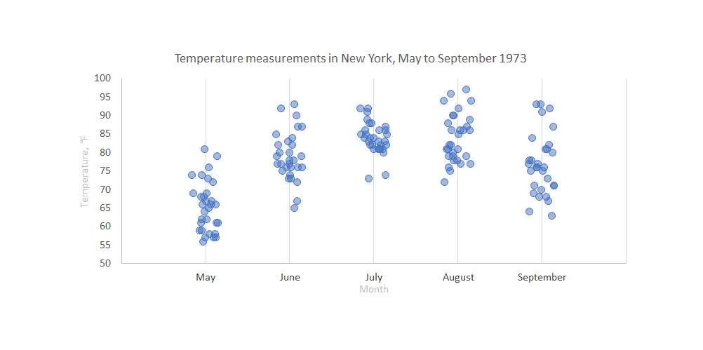
Stripchart in Excel, onedimensional scatter chart with or without jitter
Stripchart in Excel is a great way to compare data points between multiple categories. It might be with or without additional jitter. Jitter in Excel chart helps to see overlapping data points more clearly. Here is how to create one step by step.