
Here is how to move Excel chart axis labels to the bottom or top of the chart. It is helpful modification if an Excel chart horizontal axis labels overlap with series. Overlapping is a typical situation if your data have positive and negative values like, for example, air temperature or other measures.
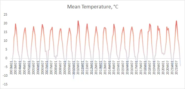
Here is the chart that I created by using this gradient line chart technique. In this situation, it is hard to see what is happening below the x-axis. Labels overlap with the line chart.
Move Excel chart axis labels to the bottom in 2 easy steps
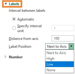
- Select horizontal axis labels and press Ctrl + 1 to open the formatting pane.
- Open the Labels section and choose label position “Low“.
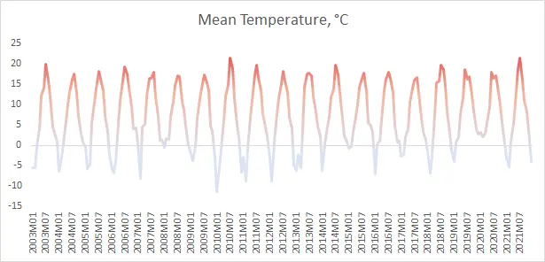
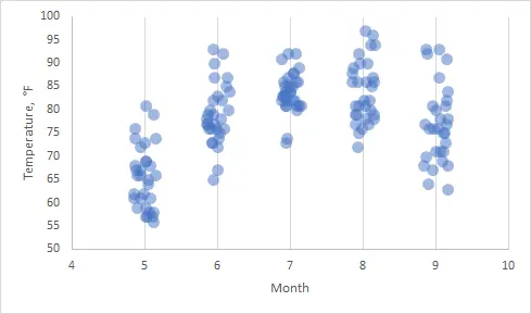
Here is the result with Excel chart axis labels at the bottom. Now it is possible to clearly evaluate the dynamics of the series and see axis labels.
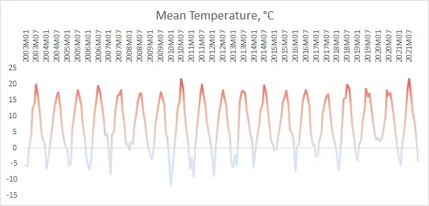
By choosing label position “High” you can get Excel chart axis labels on the top of the chart.
If you want to move not only axis labels but also the axis itself, you can do that by specifying a crossing point. Here is how to do that in another example.
If you are using many modifications in your Excel chart, try to save them as a template. That might be useful to apply them repeatedly. Here is an instruction from Microsoft that you guide you through chart template creation.
Take a look at other Excel data visualizations in this blog: magic quadrant chart, gradient line chart, Pac man chart, glowing line chart, stripchart, and others.
Leave a Reply