Jitter chart in Power BI with average line by categories
Here is how to create a jitter chart in Power BI with averages by categories and using only Power BI and DAX capabilities. No custom visualizations are necessary. A jitter chart makes it easier to view overlapping data points by categories.
How to add GIF animation to plot in R
Here is how to add GIF animation to the plot in R and draw extra attention. You can take a static ggplot2 plot and join it with GIF frames. As a result, you can create GIF in R with an infinite or finite loop.
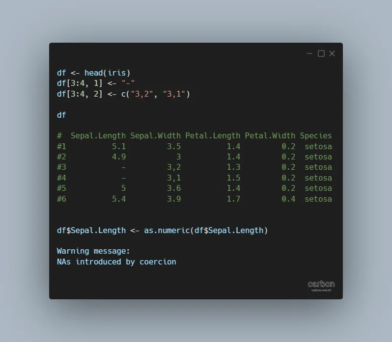
NAs introduced by coercion in R
If you see the warning NAs introduced by coercion in R, don’t panic. It is not necessarily bad, but you should understand if that is acceptable. This warning message usually appears by converting non-numerical values to numerical values with functions like as.numeric or as.integer. It may also appear by creating plots where the correct data…
in
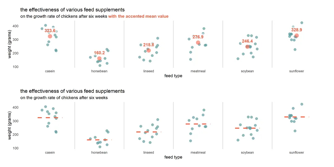
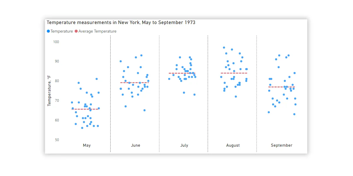
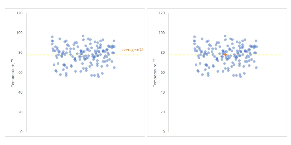
Plot mean by group in R using ggplot2 or use other measures
Here is how to plot mean by group in R using ggplot2 or try other measures to summarize values. To demonstrate that, I will use a jitter plot. A jitter plot is great if you want to look at all data points by categories, but additional statistics might be useful for evaluation.
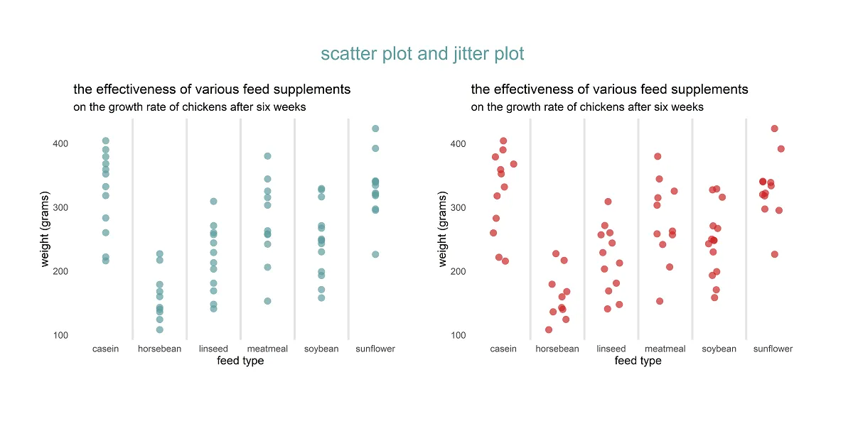
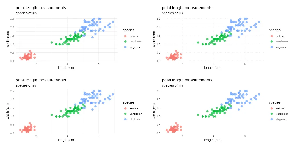
How to create a jitter plot in R with ggplot2, plotly, and base
Here are 3 ways to create a jitter plot in R, also called a strip chart or a dot plot which is a one-dimensional scatter plot. A jitter plot in R makes it easier to view overlapping data points by categorical or discrete values. In that scenario, the scatter plot groups all data points in…
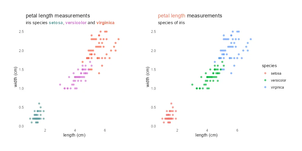
How to use different colors in the ggplot2 title in R
Different colors in the ggplot2 title might be useful to emphasize part of that or as a substitute for the R plot legend. It is not very easy to do, but worth it if it helps to draw the necessary attention.
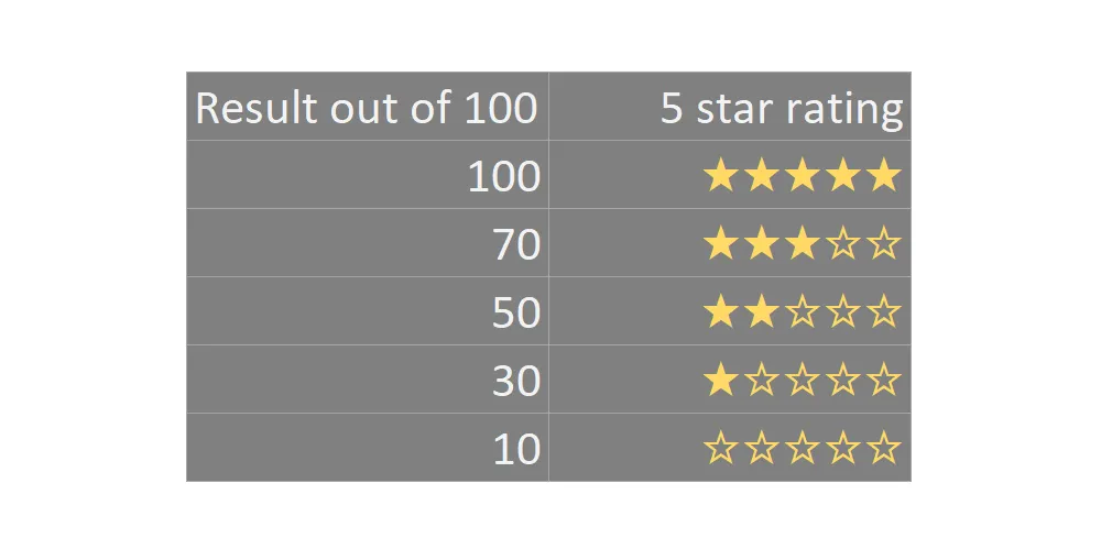
Create star rating in Excel or Power BI using DAX
Here is a simple solution to create a five star rating in Excel using formulas or Power BI using DAX. The result is obtainable using only Excel formulas or DAX capabilities. You can do that with other symbols or emojis too. With the same techniques, it is possible to create a progress bar in Excel…
in
How to swap R plot axis or rotate axis labels in ggplot2
If it is necessary to swap the R plot axis, try to do that with the x and y arguments. Package ggplot2 allows you to swap the axis by using coord_flip, but it is mostly unnecessary. Try to fix the problem at the beginning.
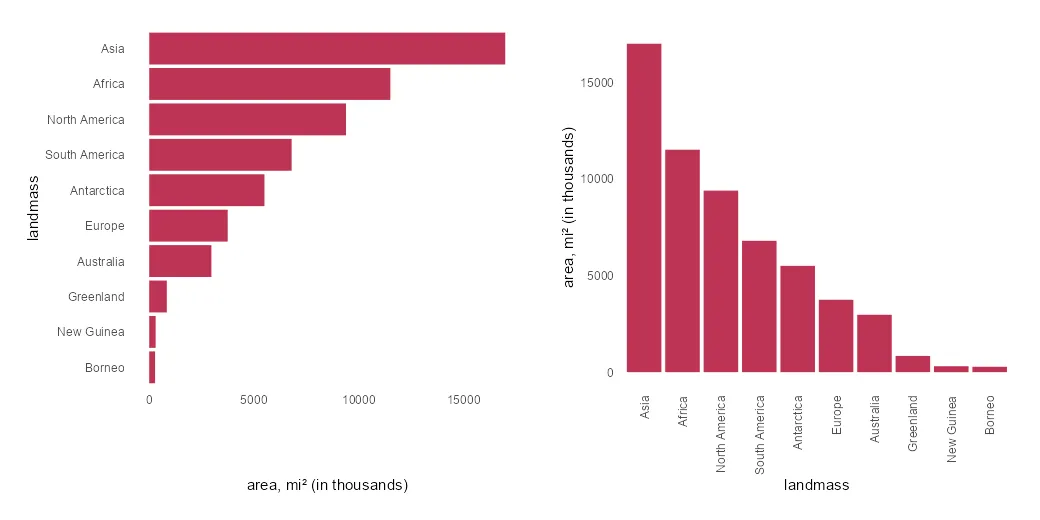
Jitter chart in Excel with average line
A jitter chart in Excel is a beautiful way to use a scatterplot and randomly distribute data points to make them more visible. In other words, if your problem is overlapping data points in Excel, this might be a good solution.