Here is how to quickly build a heatmap in R ggplot2 and add extra formatting by using a color gradient, data labels, reordering, or custom grid lines. There might be a problem if the data contains missing values. At the end of this post is an example of how to deal with NA values in the ggplot2 heatmap.
Here is the data set with United States personal expenditures (in billions of dollars) by categories and years.
USPersonalExpenditure

#                      1940   1945  1950 1955  1960
# Food and Tobacco    22.200 44.500 59.60 73.2 86.80
# Household Operation 10.500 15.500 29.00 36.5 46.20
# Medical and Health   3.530  5.760  9.71 14.0 21.10
# Personal Care        1.040  1.980  2.45  3.4  5.40
# Private Education    0.341  0.974  1.80  2.6  3.64

library(reshape2)

ue <- melt(USPersonalExpenditure)
ue <- setNames(ue, c("categories", "year", "expenditures"))

head(ue)

#           categories years expenditures
# 1    Food and Tobacco  1940       22.200
# 2 Household Operation  1940       10.500
# 3  Medical and Health  1940        3.530
# 4       Personal Care  1940        1.040
# 5   Private Education  1940        0.341
# 6    Food and Tobacco  1945       44.500
Heatmap in R with custom tile borders
Here is how to create a simple heatmap in ggplot2 by using the geom_tile.
require(ggplot2)

ggplot(ue, aes(x = year, y = categories, fill = expenditures)) +
  geom_tile() +
  scale_fill_gradient(low = "steelblue",
                      high = "tomato",
                      guide = "none") +
  theme(text = element_text(size = 15))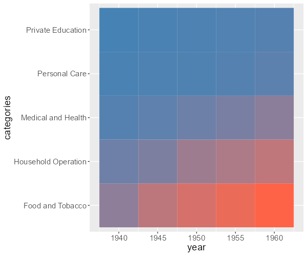
You can specify a theme and hide elements that appear in the background, but it is not critical. For a better-looking heatmap, I will remove the padding between heatmap tiles and the axis, axis ticks, and titles. To better distinguish the geom_tile elements, you can add borders for each of them.
ggplot(ue, aes(x = year, y = categories, fill = expenditures)) +
  geom_tile(colour = "white", linewidth = 1) +
  scale_fill_gradient(low = "steelblue",
                      high = "tomato",
                      guide = "none") +
  scale_x_continuous(expand = c(0, 0)) +
  scale_y_discrete(expand = c(0, 0)) +
  theme(text = element_text(size = 15)
    ,axis.title = element_blank()
    ,axis.ticks = element_blank())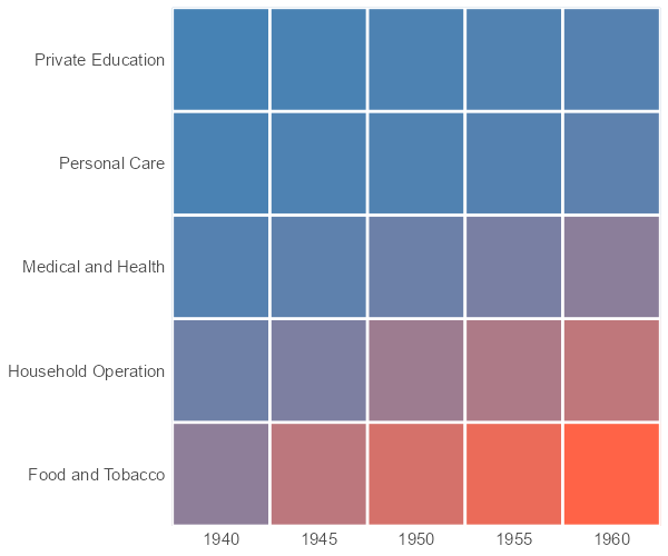
ggplot2 heatmap with data labels
If you want to add the value of each tile to the ggplot2 heatmap, here is how to do that. You can round numbers to reduce decimal spaces and use this technique to keep trailing zeros.
My favorite is the function digits from the formattable because data is not changing numeric properties.
ue$expenditures <- formattable::digits(ue$expenditures, digits = 2)
Don’t worry about the result of rounding. The function digits do the same as the round function in R.
round(1.799, digits = 2)

#[1] 1.8

formattable::digits(1.799, digits = 2)

#[1] 1.80
Another good thing to do is split lengthy text. In this case, I’m replacing the first whitespace with the new line character.
ue$categories <- sub(" ", "\n", ue$categories)Here is how it looks in the R heatmap with values.
ggplot(ue, aes(x = year, y = categories, fill = expenditures)) +
  geom_tile(colour = "white", linewidth = 1) +
  geom_text(aes(label = expenditures), color = "white", size = 5) +
  scale_fill_gradient(low = "steelblue",
                      high = "tomato",
                      guide = "none") +
  scale_x_continuous(expand = c(0, 0)) +
  scale_y_discrete(expand = c(0, 0)) +
  theme(text = element_text(size = 15)
        , axis.title = element_blank()
        , axis.ticks = element_blank()
        , axis.text.y = element_text(hjust = 0))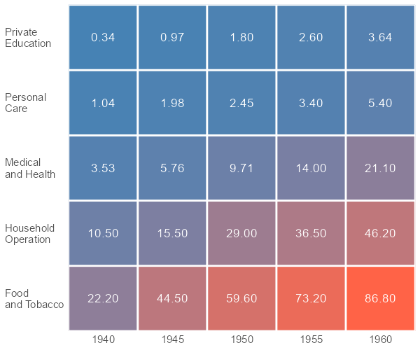
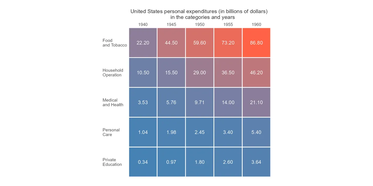
Reorder ggplot2 heatmap
Here is how to reorder the ggplot2 heatmap by using the function reorder. By default, this function uses the mean value for order, but you can try different calculations in the FUN argument. To use a different ordering principle in the function reorder, use a minus sign before the second argument.
In addition, I moved the ggplot2 axis tick labels on top of the heatmap.
ggplot(ue, aes(
  x = year,
  y = reorder(categories, expenditures),
  fill = expenditures
)) +
  geom_tile(colour = "white", linewidth = 1) +
  geom_text(aes(label = expenditures), color = "white", size = 5) +
  scale_fill_gradient(low = "steelblue",
                      high = "tomato",
                      guide = "none") +
  scale_x_continuous(expand = c(0, 0), position = "top") +
  scale_y_discrete(expand = c(0, 0)) +
  labs(
    title = "United States personal expenditures (in billions of dollars)
    in the categories and years") +
  theme(text = element_text(size = 15)
        , axis.title = element_blank()
        , axis.ticks = element_blank()
        , axis.text.y = element_text(hjust = 0)
        , plot.title = element_text(size = 15, color = "grey20", hjust = 0.5))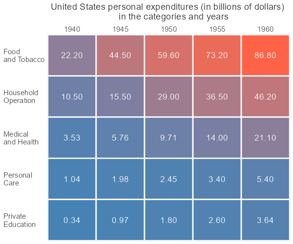
Dealing with NA values in the ggplot2 heatmap
I will create a missing value in the previously used data frame.
ue[25, 3] <- NA

tail(ue)

#             categories year expenditures
# 20   Private\nEducation 1955          2.6
# 21    Food\nand Tobacco 1960         86.8
# 22 Household\nOperation 1960         46.2
# 23  Medical\nand Health 1960         21.1
# 24       Personal\nCare 1960          5.4
# 25   Private\nEducation 1960           NA
Here is how it can lead to problems if I’m creating a heatmap with the previous code.
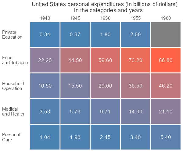
There is nothing that you can do in geom_tile with missing values. You can solve this problem by using the additional argument in the function reorder for the missing values and the same kind of arguments in the geom_text and the scale_fill_gradient.
ggplot(ue, aes(
  x = year,
  y = reorder(categories, expenditures, FUN = mean, na.rm = TRUE),
  fill = expenditures
)) +
  geom_tile(colour = "white", linewidth = 1) +
  geom_text(aes(label = expenditures), color = "white", size = 5,  na.rm = TRUE) +
  scale_fill_gradient(
    low = "steelblue",
    high = "tomato",
    guide = "none",
    na.value = "gray80") +
  scale_x_continuous(expand = c(0, 0), position = "top") +
  scale_y_discrete(expand = c(0, 0)) +
  labs(
    title = "United States personal expenditures (in billions of dollars)
    in the categories and years") +
  theme(text = element_text(size = 15)
        , axis.title = element_blank()
        , axis.ticks = element_blank()
        , axis.text.y = element_text(hjust = 0)
        , plot.title = element_text(size = 15, color = "grey20", hjust = 0.5))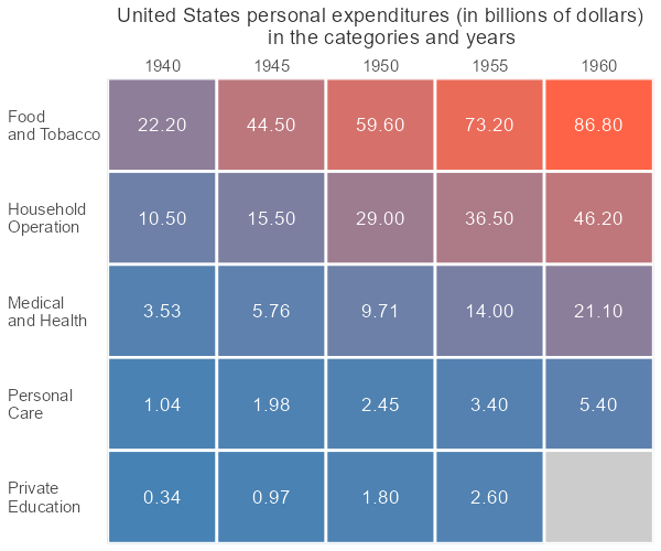
Please look at other visualizations in this blog made using R. For example, gradient line chart, glowing line chart, and gradient word cloud.
If you want to see more examples of how to implement color gradients in ggplot2, look at this post about color gradients in the jitter plot or gradient line chart.
Leave a Reply