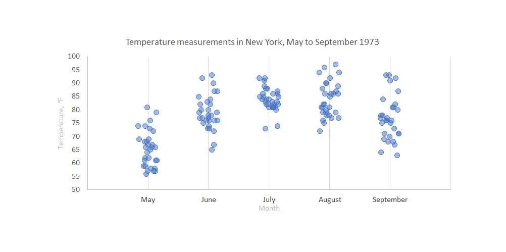
Here are 3 ways to create a jitter plot in R, also called a strip chart or a dot plot which is a one-dimensional scatter plot. A jitter plot in R makes it easier to view overlapping data points by categorical or discrete values.
In that scenario, the scatter plot groups all data points in one line above the category, but the jitter plot creates additional dispersion. In other words, this variation of scatter plot displays numerical data along a single strip and jitter to avoid substantial overlap.
Jitter plot in R using ggplot2
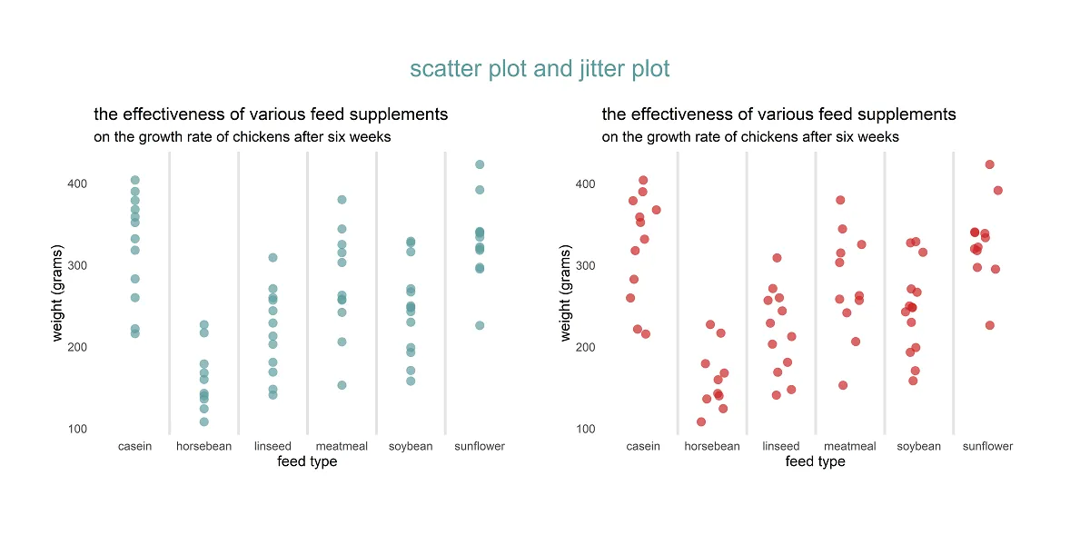
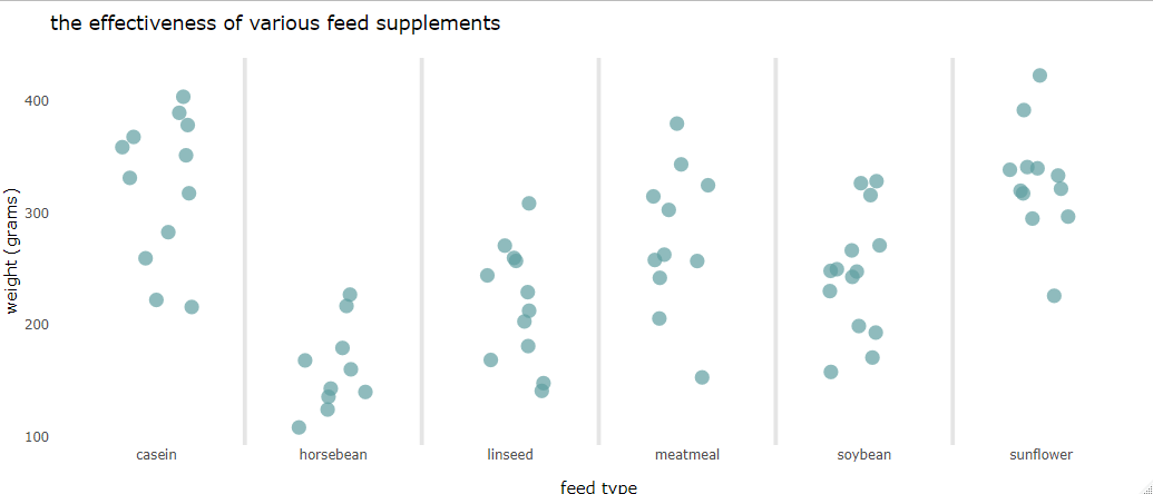
Here is a scatter plot that you can make with the geom_point.
require(ggplot2)

ggplot(chickwts, aes(x = feed, y = weight)) +
  geom_point(
    size = 3,
    alpha = 0.7,
    shape = 16,
    color = "cadetblue") +
  geom_vline(
    xintercept = seq(1.5, length(unique(chickwts$feed)), by = 1),
    color = "gray90",
    size = 1) +
  labs(
    title = "the effectiveness of various feed supplements",
    subtitle = "on the growth rate of chickens after six weeks",
    x = "feed type",
    y = "weight (grams)") +
  theme_minimal() +
  theme(panel.grid = element_blank())
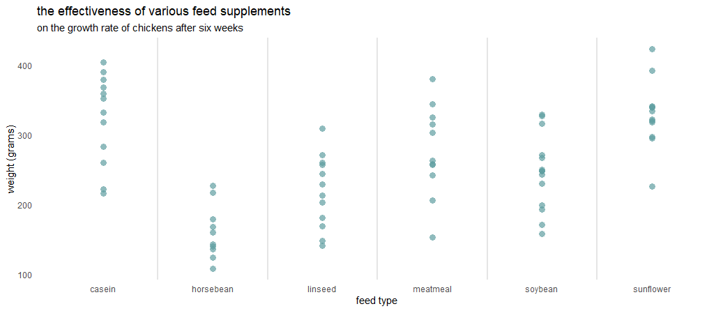

There are no default gridlines, and here is more about them. In this case, there are vertical lines between ggplot2 axis categories. All data points are above the category, and they overlap. It might be hard to evaluate data in general.
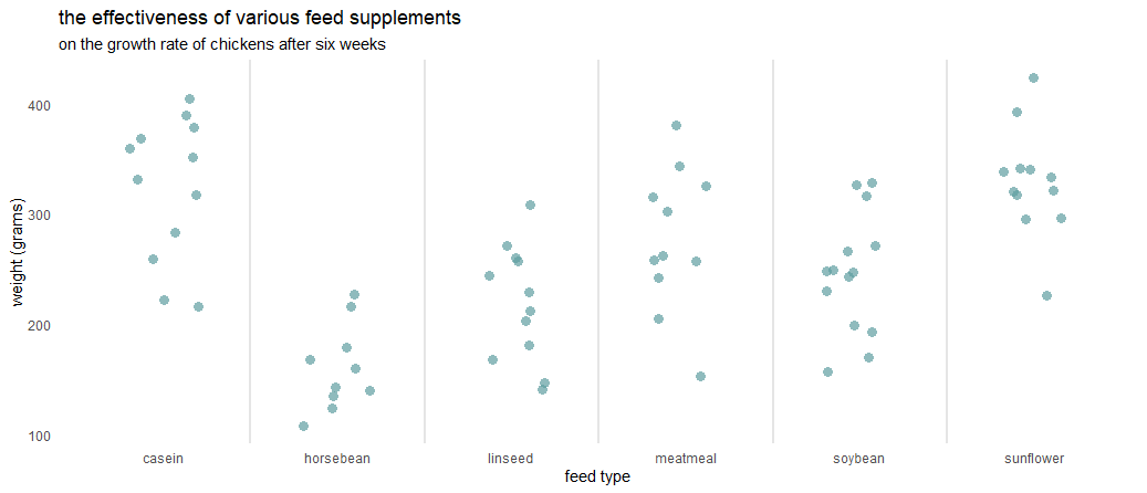
By using the geom_jitter, you can create a jitter plot in ggplot2, and the difference in the result is noticeable.
set.seed(123)

ggplot(chickwts, aes(x = feed, y = weight)) +
  geom_jitter(
    size = 3,
    alpha = 0.7,
    shape = 16,
    width = 0.2,
    color = "cadetblue") +
  geom_vline(
    xintercept = seq(1.5, length(unique(chickwts$feed)), by = 1),
    color = "gray90",
    size = 1) +
  labs(
    title = "the effectiveness of various feed supplements",
    subtitle = "on the growth rate of chickens after six weeks",
    x = "feed type",
    y = "weight (grams)") +
  theme_minimal() +
  theme(panel.grid = element_blank())
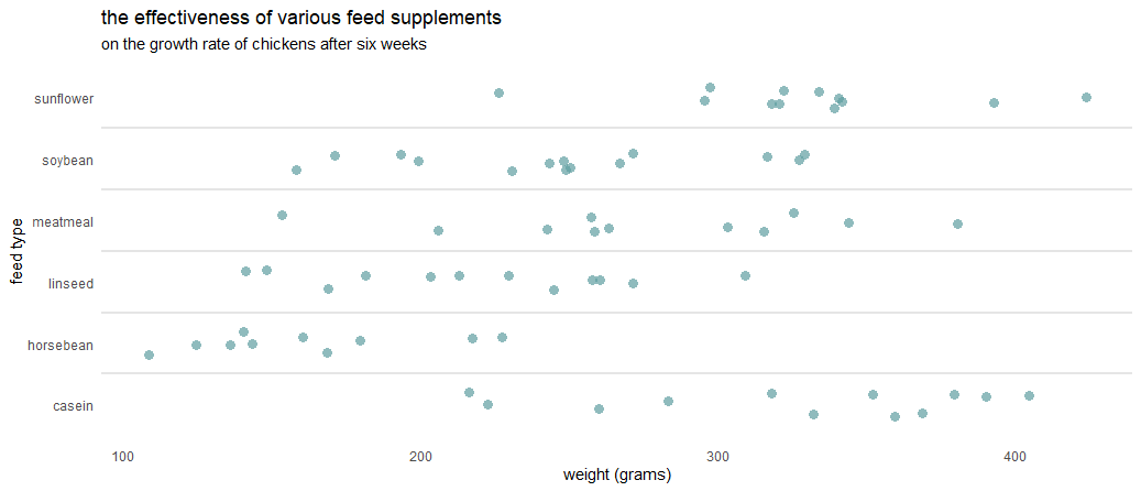
Horizontal jitter with ggplot2
If you want to rotate the ggplot2 plot, you can do that like in this post by using the coord_flip.
set.seed(123)

ggplot(chickwts, aes(x = feed, y = weight)) +
  geom_jitter(
    size = 3,
    alpha = 0.7,
    shape = 16,
    width = 0.2,
    color = "cadetblue") +
  geom_vline(
    xintercept = seq(1.5, length(unique(chickwts$feed)), by = 1),
    color = "gray90",
    size = 1) +
  labs(
    title = "the effectiveness of various feed supplements",
    subtitle = "on the growth rate of chickens after six weeks",
    x = "feed type",
    y = "weight (grams)") +
  coord_flip()+
  theme_minimal() +
  theme(panel.grid = element_blank())
Jitter plot in plotly
You might be interested to get an interactive jitter plot. If you have the jitter plot in ggplot2, the easiest way is to translate that into plotly. Here is how to do that, but there is a problem with the subtitle.
require(plotly)

set.seed(123)

ggplotly(
  ggplot(chickwts, aes(x = feed, y = weight)) +
    geom_jitter(
      size = 3,
      alpha = 0.7,
      shape = 16,
      width = 0.2,
      color = "cadetblue") +
    geom_vline(
      xintercept = seq(1.5, length(unique(chickwts$feed)), by = 1),
      color = "gray90",
      size = 1) +
    labs(
      title = "the effectiveness of various feed supplements",
      subtitle = "on the growth rate of chickens after six weeks",
      x = "feed type",
      y = "weight (grams)") +
    theme_minimal() +
    theme(panel.grid = element_blank())
)

As I mentioned, there is a problem with the R plotly subtitles after using the ggplotly function. Here is a post with the solution to fix that.
require(dplyr)

ggplotly(

  ggplot(chickwts, aes(x = feed, y = weight)) +
    geom_jitter(
      size = 3,
      alpha = 0.7,
      shape = 16,
      width = 0.2,
      color = "cadetblue") +
    geom_vline(
      xintercept = seq(1.5, length(unique(chickwts$feed)), by = 1),
      color = "gray90",
      size = 1) +
    labs(
      title = "the effectiveness of various feed supplements",
      subtitle = "on the growth rate of chickens after six weeks",
      x = "feed type",
      y = "weight (grams)") +
    theme_minimal() +
    theme(panel.grid = element_blank())

) %>%
layout(title = list(text = paste0('the effectiveness of various feed supplements',
'<br>',
'<sup>',
'on the growth rate of chickens after six weeks',
'</sup>')))
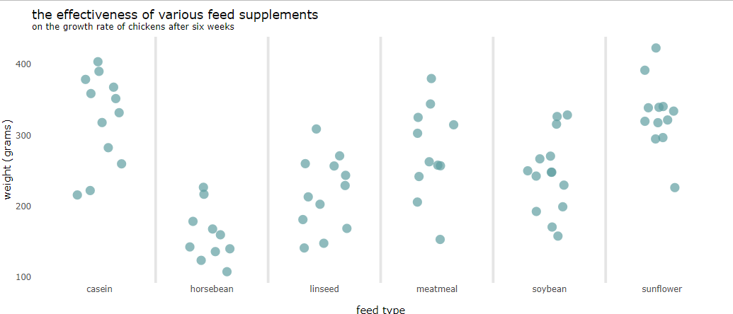
Jitter plot in base R
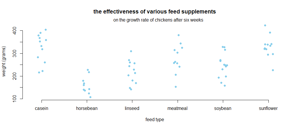
It is worth respecting the functionality of base R. Despite the improvements of multiple packages, some of the base functionality is better. Here is a jitter plot in base R that looks pretty enough. The tricky part is to add a subtitle in the base R plot.
set.seed(123)

stripchart(
  chickwts$weight ~ chickwts$feed,
  vertical = TRUE,
  pch = 20,
  cex = 1.5,
  col = "sky blue",
  method = "jitter",
  frame.plot = FALSE,
  ylab = "weight (grams)",
  xlab = "feed type",
  main = "the effectiveness of various feed supplements"
)

subtitle <- "on the growth rate of chickens after six weeks"
mtext(at = 1, adj = -0.8, subtitle)
Jitter chart in Excel
Sometimes it is necessary to do something similar in Excel. It is not as easy as it is in R, but doable. Here are two posts that will help you.