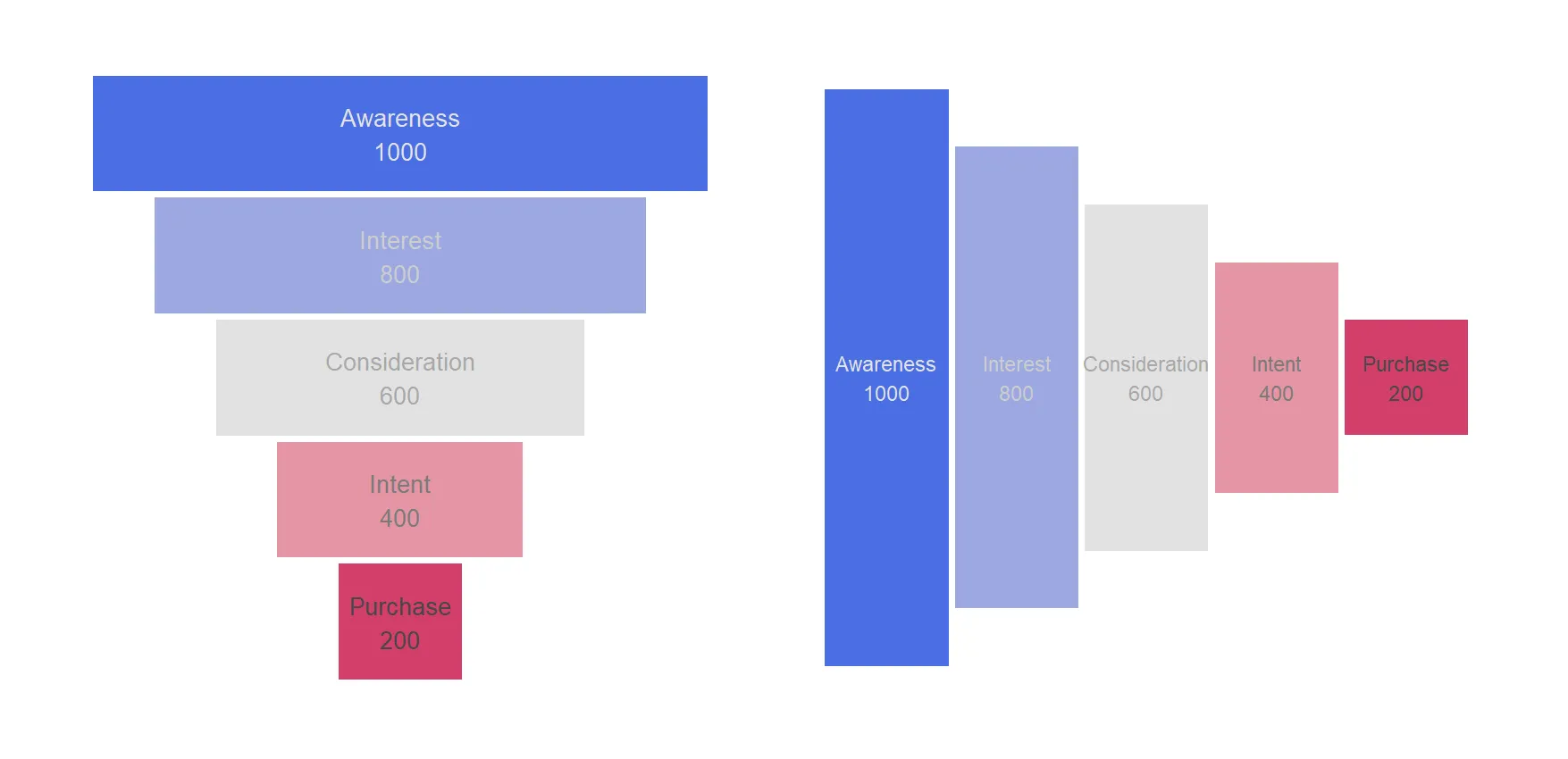
How to create a funnel chart in R using ggplot2
Here is the step-by-step process of creating a funnel chart in R with its versatile ggplot2 package. That allows us to craft visually appealing and informative funnel charts that can help you uncover insights, identify bottlenecks, and communicate the story of your data-driven processes. A funnel chart is a visualization tool that is particularly useful…
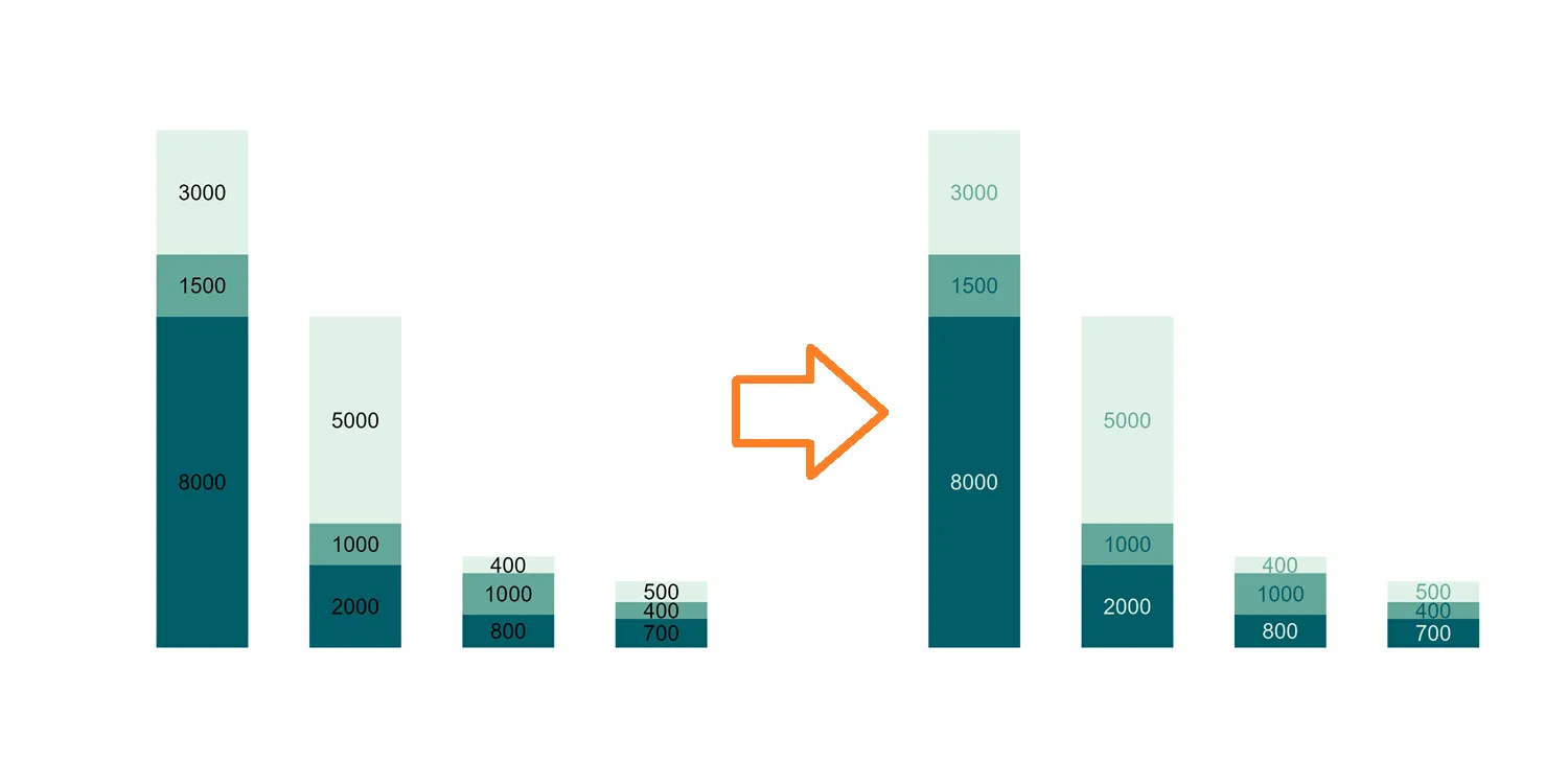
Diversify R ggplot2 stacked column chart data label colors
One of the captivating features of ggplot2 is its ability to seamlessly merge data and design, creating visually impactful charts and graphs. While a uniform color scheme for data labels in ggplot2 stacked column charts might fall short, this post unveils a technique that not only introduces sophistication to your visualizations but also amplifies data…
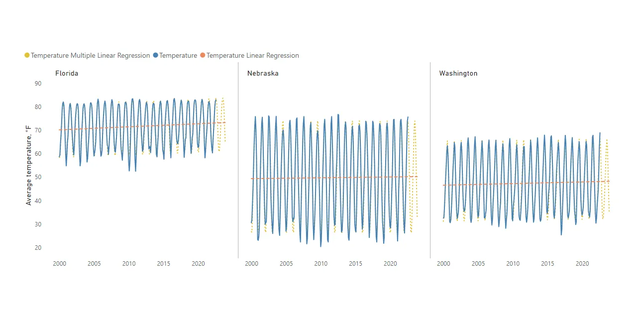
Time series forecasting in Power BI using DAX function LINESTX
DAX function LINESTX is very useful for time series forecasting in Power BI. You can get forecasting results for multiple time series at the same time. It works similarly to the Excel function LINEST. If you are familiar with that, LINESTX might be easy to understand. LINESTX is useful for creating forecasts using linear or…
Bar chart race in R using ggplot2 and gganimate
Here is a relatively simple way to create a bar chart race in R – bar chart with bars overtaking each other. An attractive data visualization to engage your auditory while showing how the situation unfolds. Using the ggplot2 and gganimate, you can create a bar chart race in R and adjust the dynamics of…
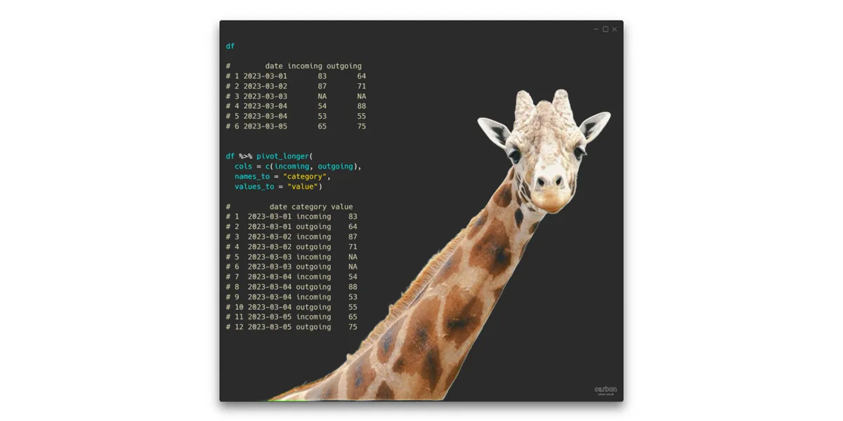
Unpivot data in R with the pivot_longer from tidyr
Here are multiple examples with the pivot_longer from tidyr, which is an excellent choice if you want to unpivot data in R and transform the data frame from wide to long.
in
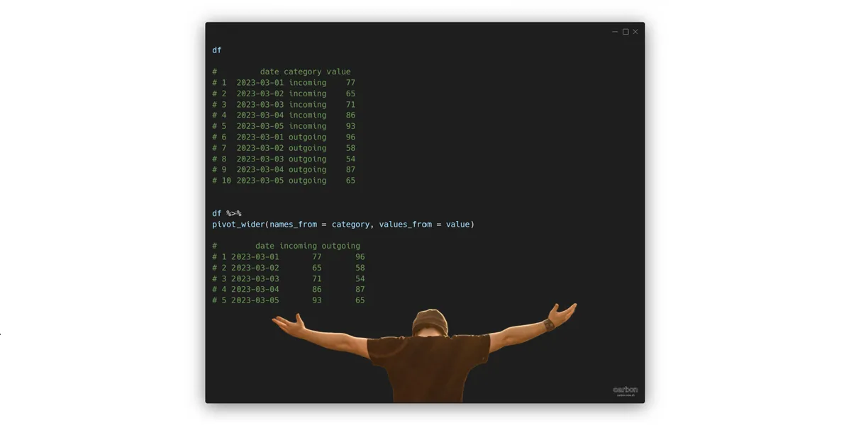
Pivot data in R, like in Excel PivotTable, from long to wide
Here is how to pivot data in R from long to wide format and increase the number of columns. This transformation might be familiar to Microsoft Excel users because of the PivoTable tool. It might not be the most commonly used data transformation, but sometimes necessary to show data in a small table or transform…
in

How to generate random dates or numbers in R
Here is how to generate random dates or numbers in R by using base functions. There are similarities in both of the tasks, and they are useful in creating reproducible examples.
in
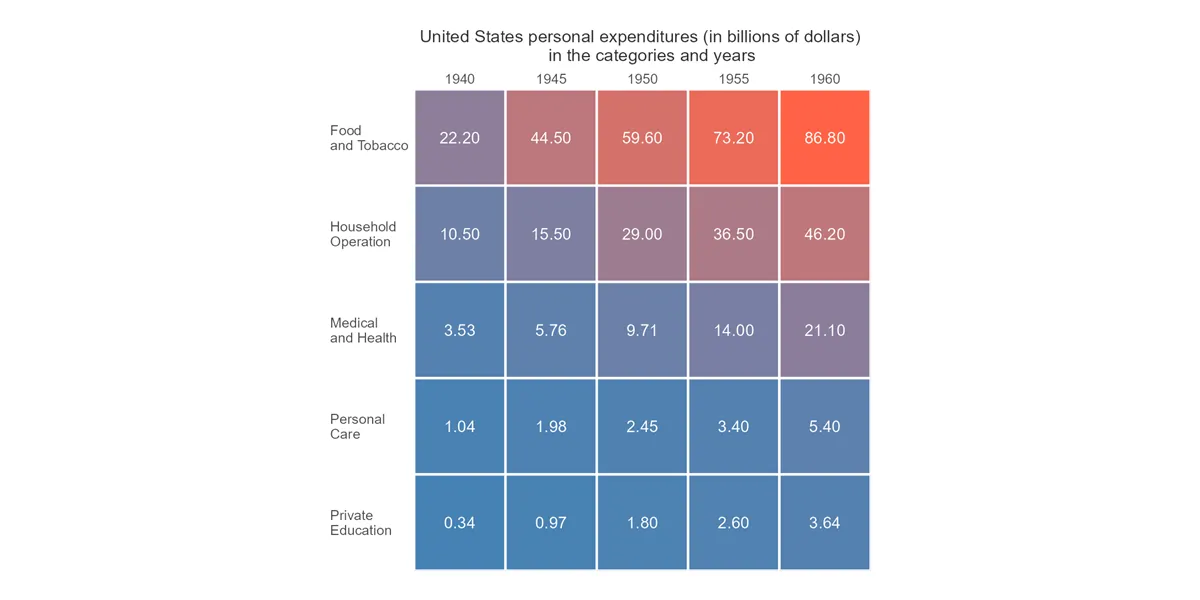
How to create a simple heatmap in R ggplot2
Here is how to quickly build a heatmap in R ggplot2 and add extra formatting by using a color gradient, data labels, reordering, or custom grid lines. There might be a problem if the data contains missing values. At the end of this post is an example of how to deal with NA values in…
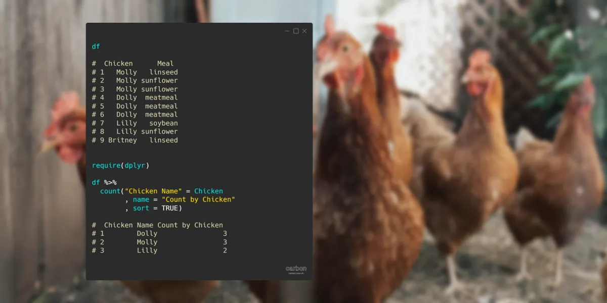
Count by group in R using base, dplyr, and data.table
Here are multiple examples of how to count by group in R using base, dplyr, and data table capabilities. Dplyr might be the first choice to count by the group because it is relatively easy to adjust to specific needs. Meanwhile data.table is good for speed, and base R sometimes is good enough.
in
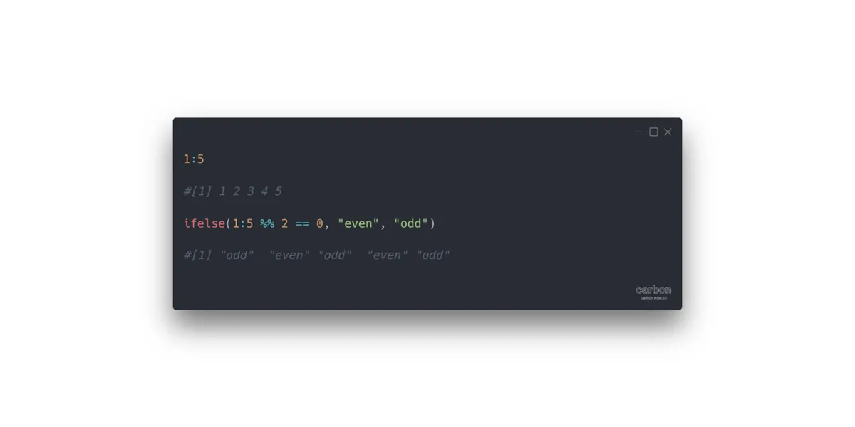
How to determine if the number is even or odd in R
You can tell if the number is even or odd in R programming by looking at the reminder after the number is divided by 2. If the remainder equals 0, it is an even number, otherwise, it is an odd number. There is a nifty way to get the reminder after division in R by…
in