Here is a relatively simple way to create a bar chart race in R – bar chart with bars overtaking each other. An attractive data visualization to engage your auditory while showing how the situation unfolds. Using the ggplot2 and gganimate, you can create a bar chart race in R and adjust the dynamics of the animation.
Data preparation for the bar chart race
Here is my randomly generated data set.
mydates <- seq(as.Date("2023-03-01"), as.Date("2023-03-31"), by = "day")

set.seed(12345)

df <-
  rbind(
    data.frame(
      "date" = mydates,
      "person" = "Alfa",
      "value" = sample(10:100, 31, replace = TRUE)),
    data.frame(
      "date" = mydates,
      "person" = "Bravo",
      "value" = sample(10:100, 31, replace = TRUE)),
    data.frame(
      "date" = mydates,
      "person" = "Charlie",
      "value" = sample(10:100, 31, replace = TRUE)),
    data.frame(
      "date" = mydates,
      "person" = "Delta",
      "value" = sample(10:100, 31, replace = TRUE)),
    data.frame(
      "date" = mydates,
      "person" = "Echo",
      "value" = sample(10:100, 31, replace = TRUE)))

require(dplyr)

df %>%
  arrange(date, person) %>%
  head() %>% print.data.frame()

#        date  person value cumulative_value
# 1 2023-03-01    Alfa    23               23
# 2 2023-03-01   Bravo    89               89
# 3 2023-03-01 Charlie    35               35
# 4 2023-03-01   Delta    12               12
# 5 2023-03-01    Echo    60               60
# 6 2023-03-02    Alfa    60               83
The next step is a calculation of a cumulative value. That will help to evaluate the position of each bar. Here is more about the cumulative sum or count calculation in R.
df <- df %>%
  group_by(person) %>%
  mutate("cumulative_value" = round(cumsum(value), digits = 0))


df %>%
  arrange(date, person) %>%
  head() %>% print.data.frame()

#        date  person value cumulative_value
# 1 2023-03-01    Alfa    23               23
# 2 2023-03-01   Bravo    89               89
# 3 2023-03-01 Charlie    35               35
# 4 2023-03-01   Delta    12               12
# 5 2023-03-01    Echo    60               60
# 6 2023-03-02    Alfa    60               83
Secondly, it is necessary to determine the position of each bar in each animation state. By using the rank function in R. In this case, it is necessary to ensure that ranks are not the same even if values are.
df <- df %>%
  group_by(date) %>%
  mutate("order" = rank(cumulative_value, ties.method = "first")) %>%
  arrange(date)
Here is how the result looks for a date where the cumulative sum values are the same.
df %>% filter(date == "2023-03-05") %>% print.data.frame()

#        date  person value cumulative_value order
# 1 2023-03-05    Alfa    33              304     4
# 2 2023-03-05   Bravo    34              304     5
# 3 2023-03-05 Charlie    55              194     1
# 4 2023-03-05   Delta    16              216     2
# 5 2023-03-05    Echo    72              298     3
Bar chart race in R
The next step is looking at the ggplot2 plots in different animation stages and getting down the best formatting. Here is how it will look at the last animation stage. It is important to remember that visualization will change dynamically. That is why important information like various data labels should not be scattered. I prefer that the bar data label and category label are together. There are only vertical ggplot2 gridlines.
require(ggplot2)

df %>% filter(date == "2023-03-31") %>%
  ggplot(aes(x = order, y = cumulative_value, fill = person)) +
  geom_col(alpha = 0.7) +
  scale_y_continuous(expand = expansion(mult = c(0, 0.2))) +
  geom_text(aes(y = cumulative_value
                , label = paste(person, round(cumulative_value), sep = "\n")
                , color = person)
                , hjust = - 0.2, size = 8) +
  labs(title='Bar chart race', x = "", y = "") +
  coord_flip() +
  theme_minimal() +
  theme(axis.text.y = element_blank()
        , axis.ticks.y = element_blank()
        , axis.text.x = element_text(size = 15, color = "grey")
        , plot.margin = margin(2, 2, 2, 2, "cm")
        , plot.title = element_text(size = 22, hjust = 0.5
                                    , color = "grey", face = "bold")
        , legend.position = "none"
        , panel.grid.minor.y = element_blank()
        , panel.grid.major.y = element_blank())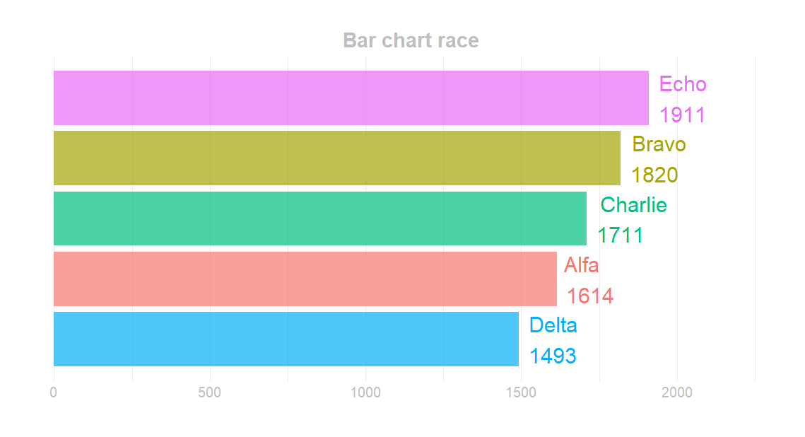
I modified the scale of the ggplot2 y-axis to expand dynamically, and there is enough space for data labels.
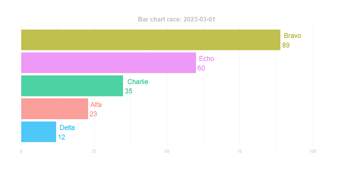
Bar chart race with the gganimate
Now you can create bar chart race animation using the gganimate. There are function transition_states and helpful variables that you can use. For example, if you show a bar chart race using the date period, you can add a date to the title for the animation stage using the closest_state.
require(gganimate)

p <- df %>%
  ggplot(aes(x = order, y = cumulative_value, fill = person)) +
  geom_col(alpha = 0.7) +
  scale_y_continuous(expand = expansion(mult = c(0, 0.2))) +
  geom_text(aes(y = cumulative_value
                , label = paste(person, round(cumulative_value), sep = "\n")
                , color = person)
                , hjust = - 0.2, size = 8) +
  labs(title = 'Bar chart race: {closest_state}', x = "", y = "") +
  coord_flip() +
  theme_minimal() +
  theme(axis.text.y = element_blank()
        , axis.ticks.y = element_blank()
        , axis.text.x = element_text(size = 15, color = "grey")
        , plot.margin = margin(2, 2, 2, 2, "cm")
        , plot.title = element_text(size = 22, hjust = 0.5
                                    , color = "grey", face = "bold")
        , legend.position = "none"
        , panel.grid.minor.y = element_blank()
        , panel.grid.major.y = element_blank()) +
  transition_states(date, state_length = 0, wrap = FALSE)
After testing, if the animation works properly, you can use the function animate to create the final result. You can specify the dimensions and other arguments. Don’t worry if, in the previous step, the animation doesn’t look perfect. After running the function animate, you can evaluate the result. You can configure the final experience and make the gganimate animation smoother or slower, with a pause at the beginning or the end or without a loop.
animate(
  p,
  fps = 8,
  start_pause = 25,
  end_pause = 35,
  duration = 25,
  width = 1200,
  height = 600,
  renderer = gifski_renderer("C:\\Users\\dc\\Downloads\\bar_race.gif")
)
The wrap argument in transition_states was necessary for me to create animation with a pause at the beginning and end.

You can add the view_follow if you want to create a bar chart race with changing axis.
p <- p + view_follow(fixed_x = FALSE)

animate(
  p,
  fps = 8,
  start_pause = 25,
  end_pause = 35,
  duration = 25,
  width = 1200,
  height = 600,
  renderer = gifski_renderer("C:\\Users\\dc\\Downloads\\bar_race.gif")
)
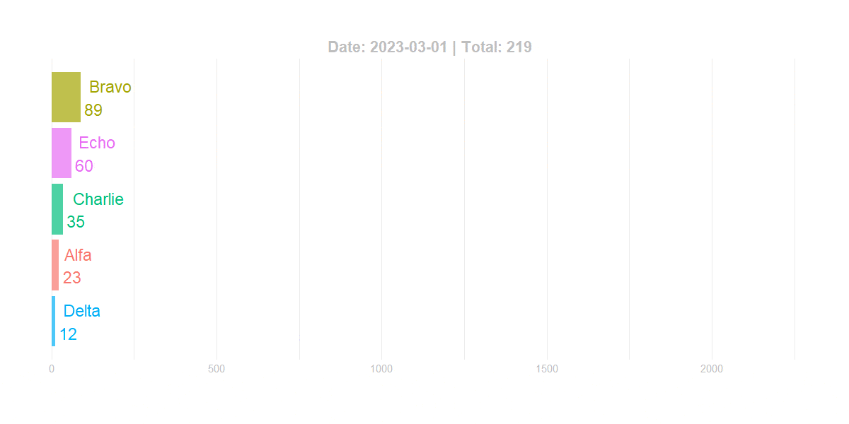
An additional variable in the gganimate animation title
If you want to show the sum of all bars in the bar chart race for the animation state, here is how you can do that. Firstly create the necessary measure in the data frame.
df <- df %>%
  group_by(date) %>%
  mutate("daily_sum" = sum(cumulative_value))

head(df) %>% print.data.frame()

#        date  person value cumulative_value order daily_sum
# 1 2023-03-01    Alfa    23               23     2       219
# 2 2023-03-01   Bravo    89               89     5       219
# 3 2023-03-01 Charlie    35               35     3       219
# 4 2023-03-01   Delta    12               12     1       219
# 5 2023-03-01    Echo    60               60     4       219
# 6 2023-03-02    Alfa    60               83     2       521
Secondly, try to pull the first record for each animation state.
df %>%
  filter(date == "2023-03-01") %>%
  first() %>%
  pull(daily_sum)

#[1] 219
Here is how to integrate a new variable in the gganimate title.
p <- df %>%
  ggplot(aes(x = order, y = cumulative_value, fill = person)) +
  geom_col(alpha = 0.7) +
  scale_y_continuous(expand = expansion(mult = c(0, 0.2))) +
  geom_text(aes(y = cumulative_value
                , label = paste(person, round(cumulative_value), sep = "\n")
                , color = person)
            , hjust = - 0.2, size = 8) +
  labs(title = 'Date: {closest_state} | Total: {df %>% filter(date == closest_state) %>% first() %>% pull(daily_sum)}',
       x = "", y = "") +
  coord_flip() +
  theme_minimal() +
  theme(axis.text.y = element_blank()
        , axis.ticks.y = element_blank()
        , axis.text.x = element_text(size = 15, color = "grey")
        , plot.margin = margin(2, 2, 2, 2, "cm")
        , plot.title = element_text(size = 22, hjust = 0.5
                                    , color = "grey", face = "bold")
        , legend.position = "none"
        , panel.grid.minor.y = element_blank()
        , panel.grid.major.y = element_blank()) +
  transition_states(date, state_length = 0, wrap = FALSE)


animate(
  p,
  fps = 8,
  start_pause = 25,
  end_pause = 35,
  duration = 25,
  width = 1200,
  height = 600,
  renderer = gifski_renderer("C:\\Users\\dc\\Downloads\\bar_race.gif")
)
Format the gganimate closest_state
If you like to show the date differently, you can change that in the data frame like this. For example, European date format.
df$date <- format(df$date, format = "%d.%m.%Y")
It will change the date formatting to the character. The rest of the script stays the same as in the previous step, and here is how it looks in the final result.

Reduce GIF file size in R
Unfortunately, smooth and high-quality animation can create a large file size. In my situation, I reduced file size by 30% using this online gif optimizer.
You can try to reduce file size with R package magick, like in this post.
If you like animated charts, look at another example of how to add GIF animation to ggplot2.
Leave a Reply