Here is the step-by-step process of creating a funnel chart in R with its versatile ggplot2 package. That allows us to craft visually appealing and informative funnel charts that can help you uncover insights, identify bottlenecks, and communicate the story of your data-driven processes. A funnel chart is a visualization tool that is particularly useful for representing a process or series of stages where data progressively narrows down, with each stage leading to a conversion or an outcome. Funnel charts are commonly used in sales, marketing, and other business contexts.
Vertical funnel chart in R using ggplot2
You can create a funnel chart in R in many ways, and this version is similar to the one available in Excel.
Here is my dataset with the necessary order for categorical values. It is important for the correct order in visualization.
funnel_data <- data.frame(
  Stage = c("Awareness", "Interest", "Consideration", "Intent", "Purchase"),
  Count = c(1000, 800, 600, 400, 200)
)

funnel_data$Stage <-
  reorder(funnel_data$Stage, funnel_data$Count, decreasing = FALSE)
The idea behind the centered funnel plot in ggplot2 is two separate bar plots. Information on the x-axis is practically useless.
require(ggplot2)

p1 <- ggplot(funnel_data, aes(x = Count, y = Stage, fill = Stage)) +
  geom_col(aes(x =  -Count), width = 0.95) +
  labs(x = "", y = "") +
  theme_minimal() +
  theme(panel.grid = element_blank()
        , text = element_text(size = 20)
        , legend.position = "none")


p2 <- ggplot(funnel_data, aes(x = Count, y = Stage, fill = Stage)) +
  geom_col(aes(x =  Count), width = 0.95) +
  labs(x = "", y = "") +
  theme_minimal() +
  theme(panel.grid = element_blank()
        , text = element_text(size = 20)
        , legend.position = "none")


require(patchwork)

p1 + p2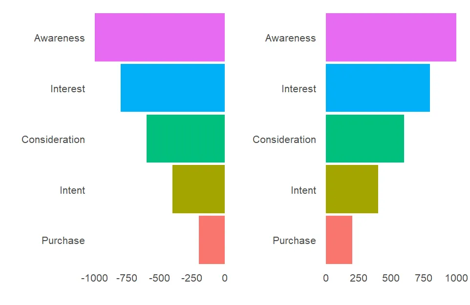
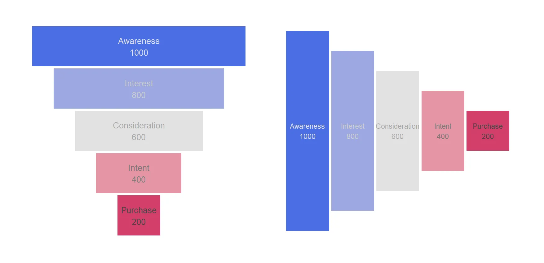
After putting it together and using the colorspace package to diversify colors, the result looks like this.
require(ggplot2)
require(colorspace)

ggplot(funnel_data, aes(x = Count, y = Stage, fill = Stage)) +
  geom_col(aes(x =  Count), width = 0.95) +
  geom_col(aes(x = - Count), width = 0.95) +
  geom_text(aes(x = 0, label = Count, color = Stage), hjust = 0.5, size = 7) +
  scale_fill_discrete_diverging(palette = "Blue-Red 2", nmax = 5, rev = TRUE) +
  scale_color_discrete_sequential(palette = "Light Grays", nmax = 5, rev = FALSE) +
  labs(x = "", y = "") +
  theme_minimal() +
  theme(panel.grid = element_blank()
        , axis.text.x = element_blank()
        , axis.text.y = element_text(size = 20, hjust = 0)
        , legend.position = "none")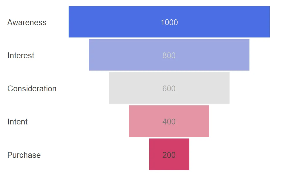
Here is another version of funnel chart in R, but with different data labels. Check out another blog post on how to add them in different locations.
ggplot(funnel_data, aes(x = Count, y = Stage, fill = Stage)) +
  geom_col(aes(x =  Count), width = 0.95) +
  geom_col(aes(x = - Count), width = 0.95) +
  geom_text(aes(x = 0, label = paste(Stage, Count, sep = "\n"), color = Stage),
            hjust = 0.5, size = 7) +
  scale_fill_discrete_diverging(palette = "Blue-Red 2", nmax = 5, rev = TRUE) +
  scale_color_discrete_sequential(palette = "Light Grays", nmax = 5, rev = FALSE) +
  labs(x = "", y = "") +
  theme_minimal() +
  theme(panel.grid = element_blank()
        , axis.text.x = element_blank()
        , axis.text.y = element_blank()
        , legend.position = "none")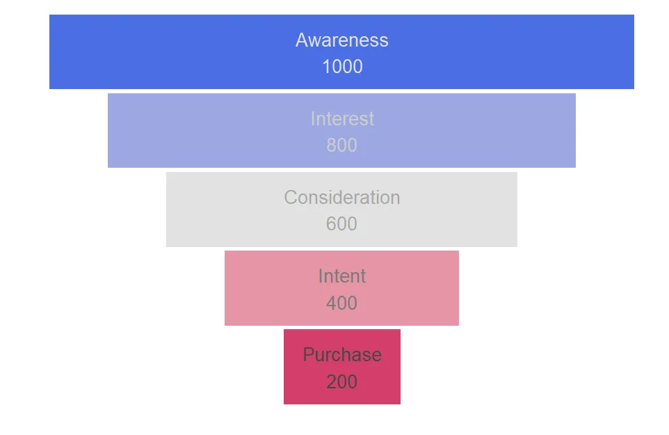
Horizontal funnel chart in R using ggplot2
With the help of the coord_flip and a few other adjustments, you can get a ggplot2 funnel plot that is oriented horizontally.
funnel_data$Stage <-
  reorder(funnel_data$Stage, funnel_data$Count, decreasing = TRUE)

ggplot(funnel_data, aes(x = Count, y = Stage, fill = Stage)) +
  geom_col(aes(x =  Count), width = 0.95) +
  geom_col(aes(x = - Count), width = 0.95) +
  geom_text(aes(x = 0, label = paste(Stage, Count, sep = "\n"), color = Stage),
            hjust = 0.5, size = 6) +
  scale_fill_discrete_diverging(palette = "Blue-Red 2", nmax = 5, rev = FALSE) +
  scale_color_discrete_sequential(palette = "Light Grays", nmax = 5, rev = TRUE) +
  labs(x = "", y = "") +
  coord_flip() +
  theme_minimal() +
  theme(panel.grid = element_blank()
        , axis.text.x = element_blank()
        , axis.text.y = element_blank()
        , legend.position = "none")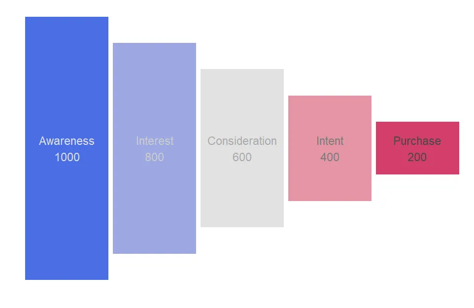
Other funnel plot options
Alternatives are not so many. A funnel chart is not the most popular chart type that is useful on a daily basis. Funnel charts are typically used to represent a sales or marketing funnel, where the stages represent different steps in a sales or conversion process. Other good options might be packages Plotly or FunnelPlotR. Interactivity is a big plus to the Plotly, and you can find other examples in this blog by using search.
Leave a Reply