Here is how to create an Excel chart axis conditional formatting for necessary values using format code. It is relatively easy to do for the vertical axis, but it is also possible for the horizontal axis.
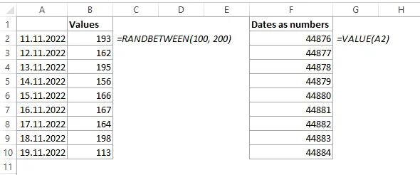
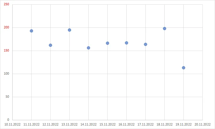
Here is my data for a few dates that I generated with the Excel function RANDBETWEEN. There is also a numerical representation for dates that is useful to define the condition for formatting if you have dates on the axis. You can get that by using the function VALUE or by using the number format for dates.

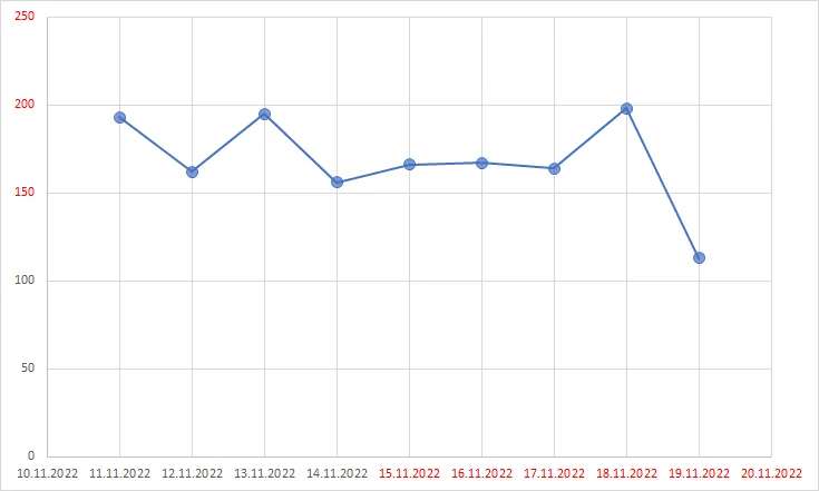
In this post, I will be mainly using a scatter chart.
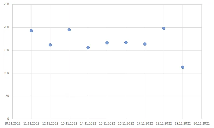

A scatter chart is a very versatile chart type, and by using that, you can create a magick quadrant chart or jitter chart in Excel.
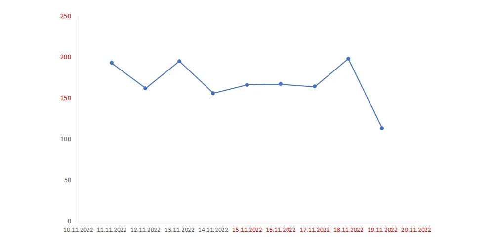
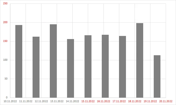
Excel chart Y-axis conditional formatting
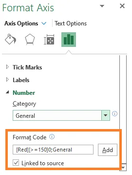
You should create the necessary format code to apply conditional formatting for the Excel chart axis.
Double-click on the axis values to open the formatting pane. After that, create the necessary condition in the number section and push the Add button.
[Red][>=150]0;General

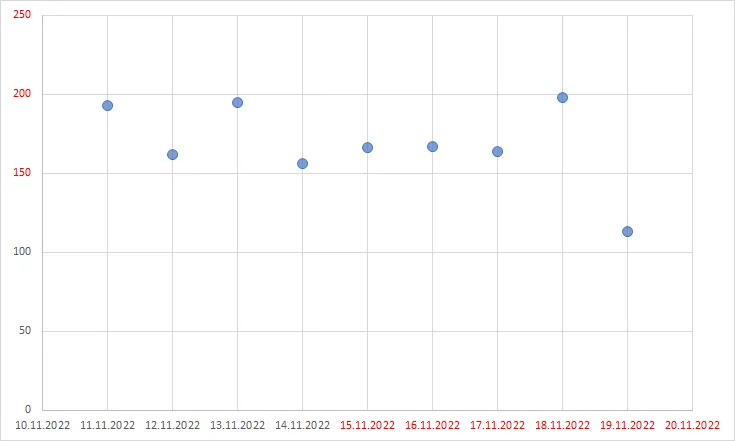
Here is the result.
You can learn more about conditions with format code in this post by Microsoft.
Excel chart X-axis conditional formatting
For the scatter chart, it is easy to use format code for the X axis. By using the numerical representation of dates, you can use that to create the necessary condition, for example, like this. It is also important to define the date format with the format code.
[Red][>=44880]dd.mm.yyyy;dd.mm.yyyy
Use different Excel chart types
While previously I was using only scatter charts, it is possible to get the same formatting with different chart types.
The trick is to create a combo chart. For example, if you want to create a column chart, add the same time series twice to the same scatter chart, change the chart type to combo, check in the box that the second series will be using a secondary axis and the first data series keep as scatter plot and second as columns.
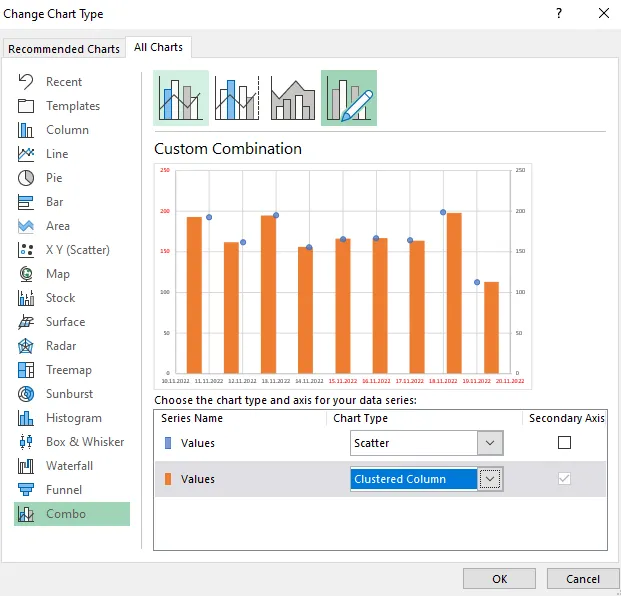

After that, remove the markers for the scatter chart and delete the secondary axis. It is a similar technique used to create an Excel chart with clustered and stacked columns.
Meanwhile, if you add a line between markers, the scatter chart looks like a line chart, and the combo chart is for another time.
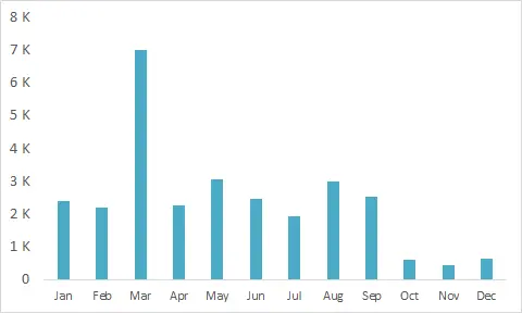
Here is another example that uses format code to show numbers in thousands on the Excel chart axis.