

If you are looking for Excel PERSONAL.XLSB location in Windows, I assume you already know why it is helpful. The Personal Macro Workbook file location is in the XLSTART folder. Here is the simplest way how to find that and solve other problems.
Calculate quarter in DAX from date using Power BI or Excel

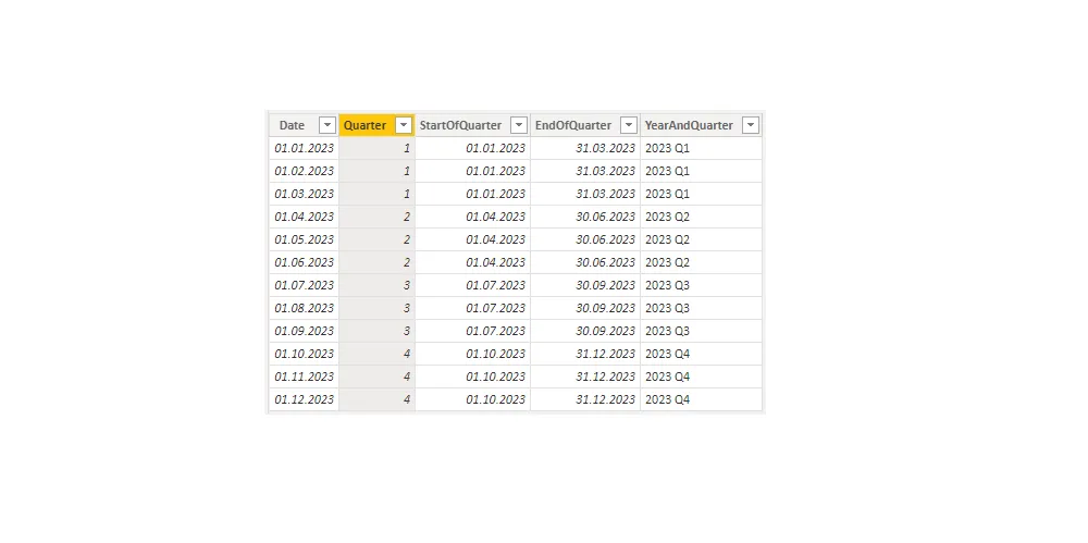
Here is an approach that will help you calculate quarter in DAX from the date using various tools like Power BI or Excel data model. The previous post contains a method that is useful not only in Excel but also using Power BI.
Get quarter in Excel from date – fast and easy
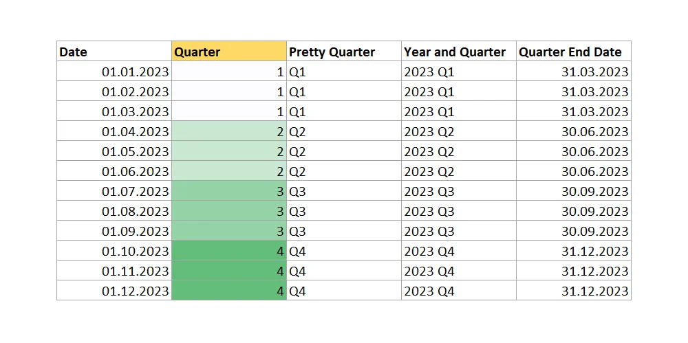
As usual in Excel, there is more than one way to get identical results, and the same happens if you try to get a quarter in Excel from date. Excel has multiple functions to do calculations with dates, but at this point, none of them are for quarter calculation.
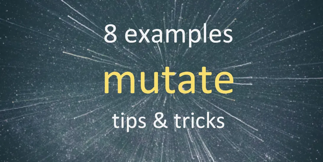
8 examples of how to use the dplyr function mutate in R

The dplyr function mutate in R might be one of the most popular functions that are used, for example, by creating a new data frame column. It is not hard to use that, and for some R users might be a reason why the function mutate is not fully known.
Use R dplyr mutate to add and remove existing columns

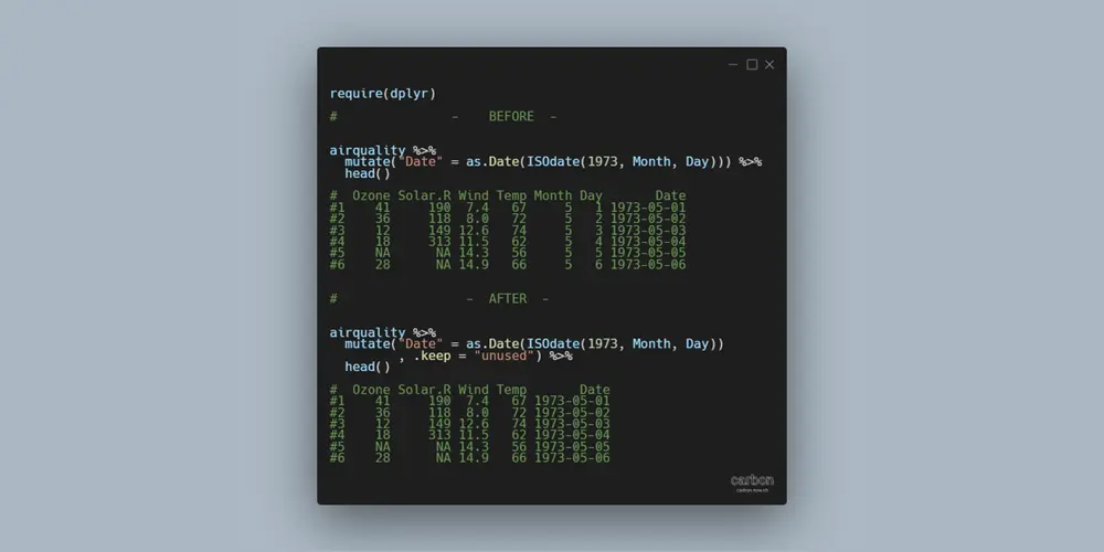
The main purpose of the function mutate from dplyr is to add a new variable with necessary calculations. Here is how to use the mutate to add and remove existing data frame columns if they are not necessary. It will help you to eliminate extra steps in your data-wrangling process.
How to navigate through slides in PowerPoint slide show

When you have a lot to show, it is essential to know how to navigate through slides in a PowerPoint slide show. These 3 simple tips will help you to increase your control over the slide show. Sometimes it is useful to jump to a specific slide in PowerPoint depending on the situation.
Add marginal distribution in R with rug plot from ggplot2

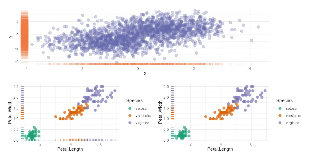
The R rug plot using the ggplot2 package is an interesting way to add one-dimension marginal distribution in R to the plot. There are multiple ways how to use that, and here are a couple of examples in combination with a scatter plot.
Get the user name in an Excel cell with a formula or VBA macro

If you want to get the Windows user name in an Excel cell, there are at least two ways to do that. By using an Excel formula to return the username, you will get dynamic results depending on who will open the file. Otherwise, you can return the same with VBA and a simple Excel… Continue reading Get the user name in an Excel cell with a formula or VBA macro
Columns with different names to join data frames in R dplyr

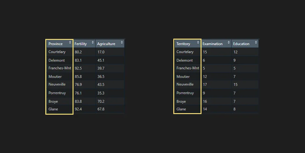
Columns with different names to join data frames in R by using functions from dplyr, like left_join or others, are not very handy but can be used. It is better if you have data frames with matching key column names. In that kind of scenario, you can sometimes join without specifying them if there are… Continue reading Columns with different names to join data frames in R dplyr
How to change marker shape in the R plot
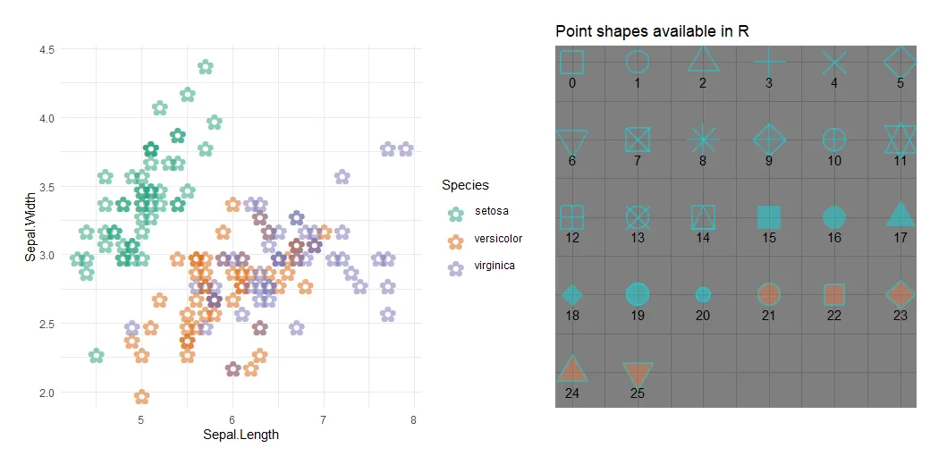
Sometimes you might wonder how to remove the border around dots in ggplot2, but all you have to do is change the marker shape in the R plot. When creating a plot in R that contains markers, it is possible to adjust the color, transparency, and also shape.