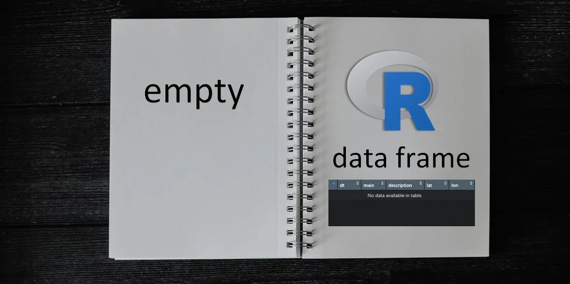
How to create an empty data frame in R
Here is how to make an empty data frame in R only with column names. Choose between 4 different methods that you can use to achieve that, and decide which of those fits better for you.

Left join only selected columns in R
If you want to use dplyr left join or any other type of join in R to combine information from two or multiple data frames, this post might be very helpful. Here is how to left join only selected columns in R.
in
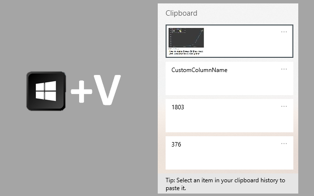
Press Win + V to access clipboard history
Windows shortcut Win + V is very helpful when you need to access something from your clipboard history. For example, if you work with some Excel files or data sets and have to apply some of the previous filtering parameters.
in
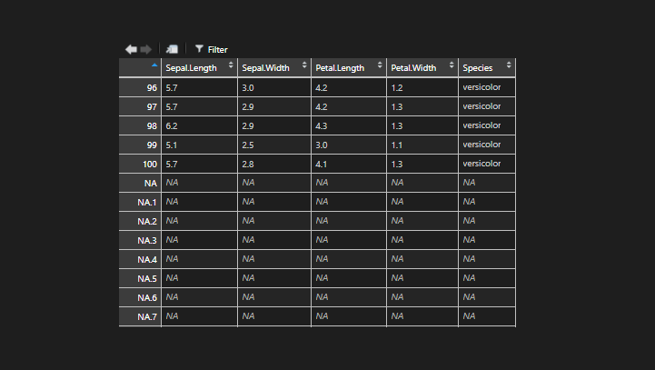
NA row names in R data frame
Here is one of the ways how you can run into this problem and get NA row names in the R data frame.
in
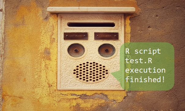
Play a sound at the end of R script in Windows command line
In my post about favorite RStudio tips and tricks, I mentioned sounds that could be played during R script execution. It works great but doesn’t make a sound after running R script from the Windows command line. Here is how to do that by using PowerShell and adding additional lines in the same batch file.
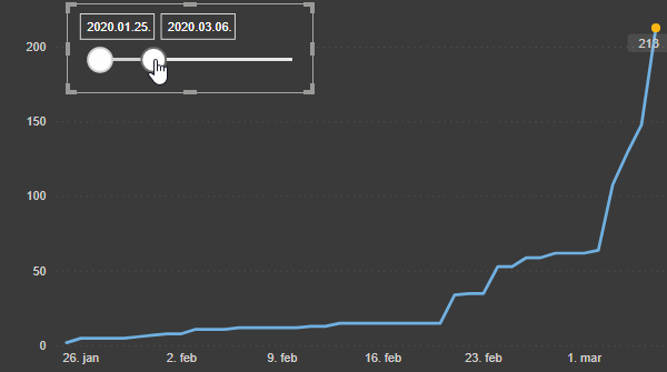
How to make Power BI line chart with accented last data point
Here is my approach on how to make Microsoft Power BI line chart with accented last data point. It is flexible and can be used with filters.
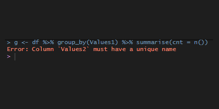
dplyr error: column must have a unique name
In rare cases, the data source may contain multiple columns with the same name, and some of the next actions with dplyr functions might result in the error “column must have unique name”.
in

How to rename data frame columns in R
Here are multiple ways how to rename columns in R using base functionality or dplyr functions like rename and select.
in

Difference between DAX and Excel functions that looks the same
If you know Excel functions, it is easier for you in Power BI with DAX. Sometimes it is mentioned as an advantage. It is indeed, but sometimes there is a significant difference between DAX and Excel functions that looks the same. I’m not talking about cell references – those are obvious.
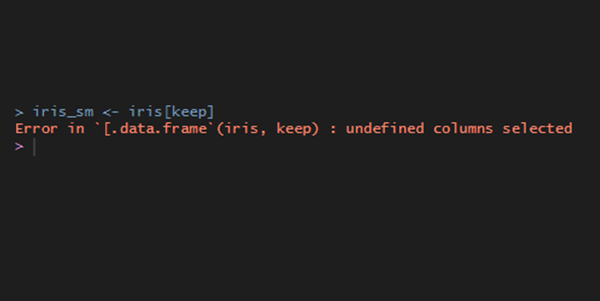
R error in data.frame : undefined columns selected
For me, R error undefined columns selected appears when I try to select some of the columns to keep in the data frame. It is easy to solve. You have to search for the misspelled column name, but if there is a long list of column names, then here is how to do that quickly.
in