
How to automatically upload files to SharePoint
Here is an example of how to automatically upload files to SharePoint Online by using PowerShell. By knowing how to run PowerShell script from the Windows command line (CMD) you can also build a workaround to upload files during R or Python script execution.
in

How to sync MS Teams files with local OneDrive folder
If you’re interested to use your MS Teams files like you usually would in File Explorer, then here is how to sync with the local OneDrive folder.
in
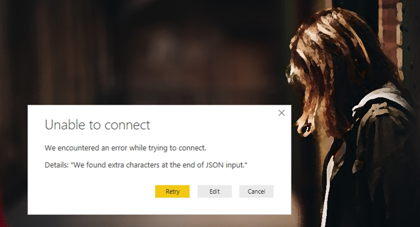
Power Query error: We found extra characters at the end of JSON input
I was getting this error about extra characters at the end of JSON input while trying to connect to my JSON file in SharePoint with Power Query. Try to connect by using SharePoint Folder.
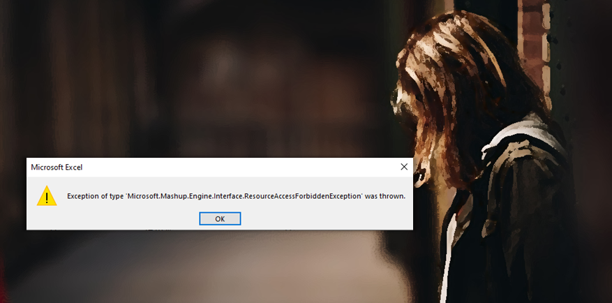
Power Query error: ResourceAccessForbiddenException
Here is one of the explanations if you have this Power Query error ResourceAccessForbiddenException while refreshing your data. If previously everything worked just fine, then the reason might be obsolete (old) authorization.

How to connect to SharePoint file with Power Query or Power BI
There is a couple of ways how to connect to the SharePoint file with Power Query, but first of all, I recommend the connection through SharePoint Folder. It is more versatile and can be used successfully with different file formats – CSV, TXT, Excel, or JSON.

Get full path to current R script
Are you wondering where is my current R script file located and how to determine the full path? Here is how to do that in RStudio or while running in batch mode.
in

How to restore deleted MS Teams channel
If you are here, then I suppose that it is not so intuitive to restore the deleted MS Teams channel.
in
Execute Windows CMD command (PowerShell) from R script
Here is an example of how to execute the Windows CMD command or PowerShell from R script. You can run cmd.exe by using the system function, and input might be something that you can run in CMD.
in
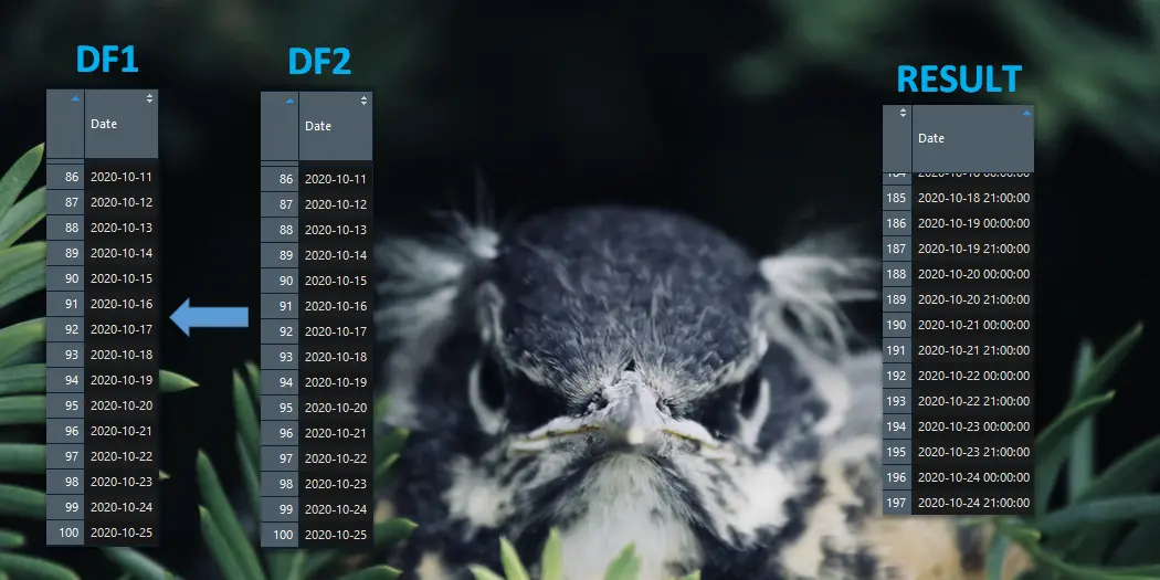
R time shift problem after merging data
After merging two data frames by the date column, something weird was happening. The records did not match, and one of the date columns appeared with an additional timestamp. In the beginning, I was thinking that something is wrong with the join function from dplyr function that I was using. But as always, there was…
in

How to use OpenWeather API in R
Here is an approach that doesn’t require a dedicated package for using OpenWeather API in R.
in