

By default, you can not add text labels on Excel scatter chart axis, but here is a workaround that allows you to do that. You can change Excel scatter chart horizontal or vertical axis labels using a dummy series. Here is how to do that in a few simple steps.
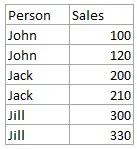
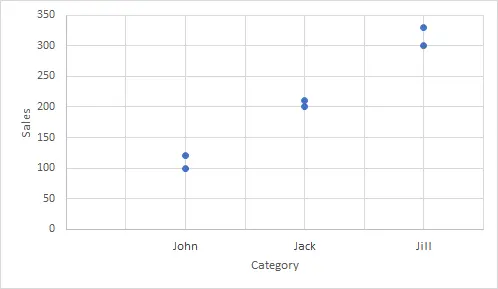
Here is the data that I would like to display in the Excel scatter chart. In addition, I would like to add custom labels on Excel scatter chart x-axis with each person’s name.

Stepps to add text labels on Excel scatter chart axis
1. Firstly it is not straightforward. Excel scatter chart does not group data by text. Create a numerical representation for each category like this.
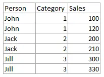

By visualizing both numerical columns, it works as suspected. The scatter chart groups data points.


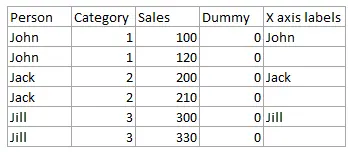
2. Secondly, create two additional columns.
The first column contains dummy series that will be used to add text labels on Excel scatter chart axis. Values are equal to the crossing point with the y axis. In my case, it is zero.
The second column contains labels that replace dummy series values – only one for each category to avoid overlapping.

3. Add dummy series to the scatter plot and add data labels.


4. Select recently added labels and press Ctrl + 1 to edit them. Add custom data labels from the column “X axis labels”. Use “Values from Cells” like in this other post and remove values related to the actual dummy series. Change the label position below data points. Hide dummy data series markers by switching marker options to none.
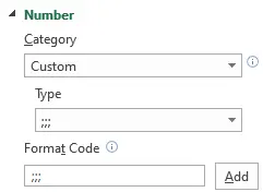
5. Select actual x-axis labels, press Ctrl + 1, and use format code to make them invisible.

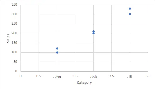
That is how you can add custom categories on Excel scatter chart axis.
It can be a vertical axis, horizontal, or both of them. Be aware of other customizations that might be necessary, like axis minimum, maximum or major units.
You can download the file with the result right here.
A scatter chart in Excel can be a stepping stone for unusual visualizations like magic quadrant charts.