
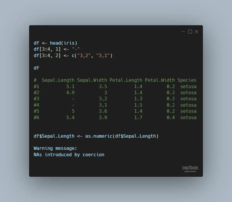
If you see the warning NAs introduced by coercion in R, don’t panic. It is not necessarily bad, but you should understand if that is acceptable. This warning message usually appears by converting non-numerical values to numerical values with functions like as.numeric or as.integer. It may also appear by creating plots where the correct data… Continue reading NAs introduced by coercion in R
Category: R
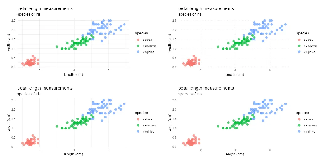
Plot mean by group in R using ggplot2 or use other measures

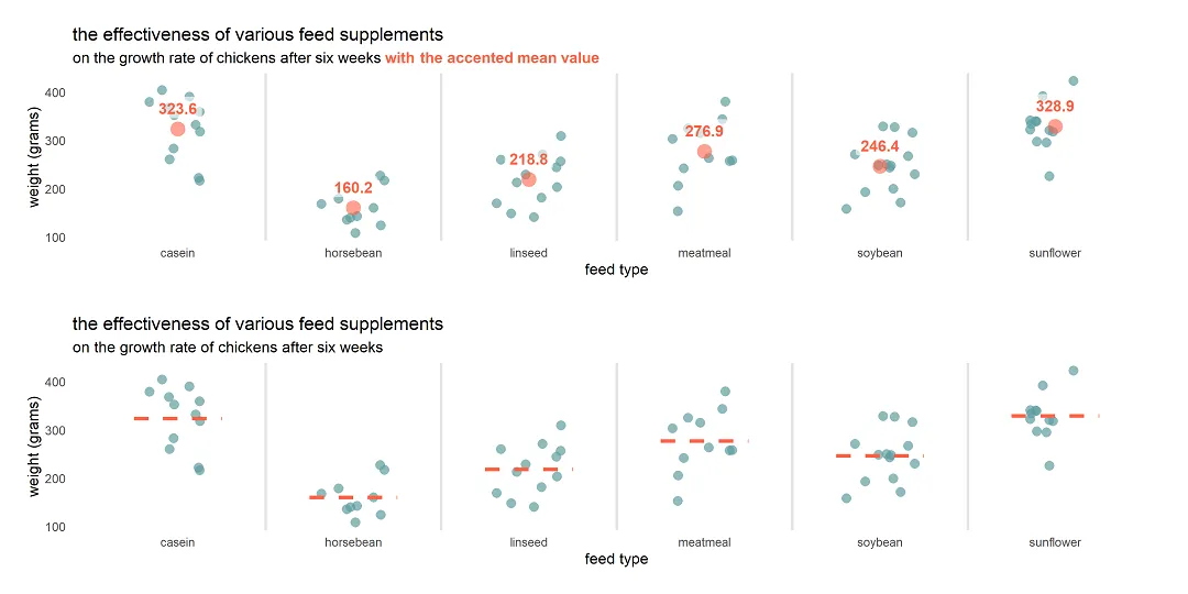
Here is how to plot mean by group in R using ggplot2 or try other measures to summarize values. To demonstrate that, I will use a jitter plot. A jitter plot is great if you want to look at all data points by categories, but additional statistics might be useful for evaluation.
How to create a jitter plot in R with ggplot2, plotly, and base

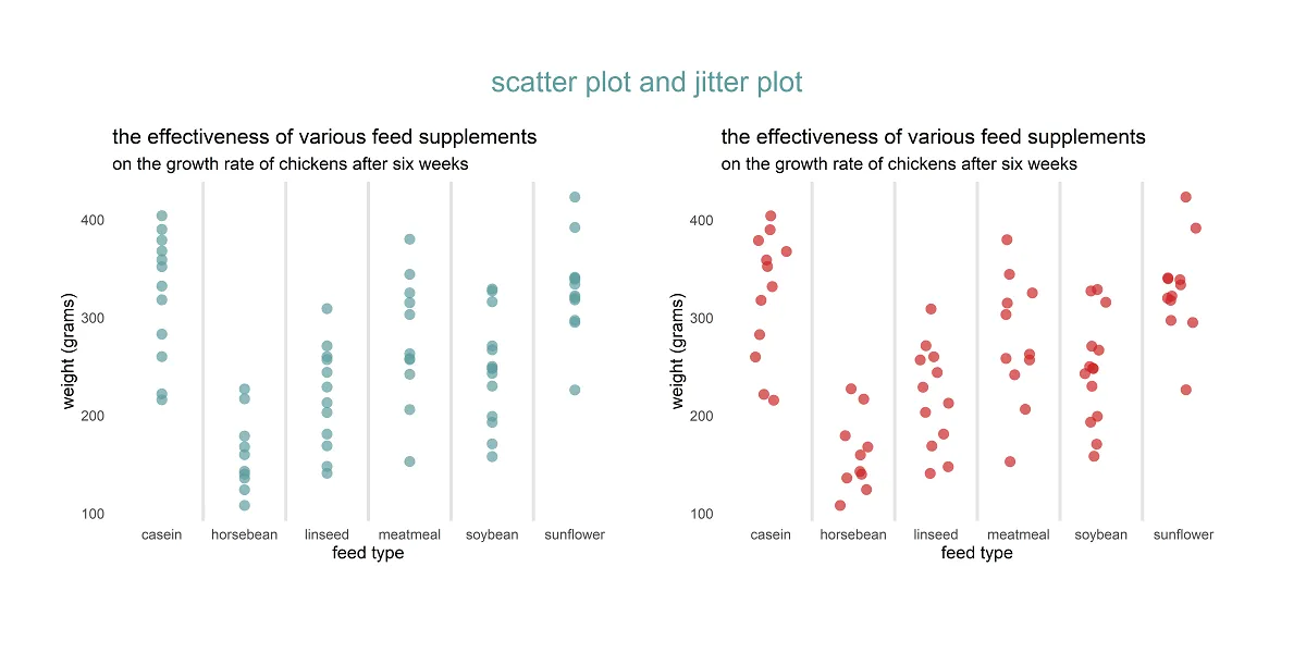
Here are 3 ways to create a jitter plot in R, also called a strip chart or a dot plot which is a one-dimensional scatter plot. A jitter plot in R makes it easier to view overlapping data points by categorical or discrete values. In that scenario, the scatter plot groups all data points in… Continue reading How to create a jitter plot in R with ggplot2, plotly, and base
How to use different colors in the ggplot2 title in R

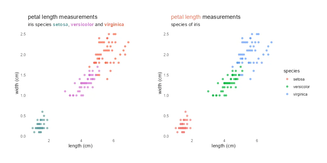
Different colors in the ggplot2 title might be useful to emphasize part of that or as a substitute for the R plot legend. It is not very easy to do, but worth it if it helps to draw the necessary attention.
How to swap R plot axis or rotate axis labels in ggplot2
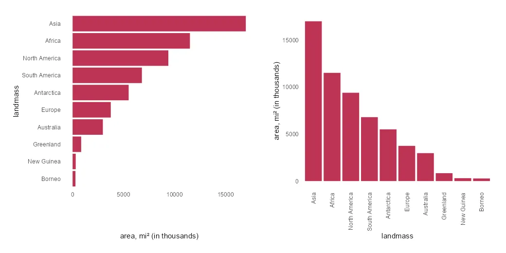
If it is necessary to swap the R plot axis, try to do that with the x and y arguments. Package ggplot2 allows you to swap the axis by using coord_flip, but it is mostly unnecessary. Try to fix the problem at the beginning.
8 examples of how to use the dplyr function mutate in R


The dplyr function mutate in R might be one of the most popular functions that are used, for example, by creating a new data frame column. It is not hard to use that, and for some R users might be a reason why the function mutate is not fully known.
Use R dplyr mutate to add and remove existing columns

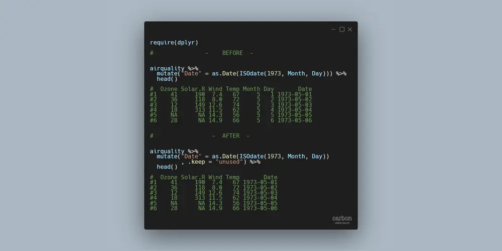
The main purpose of the function mutate from dplyr is to add a new variable with necessary calculations. Here is how to use the mutate to add and remove existing data frame columns if they are not necessary. It will help you to eliminate extra steps in your data-wrangling process.
Add marginal distribution in R with rug plot from ggplot2
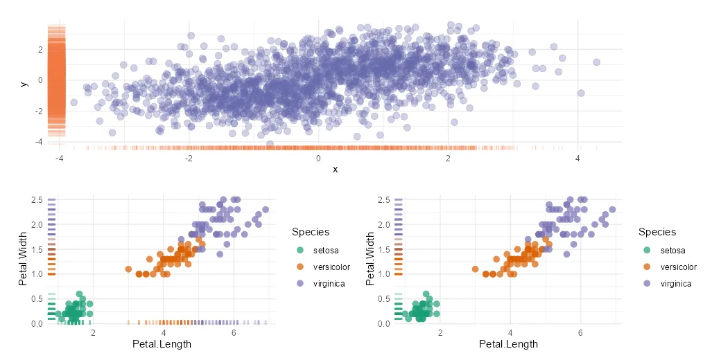
The R rug plot using the ggplot2 package is an interesting way to add one-dimension marginal distribution in R to the plot. There are multiple ways how to use that, and here are a couple of examples in combination with a scatter plot.
Columns with different names to join data frames in R dplyr

Columns with different names to join data frames in R by using functions from dplyr, like left_join or others, are not very handy but can be used. It is better if you have data frames with matching key column names. In that kind of scenario, you can sometimes join without specifying them if there are… Continue reading Columns with different names to join data frames in R dplyr