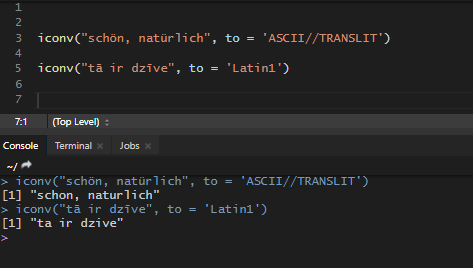
How to convert accented characters to unaccented in R or Power BI
Sometimes it’s necessary to convert accented characters to non accented in R or Power BI for text analysis purposes. Accented characters might be a problem in texts with spelling mistakes and spoil the analysis.
in
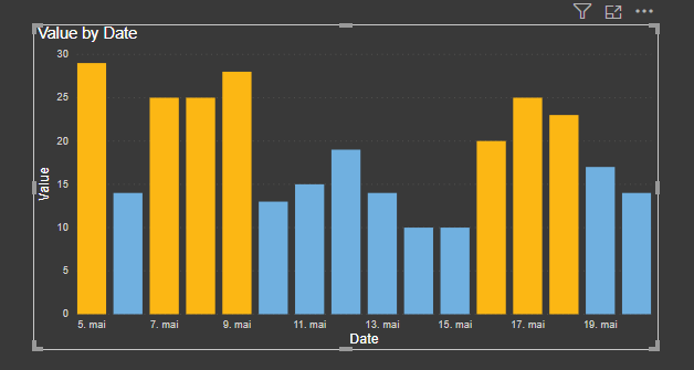
Power BI line chart marker color conditional formatting
Even there is no straight forward option to build Power BI line chart marker color conditional formatting, you can do that, by using a bar chart formatting features.
in

How to concatenate text by group in R
To concatenate, you can use R base functions paste and paste0 that are almost the same. The only difference is in the separator argument. In this situation, we will use the collapse argument that will separate all the text within a group when concatenated.
in
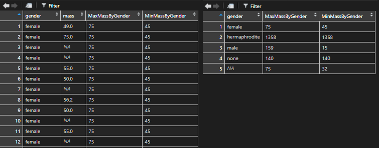
How to get maximum or minimum value by each group in R
Here is a quick and easy way hot to get the maximum or minimum value within each group in R in separate columns. Let’s take a look at the data set with NA values, which makes it a little bit harder.
in

My best tips for productive working from home
Here is my compilation of best tips, resources, and observations that are very useful when working from home. Especially helpful in this time during the Covid-19 pandemic.

Dynamic Power BI map visualization with coronavirus data
With the help of additional custom visualization, it is possible to create pretty awesome dynamic Power BI map visualization to see how things are changing during a time.
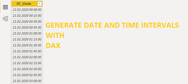
How to generate date and time interval list with DAX
Here is how to create a new table and generate a dynamic date and time interval list with DAX. In this example, I will build a table with a column that contains 15 minute intervals for the last 7 days.
in
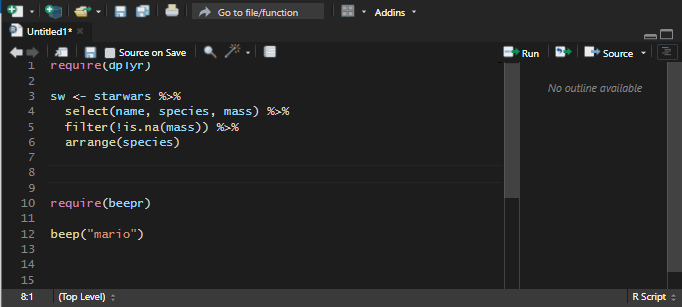
My favorite RStudio tips and tricks
Here is a list of my most used time-saving tips and tricks or just great looking features in RStudio.
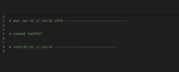
How to modify or create RStudio code snippets
RStudio snippets are very handy when it comes to dealing with repetitive tasks. Here is how to modify RStudio snippets or create a new one.
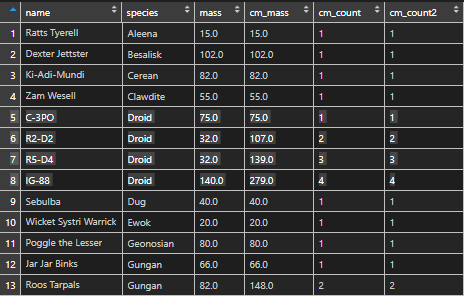
Cumulative sum or count in R
Here is how to calculate cumulative sum or count by using R built-in datasets.
in