
Here is how to remove legend in ggplot2, also known as a guide. There are multiple ways how to do that depending on the situation. On the other hand, if you are looking at why the ggplot2 legend is not showing, there might be a chance that somewhere in the script it is suppressed.
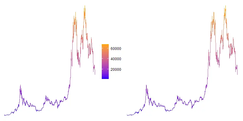
It rarely happens when a legend or guide is not helpful enough, but here is an example. I used bitcoin price data with the help of the coindeskr package.
require(coindeskr)

btc <- get_historic_price(start = "2017-01-01")

btc$Date <- as.Date(row.names(btc))
This visualization uses a color gradient and it might be useful without a color guide.
require(ggplot2)

ggplot(btc, aes(x = Date, y = Price, color = Price)) +
  geom_line() +
  scale_colour_gradient(low = "blue", high = "orange") +
  theme_void()

Remove legend in ggplot2
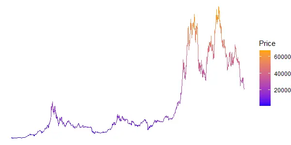
Perhaps an intuitive way to remove legend in ggplot2 is by setting that when specifying visualization type. Like in this situation in function geom_line with the argument show.legend.
ggplot(btc, aes(x = Date, y = Price, color = Price)) +
  geom_line(show.legend = FALSE) +
  scale_colour_gradient(low = "blue", high = "orange") +
  theme_void()
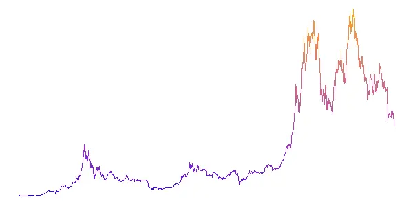
You can also remove all legends in ggplot2 by modifying a theme like this.
ggplot(btc, aes(x = Date, y = Price, color = Price)) +
  geom_line() +
  scale_colour_gradient(low = "blue", high = "orange") +
  theme_void() +
  theme(legend.position = "none")
It is important to remove the legend after applying the theme. Otherwise, it comes back.
Remove guide in ggplot2
Take a look at the functions that you are using in ggplot2 visualization. Function like scale_colour_gradient contains a guide argument that can turn that off.
ggplot(btc, aes(x = Date, y = Price, color = Price)) +
  geom_line() +
  scale_colour_gradient(low = "blue", high = "orange", guide = "none") +
  theme_void()
You can also remove the guide by specifying a certain scale in the guides function.
ggplot(btc, aes(x = Date, y = Price, color = Price)) +
  geom_line() +
  scale_colour_gradient(low = "blue", high = "orange") +
  theme_void() +
  guides(color = "none")
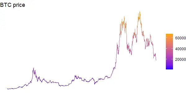
Hide legend title in ggplot2
The color guide might be useful if you don’t have the y-axis like in theme_void. In this situation plot title is more informative, and an additional title is not necessary.
You can remove the legend title by modifying the theme like this.
ggplot(btc, aes(x = Date, y = Price, color = Price)) +
  geom_line() +
  scale_colour_gradient(low = "blue", high = "orange") +
  theme_void() +
  theme(legend.title = element_blank()) +
  ggtitle("BTC price")
By the way, here is another interesting example in ggplot2 if you want to know how to sort text as a number. For example, by dealing with month names.