
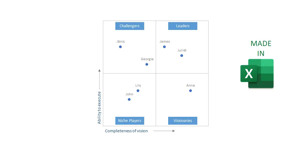
If you feel inspired by the Gartner magic quadrant chart or there are other reasons, here is how to create a magic quadrant chart in Excel. Imitation of already existing visualization is a great way to learn new things with a definite goal in mind. You might have your metrics, but the main principle is to show them in a two-dimensional grid that is handy for use in Excel scatter plots. In other words, an Excel quadrant chart is a scatter chart with quadrants separated by the X and Y-axis.
Magic quadrant chart in Excel
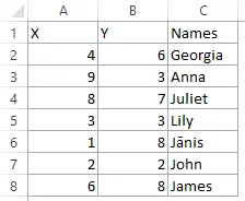
Prepare your data like coordinates in two dimensions. It should be done in a way that there is a defined minimum and maximum. For example, I have a table that contains employee evaluations by two parameters from 0 to 10.

Here are steps on how to create a quadrant chart in Excel, but you can download the result below.
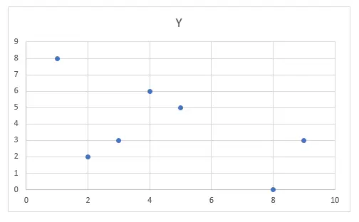
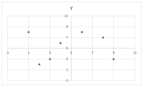
1. Select columns with X and Y parameters and insert a scatter chart.

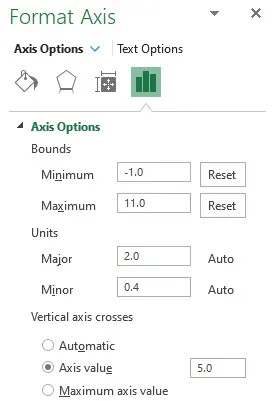
2. Select the horizontal axis of the axis and press shortcut Ctrl + 1.
3. Set the minimum, maximum, and position where the vertical axis crosses. Sometimes it is necessary to leave a gap for the situation when values reach maximum or minimum. The crossing should be the middle point of your scale.

4. Repeat the previous two points for Y-axis. The result will look like this.

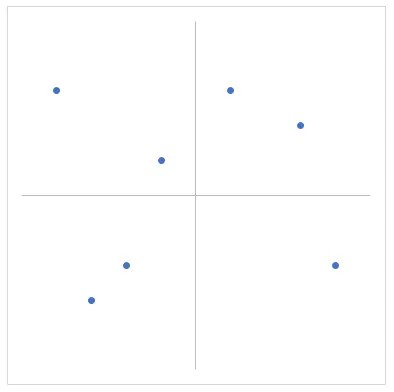
5. Remove unnecessary scatter chart elements like gridlines and title.
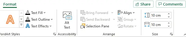
6. Change chart dimensions to square. You can do that in the Format tab after selecting a chart.

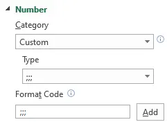
7. If you want to hide axis labels, you can do that by using Excel format code. Select axis labels and press Ctrl + 1. In the Number section, use format code like this.

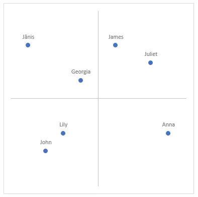
At this point, the result looks almost like a magic quadrant chart.

8. You can increase marker size. Most importantly, add custom data labels. Select data labels and press Ctrl + 1. Add values from cells.
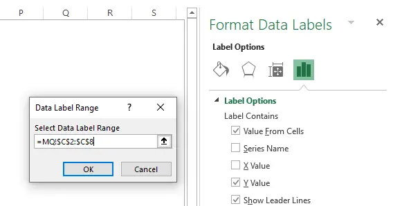

After applying them, keep only Value From Cells selected. Choose the label position above the data points if you like.

9. In conclusion, add the necessary graphical elements. Here is an example that will help you understand how to add an object to an Excel chart without further problems with copying or moving.
Here you can download the Excel file result.


3 other visualizations in Excel
However, if you want to create other interesting charts in Excel, I recommend a few other posts from this blog:
Great