
How to connect to the Salesforce data with R
Here is how to get necessary Salesforce data with R. Previously, there was a package RForcecom, but now you should use the salesforcer package instead. During this year, RForcecom was removed from CRAN.
in

Data dictionary in Power BI by using Q&A, GIF background
Here is a fun way to use Q&A functionality to build a data dictionary in Power BI. The first question might be – what is a data dictionary? There might be a different understanding, but my definition is similar to this one. A collection of definitions about data that you have and specific terminology.
in

How to connect to the Salesforce data with Power Query, Power BI, Excel
Here is how to connect to the Salesforce data with Power Query in Excel or Power BI. For the Salesforce CRM data exploration, I found Power Query very useful. There is no difference if you are using Power Query in Excel or Power BI. The steps to connect to the data with Power Query are…
in

How use dplyr distinct with exceptions, select unique rows in R
Here are several examples of how to use dplyr distinct to select only unique rows in the data frame. Examples starting with situations where you define columns used to get distinct rows and ending with dplyr distinct with exceptions. Similarly to distinct by using one or multiple columns to get unique rows, maybe it is more…
in

Add custom button with a shortcut to Excel file in Power BI report
When the Power BI report is not enough, here is how to add an interactive button as a shortcut to the Excel file in the Power BI report. This approach will work if the location of your Excel file is in OneDrive, SharePoint, and Power BI report user can access it. Other scenarios I will…

How to bind R data frames vertically
Here is how to bind two or more R data frames vertically using different methods and dealing with possible errors. Binding R data frames together by rows might be easy, but there might be situations where columns don’t match or there are more than two data frames.
in

How to calculate weighted mean in R
Calculation of weighted mean in R is done easily by dedicated function or mathematically. Here are a couple of situations and solutions to successfully do weighted mean calculations in R.
in
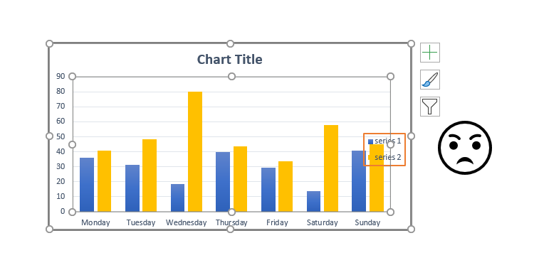
How to reset Excel chart plot area formatting
For me, the most annoying thing about Excel charts are is the inability to resize elements automatically. Usually, it happens after mild corrections of the plot area. Here is how to fix that and reset the Excel chart plot area to get back automatic size adjustments.
in
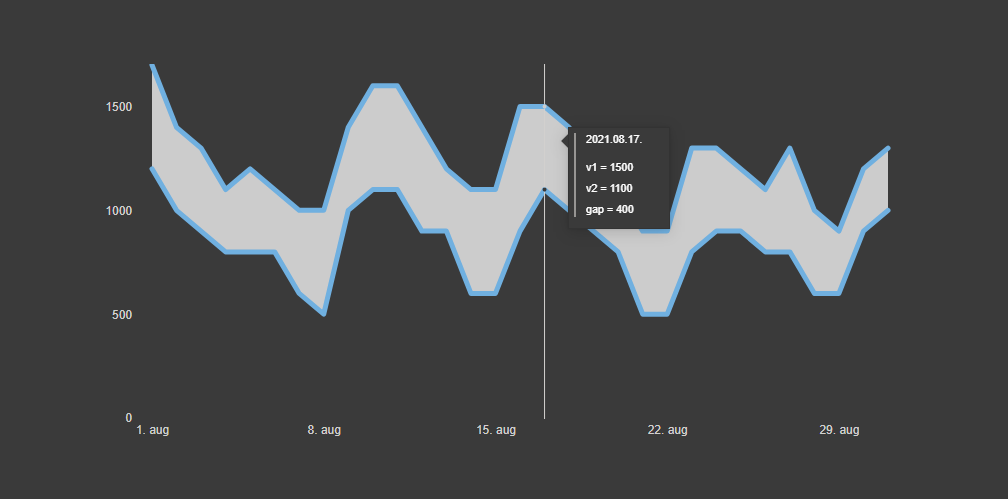
Power BI chart with the accented gap between two lines
Here is how to create a Power BI chart with an accented gap between two lines. With the help of fill color between two lines, it will help you evaluate the difference between two values.