One of the simplest methods that you can detect outliers in Power BI is visual detection and IQR method that is also used in box plots (sometimes called box and whisker plot).
IQR method is versatile and can be used in skewed datasets. It is even better without Box Plot visualization because you can work with the underlying dataset and avoid some problems that can be missed. You can find out more in this post – How to create BoxPlot in R and extract outliers.
Here is M code for data table that you can put in a blank query or paste in Power Query blank query.
let
    Source = Table.FromRows(Json.Document(Binary.Decompress(Binary.FromText("ZZLBDQMxCAR7uXciwQIG1xKl/zZy3nwC+Y7Qwnr8el0QyFPiKXo9LthOv96PH4yDFbI7thtrQrVjP3hLoeM4uGKP7EWMFR0nQyLGyuJ07ZG9eYmjh6gwxHRgZYiEdHxaanhlx9+W4f1udb7J38rT0qRidXxauqwaIaclPH1ccloCGSN7047tjiHEa0yDLmFlHdPlMusrYbzkTu+YLSHeFSOIl/SnwtdlzZV0mcsHpkvfOS6hS4/o00aXqat/CKPLkPMh3h8=", BinaryEncoding.Base64), Compression.Deflate)), let _t = ((type text) meta [Serialized.Text = true]) in type table [DATE = _t, VALUE = _t]),
    #"Changed Type" = Table.TransformColumnTypes(Source,{{"DATE", type date}, {"VALUE", Int64.Type}})
in
    #"Changed Type"
Identify outliers in Power BI with IQR method calculations
By doing the math, it will help you detect outliers even for automatically refreshed reports. Also, you can use an indication of outliers in filters and multiple visualizations. To do that, I will calculate quartiles with DAX function PERCENTILE.INC , IQR, and lower, upper limitations.
Here are 5 measures that I created.
1. Calculate the bound of the first quartile in data.
QUARTILE1 = PERCENTILE.INC(MyTable[VALUE];0.25)
2. Calculate the bound of the third quartile in data.
QUARTILE3 = PERCENTILE.INC(MyTable[VALUE];0.75)
3. Calculate the inner quartile range (IQR).
IQR = [QUARTILE3]-[QUARTILE1]
4. Calculate the lower limit. Values that are smaller than lower limit value might be outliers.
LOWER_LIMIT = [QUARTILE1] - 1.5*[IQR]
5. Calculate the upper limit. Values that are greater than the upper limit value might outliers.
UPPER_LIMIT = [QUARTILE3] + 1.5*[IQR]
Datapoint less than the lower limit or more than the upper limit is considered as an outlier.
After you detected the lower and upper limit, you can add a custom column with a conditional statement to filter those values, use it as conditional formatting, or visualize like this.
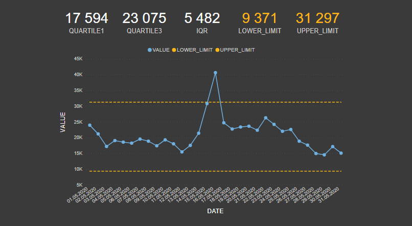
To display lower and upper limit lines properly, I modified lower and upper limit measures with filter functions like this.
LOWER_LIMIT = CALCULATE([QUARTILE1] - 1.5*[IQR];ALL())

UPPER_LIMIT = CALCULATE([QUARTILE3] + 1.5*[IQR];ALL())
It is something to consider even in other cases because some Power BI visualization interactions and filters might affect the outlier detection result.
Additional information about IQR method in Power BI
Of course, there is also PERCENTILE.EXC and there is a slight difference between PERCENTILE.INC and PERCENTILE.EXC that you can find out here.
The art of detecting outliers is more than this. You have to understand what’s going on in data and make sense of this by using context.
Sometimes you have to split data and detect outliers in subgroups. For example, values might vary a lot between working days and holidays. In that case, it is better to analyze those two groups separately.
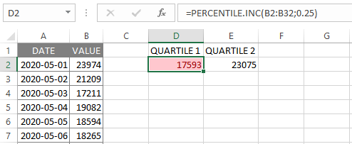
You can also check the results in Excel with PERCENTILE, PERCENTILE.INC, PERCENTILE.EXC or QUARTILE, QUARTILE.INC, QUARTILE.EXC functions. I did some testing with this example with PERCENTILE.INC in EXCEL and got a little bit different result with the first quartile.
If you’re interested to understand the IQR method more deeply, then I suggest this post: Why “1.5” in IQR Method of Outlier Detection?
Identify outliers in Power BI visually
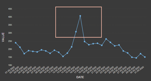
An outlier is a data point that is significantly distant from others, and some times you can detect that just by eyeballing.
Create a line chart
If you want to know how to add markers, click here. One of the easiest approach that is applicable in time series analysis. You can also add conditional formatting to Power BI line chart markers. It is not so precise like the IQR method and useful in small datasets.
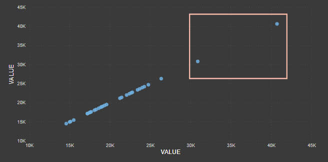
Create a scatter chart
Sometimes you don’t have a time series, or it can be more clear in this way.
Run cluster analysis in your table. By adding a cluster analysis field in Power BI table visualization, you can detect outliers easier.
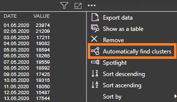
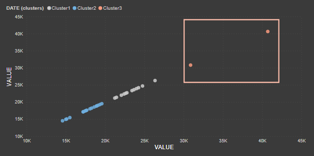
The problem with cluster analysis is that clusters are not re-evaluated on refresh, and new points will be assigned to a (blank) cluster. But if you analyze one variable and put the Power BI clustering result in the scatter chart legend, it helps to see categories that might contain outliers.
Outlier detection with Power BI quick insights
By running quick insights, you can get two types of visualizations to spot outliers: Category outliers and Time-series outliers. More information here.
There is a possibility to download custom Power BI visual like Outliers Detection. When you do all the math by your self, then you can apply outlier detection to plenty of Power BI standard visualizations.
Leave a Reply