Like step chart option previous post it is also a little bit hidden. The key is to use categorical X axis.
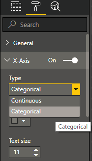
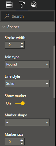
After that, you can see activated marker option under Shapes.
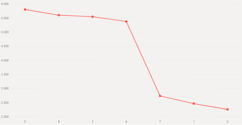
How to add markers to line chart in Power BI
Comments
3 responses to “How to add markers to line chart in Power BI”
Thanks for this – solved my problem!
Is there any way to change the color of each marker based on its value? If I’m charting defect rate over time, I’d like to show those above a threshold to be red and those below it to be green.
Thank you for your question. Yes, we can do that. Take a look at this post: https://datacornering.com/power-bi-line-chart-marker-color-conditional-formatting/
Leave a Reply