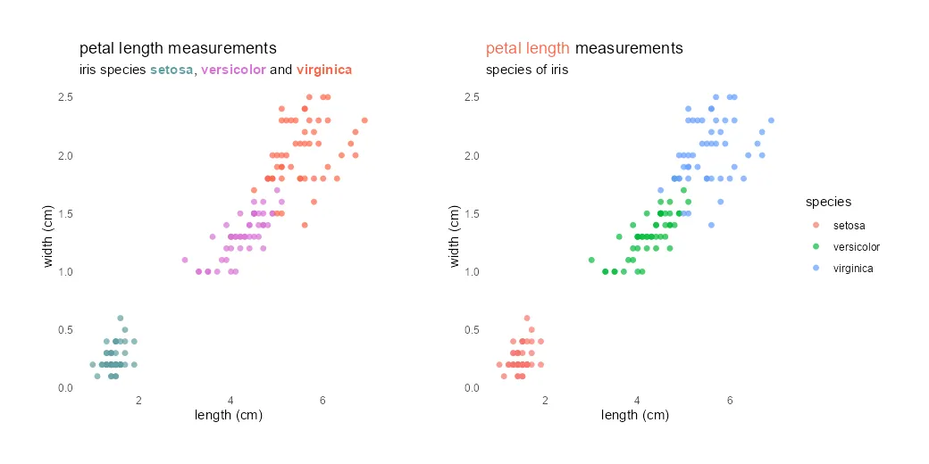
Different colors in the ggplot2 title might be useful to emphasize part of that or as a substitute for the R plot legend. It is not very easy to do, but worth it if it helps to draw the necessary attention.
Here is how my R scatter plot looks at the beginning. That is created with a little formatting effort by removing gridlines and adjusting markers and titles.
require(ggplot2)


ggplot(iris, aes(x = Petal.Length, y = Petal.Width , color = Species)) +
  geom_point(size = 3,
             alpha = 0.7,
             shape = 16) +
  labs(
    title = "petal length measurements",
    subtitle = "species of iris",
    x = "length (cm)",
    y = "width (cm)",
    color = "species"
  ) +
  theme_minimal() +
  theme(panel.grid = element_blank())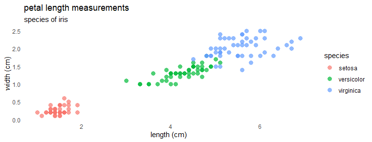
Different colors in the ggplot2 title
By using ggplot2 theme elements, it is possible to change the color of the plot title. Here is what it looks like in a different color.
ggplot(iris, aes(x = Petal.Length, y = Petal.Width , color = Species)) +
  geom_point(size = 3,
             alpha = 0.7,
             shape = 16) +
  labs(
    title = "petal length measurements",
    subtitle = "species of iris",
    x = "length (cm)",
    y = "width (cm)",
    color = "species"
  ) +
  theme_minimal() +
  theme(panel.grid = element_blank(),
        plot.title = element_text(color = "slategray"),
        plot.subtitle = element_text(color = "slategray"))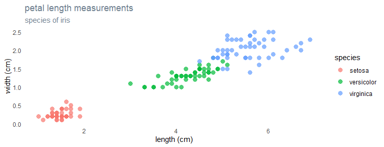
To create an R plot with different colors of words in the title, I will be using the ggtext package. It is a ggplot2 extension that provides Markdown and HTML rendering.
library(ggtext)


ggplot(iris, aes(x = Petal.Length, y = Petal.Width , color = Species)) +
  geom_point(size = 3,
             alpha = 0.7,
             shape = 16) +
  labs(
    title = "<span style = 'color:tomato;'>petal length</span> measurements",
    subtitle = "species of iris",
    x = "length (cm)",
    y = "width (cm)",
    color = "species"
  ) +
  theme_minimal() +
  theme(panel.grid = element_blank(),
        plot.title = element_markdown())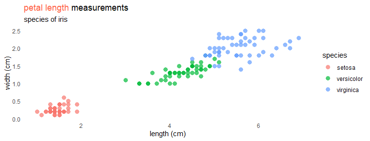
Be careful if you are editing existing ggplot2 visualization. Remember to replace element_text with element_markdown to get different colors in the ggplot2 title.
Substitute ggplot2 plot legend by coloring individual words in the subtitle
Here is another approach to using different colors in the ggplot2 title. In this R plot, the ggplot2 is without legend. Instead, I’m using keywords in the subtitle matching with colors of scatter plot groups. In addition, I used an asterisk symbol to make them appear in bold.
ggplot(iris, aes(x = Petal.Length, y = Petal.Width , color = Species)) +
  geom_point(size = 3,
             alpha = 0.7,
             shape = 16,
             show.legend = FALSE) +
  scale_color_manual(values = c("cadetblue", "orchid", "tomato"))+
  labs(
    title = "petal length measurements",
    subtitle = "iris species
    <span style = 'color:cadetblue'>**setosa**</span>,
    <span style = 'color:orchid;'>**versicolor**</span> and
    <span style = 'color:tomato;'>**virginica**</span>",
    x = "length (cm)",
    y = "width (cm)",
    color = "species"
  ) +
  theme_minimal() +
  theme(panel.grid = element_blank(),
        plot.subtitle = element_markdown())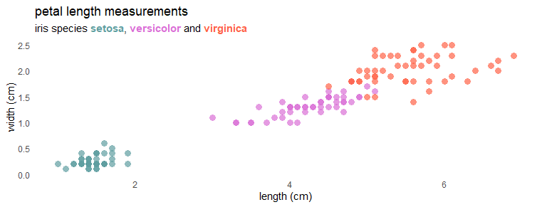
I hope it will help you change the color for part of the ggplot2 title, subtitle, or ideas for other enhancements.
Please take a look at other posts from this blog about data visualization or other stuff. For example, how to save R plots or other results temporarily or convert to WebP format.
Leave a Reply