Here is a solution to add more analytical capabilities to your Power BI charts. Switch Power BI chart axis dimensions to get data grouped by dates, weeks, months, or any other way that you want. By modifying the data model, you can create a slicer that can swap the necessary scale of the axis. That is not limited to dates, and you can dynamically change the Power BI chart axis by using the data categories you want.
In this post, I’m looking to switch between date and month. In case you are using the week dimension, take a look at the ISO week and ISO year calculation in DAX. That is necessary to get the same count of days in the week. You can add a date period in Power BI tooltip that represents a certain week.
To demonstrate how to create a slicer that can switch the Power BI chart axis dynamically, I used this method to generate random data with Power Query. Here is the M code that you can put in a blank query. You can download the file with contains the solution with the dynamics Power BI chart axis right here.
let
    Source = List.Dates(#date(2021, 1, 1), 400, #duration(1, 0, 0, 0)),
    #"Converted to Table" = Table.FromList(Source, Splitter.SplitByNothing(), null, null, ExtraValues.Error),
    #"Renamed Columns" = Table.RenameColumns(#"Converted to Table",{{"Column1", "Date"}}),
    #"Changed Type" = Table.TransformColumnTypes(#"Renamed Columns",{{"Date", type date}}),
    #"Added Custom" = Table.AddColumn(#"Changed Type", "Sales", each List.Random(1)),
    #"Expanded Sales" = Table.ExpandListColumn(#"Added Custom", "Sales"),
    #"Multiplied Column" = Table.TransformColumns(#"Expanded Sales", {{"Sales", each _ * 1000, type number}}),
    #"Rounded Off" = Table.TransformColumns(#"Multiplied Column",{{"Sales", each Number.Round(_, 0), type number}}),
    #"Changed Type1" = Table.TransformColumnTypes(#"Rounded Off",{{"Sales", Int64.Type}})
in
    #"Changed Type1"
Prepare data model
In the beginning, my data model contains a fact table that is created with the code above. It is a good practice to add a date table, and that is what I’m doing next.
1. Create a calculated table and create a simple Power BI date table using the DAX function CALENDARAUTO. Mark it as a date table.
MyCalendar = CALENDARAUTO()
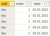
2. Next important step is a calculated table that contains necessary date dimensions and all possible dates. Create a calculated table like this.
date_units_slicer =

// calculate table with dimension and necessary order
VAR unit_order =
DATATABLE("unit", STRING, "order", INTEGER,
{
    {"day", 1},
    {"month", 2}
})

// calculate same dates as in the date table
VAR dates = SELECTCOLUMNS(CALENDARAUTO(), "date", [Date])

RETURN

// generate all possible combinations between date dimensions and dates
GENERATE(unit_order, dates)
It contains two variables. The first variable contains a table with values that will be used in the slicer as date dimensions and a column to get them in the right order. The second variable is another calendar table. That is not a universal approach. You can generate a column with dates in other ways. Those tables are united with the function GENERATE that creates all possible combinations of records between them.
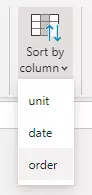
3. Sort column “unit” with dimension by order column.
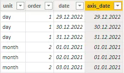
4. Create a calculated column that will contain dates for each date dimension. There should be the date first day of each period. Dates, the first day of the week, the first day of the month, etc. Here is how to calculate the necessary first and last dates if you use weeks.
axis_date =
SWITCH (
    date_units_slicer[order],
    1, date_units_slicer[date],
    2, DATE ( YEAR ( date_units_slicer[date] ), MONTH ( date_units_slicer[date] ), 1 )
)
In the result, you will get a column with the first date of each date dimension.
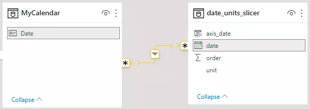
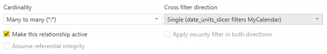
5. Create a relationship between the date dimension table and the calendar table. It is important to change relationships like this to enable the slicer to filter the calendar table.
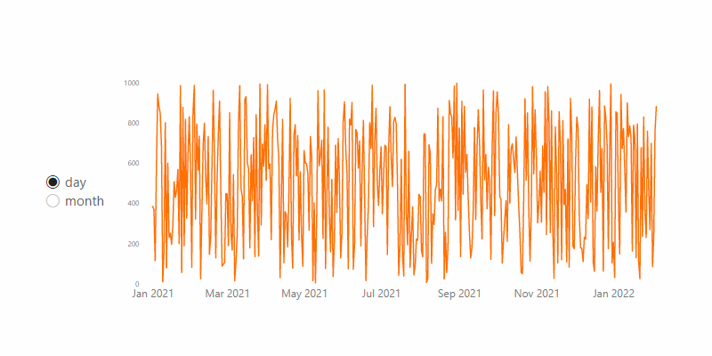
Let’s switch Power BI axis dynamically
When the data model is ready, you can start to build a Power BI chart and slicer that can switch date dimensions.
If you are switching between multiple dimensions in Power BI, it might be necessary that results are only for full periods. For example, if you have only a few dates of march with facts, it will be difficult to compare it with other months that have facts for all dates.
Create a new DAX measure that will do the necessary calculation only for the full periods. In this case, for the full months. With function EOMONTH, I’m checking if the last date that contains facts is at the same time as the last date of the month.
Sales Fact =
VAR sum_of_sales =
    SUM ( 'MySales'[Sales] )
VAR date_on_axis =
    SELECTEDVALUE ( date_units_slicer[axis_date] )

// get start of the month of the last available fact
VAR last_fact_date =
    MAXX ( ALL ( 'MySales' ), 'MySales'[Date] )
VAR month_start_of_last_fact_date =
    DATE ( YEAR ( last_fact_date ), MONTH ( last_fact_date ), 1 )

// calculate date that will be used to filter facts only for full periods in case of month dimension
VAR last_full_month =
    IF (
        EOMONTH ( last_fact_date, 0 ) = last_fact_date,
        month_start_of_last_fact_date,
        month_start_of_last_fact_date - 1
    )
RETURN
    IF (
        date_on_axis <= last_full_month
            && SELECTEDVALUE ( date_units_slicer[unit] ) = "month",
        sum_of_sales,
        IF ( SELECTEDVALUE ( date_units_slicer[unit] ) = "day", sum_of_sales )
    )
Here is how to calculate the necessary first and last dates if you are using weeks. It might get too complex if you are relying only on measures. Try to add a table to the data model where are defined start date for each date dimension.
As the result, you can now build a slicer with the date dimension that I prefer with single select controls. Use calculated column for the date axis and previously made measure for the facts.
You can download the file with contains the solution with the dynamics Power BI chart axis right here.
There is more
If you have an advanced diagram and you can switch the Power BI axis by using a slicer, take a look at other modifications. You can add necessary measures to the Power BI chart by using a slicer. Calculate and compare actual values with previous periods like the same week last year, same month last year, or simply same date last year.
There are a lot more great things to add to your Power BI reports that you can find in this blog.
Leave a Reply