Histograms are useful for data distribution visualization, and there are many possible ways how to make an Excel PivotTable histogram. Some may prefer the Histogram option in Data Analysis Add-In or the FREQUENCY function for this task. But I think that the easiest way is to do that with PivotTable. Here is how to do that in a few simple steps.
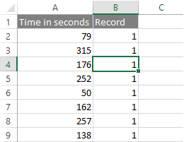
1. Go to your dataset and select any of the cells or a specific range. In my case, there are time measurements, and I want to look at the typical time frame.

2. In the ribbon go to Insert -> PivotTables and create it wherever you want.
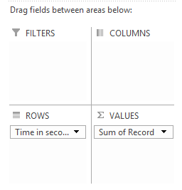
3. Put data field that needs to get distribution in ROWS and field for calculation in VALUES.

4. Right-click on the Row Labels column in PivotTable un choose Group.

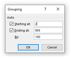
5. In the Grouping window, you will see Starting at: dataset minimum and Ending at: dataset maximum. It looks better and easier to read if you change them to round numbers. Also, you have to choose is By: and in my case, it was 60 (my measurement was in seconds and 60 represents one minute). Don’t worry about that much – you can come back to Grouping any time and change that.


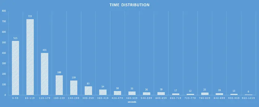
6. Visualize it with a bar chart, tune it up a little bit and done. If you need to change grouping, then repeat step number 4. If you decided to remove grouping, right click on Row Labels column in PivotTable and choose Ungroup.
As you see in results, Excel automatically made some corrections to the last group range to make them all even.

There are other useful things that you can do other than Excel PivotTable histogram. For example, you can easily calculate the weighted average.
Leave a Reply