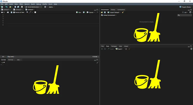
How to clear RStudio panes with code
Here is how to clear the RStudio console, environment, and plot windows (panes) individually or at the same time by using code (a combination of functions).
in
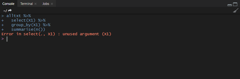
dplyr error in select: unused argument
An unused argument error might appear with any function (for example, dplyr), and the primal cause is a misunderstanding. If the function appears with the same name in multiple active libraries, then make sure which of them you are using. If you are not using from the library what you think you are using, then…

How to run R script from another R script and use as a source
Here is a solution with running R script from another R script and using as a source. It comes handy when R script uses different bit version R, or you want to continue script execution with another one.
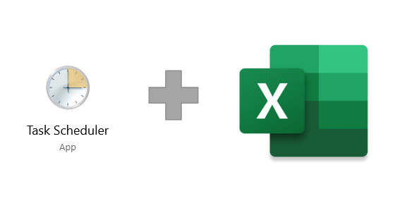
How to run Excel file from Windows 10 Task Scheduler
Sometimes, when Excel file contains macros that can run automatically when the file opens, there is a need to do that periodically and autonomously. In that case, Windows Task Scheduler comes handy. Here is how to run Excel with Windows Task Scheduler.

How to run Excel macro on file opening
Here is how to run Excel macro automatically every time you open the file in a few easy steps.
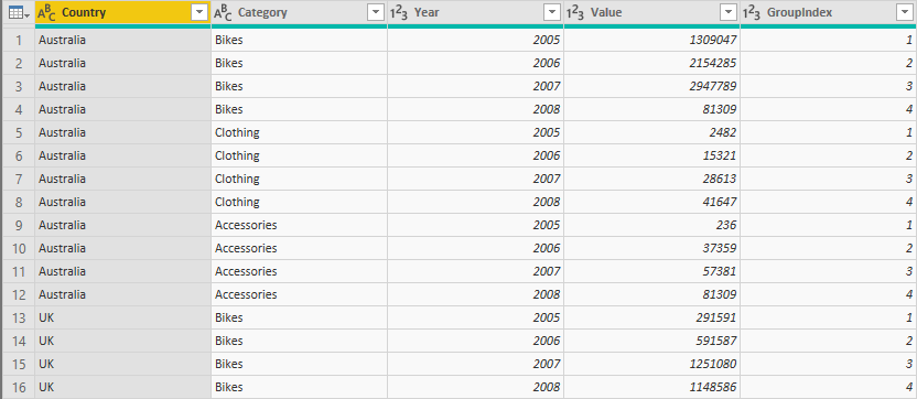
How to create group index with Power Query or R
It is possible to generate a group index (unique row ids) by one or many groups in Power Query. It comes handy when you have to detect the first or last record in each group. Here is 2 solutions: group index with M language and group index with R.
in
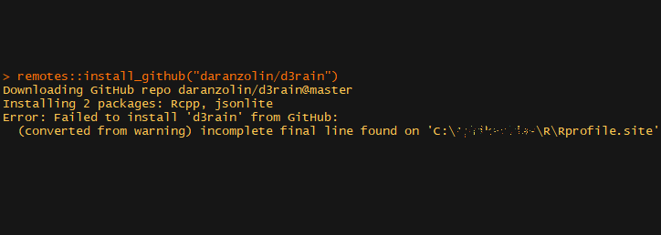
Incomplete final line found on Rprofile.site when installing from GitHub
I was stumbling on this “incomplete final line found on Rprofile” error while installing d3rain package with the following code remotes::install_github(“daranzolin/d3rain”). In one of the previous post I was modifying my Rprofile.site file and there is definitely a connection with this error.
in
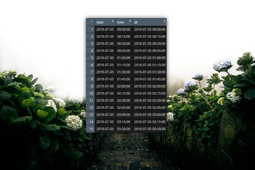
How to generate time intervals or date sequence in R
In this post, you will get summary and code examples for creating time intervals, date or date-time sequence different ways in R. For example, you have to make summary statistics for 15 minute time intervals in R. There might be situations wherein a 15 minute interval is no data. It is necessary to, first of…
in

How to animate Excel chart in PowerPoint
Data visualizations are a great way to present your data, but sometimes you need to add some animation effects in PowerPoint to make your storytelling better. Here is a fast and easy approach on how to animate an Excel chart in a few steps.
in
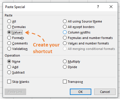
Excel shortcut for Paste Special Values
Here is a simple solution for a handy shortcut to paste copied Excel data as values. The idea is that you add a simple VBA code to your Personal.xsb file and create a shortcut that you like.