If you have a data set with certain characteristics, you might want to take a chance and create a line chart with gradient color in Excel. Sometimes by coincidence, you can tell a better story. For example, if something is suddenly changing over time. Otherwise, color gradients are a rarely used formatting in Excel charts.
Here is another beautiful example, with a variation of the same color in Excel to show a multiple date series in one chart.
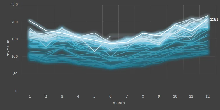
Chart with gradient color in Excel
Here is how to create that in a few easy steps.
1. Create a simple line chart like this.
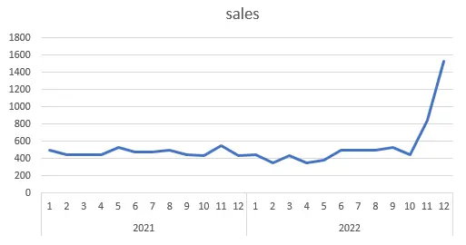
2. Select the line and press Ctrl + 1 to open the formatting pane.
3. Check the gradient line option and choose the gradient direction.
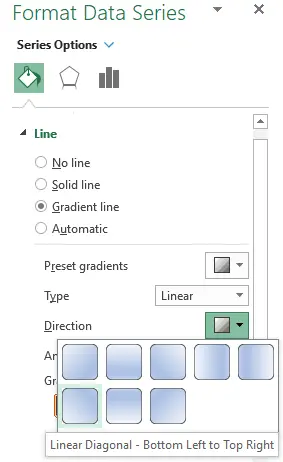
4. Adjust positions of gradient stops and colors.

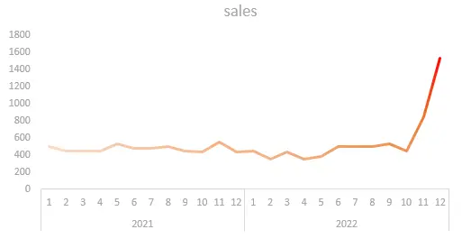
5. By removing gridlines or other unnecessary elements, you can get a result that looks like this.
Add icons to the Excel chart
Icons can help you to tell a better story. Here is how to do that to ensure that all the chart elements are grouped together.
Select your chart and find icons in the Insert tab.
![]()
You can use a search box to get the necessary icon. In my case, it was a rocket icon to illustrate the rapid changes in the chart. With a few adjustments of size, orientation and color, it looks like this.
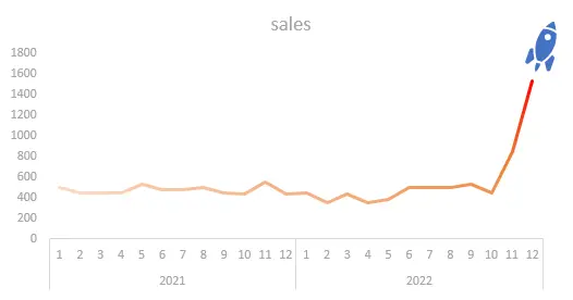
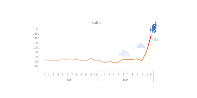
Add other icons as necessary. With the help of clouds, I created a chart that is in the title picture of this post.
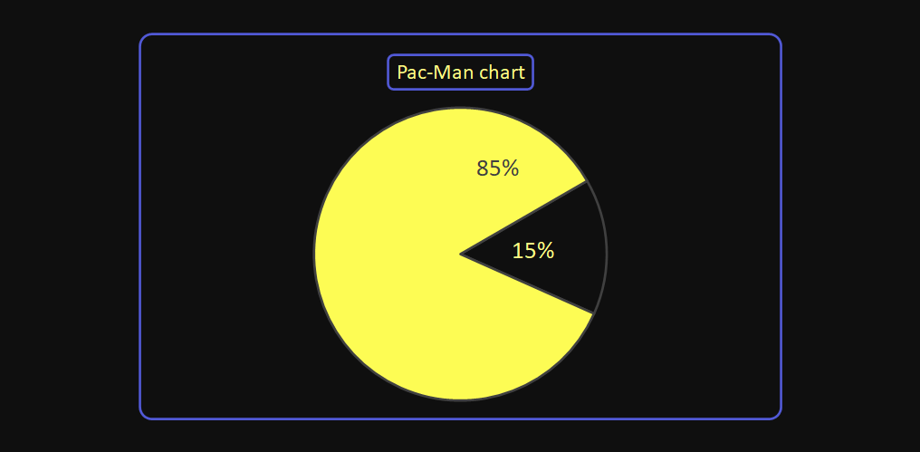
If you have a chart or formatting that is useful on rare occasions, try to collect them. Then you might get a chance to use them not so rarely at all. Take a look at this Pac-Man chart in Excel.
Take a look at other posts in the Excel category.
For example, here is a quick tip on how to copy formatting from one chart to another.
Leave a Reply