
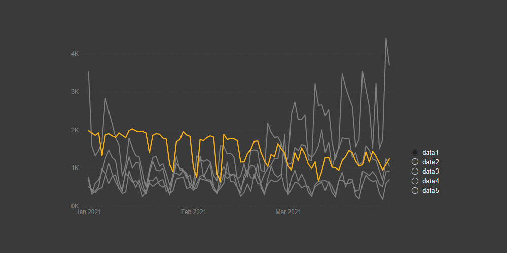
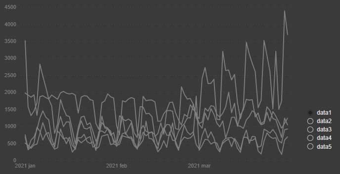
If you have multiple line chart series in one chart, then here is how to highlight one series among many in Power BI dynamically. That will enhance the ability to analyze data and compare one series to others.
How to highlight a line chart series among many in Power BI in 5 steps
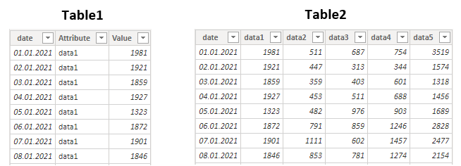
1. First of all, you should have the same data in two tables with a different structure. One way is to reference the first table in Power Query and transform it as necessary – with pivoting or unpivoting. It depends on what you have as the first table.

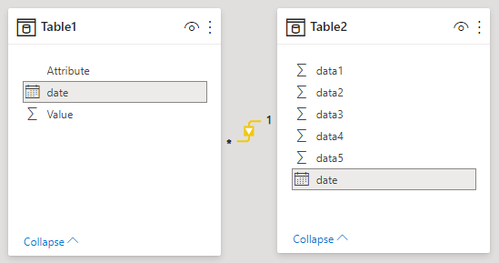
2. Connect both tables in the data model by the key column.

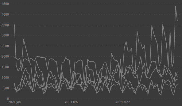
3. Create a line chart from the table that contains them in separate columns with all series in the same color.

4. Add a slicer with the column from the table that contains all data series names in one variable. Turn on single select in the slicer selection controls.

5. Add the column that contains values for each of the line chart series.
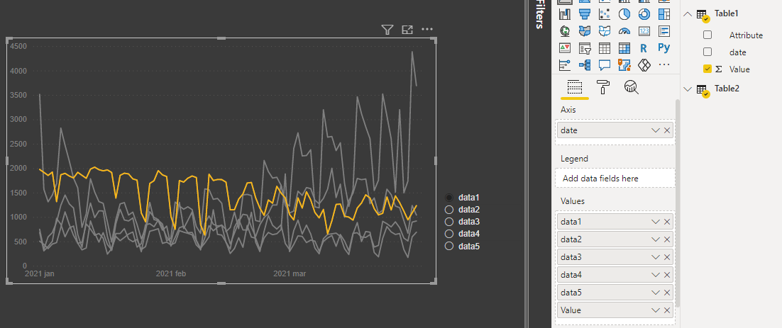

That’s it. You can now play with slicer and enjoy one highlighted Power BI line chart series among many that grayed out.
Another possibility in Power BI is to visualize every series in separate charts. Take a look at this post that will guide you through that process.
Here you can download the pbix file that contains the result.