Data visualizations are a great way to present your data, but sometimes you need to add some animation effects in PowerPoint to make your storytelling better. Here is a fast and easy approach on how to animate an Excel chart in a few steps.
Animated Excel chart creation steps:
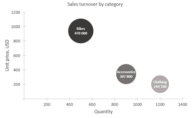
1. Create your chart in Excel. I created a bubble chart that looks like this.
2. Copy that chart to PowerPoint.
3. Go to the Animations tab and choose one of them. For that kind of bubble chart “Bounce” works great.

4. Only, after you choose animation, the Effect Options is active, and you can change, how exactly to animate. In this case, “By category” looks good.
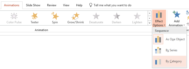
5. At the left side of the chart animation sequence icons appear, and you can change animation effect for any of them by selecting the necessary one. You can even go to Animations -> Animation Pane and change the animation properties.
![]()
I decided to select the first one and change “Bounce” animation to less dynamic (“Appear”).
6. Your animated Excel chart in PowerPoint is ready.

You can go even further add axis labels separately. It may help your audience better follow the story.
What I did – made existing labels in the same color as the background to reserve some necessary space and added text boxes that looks the same. You have to make them as separate elements to be able to animate.
For chart labels the “Fly In” animation works great – change effect options to make them follow the right direction.
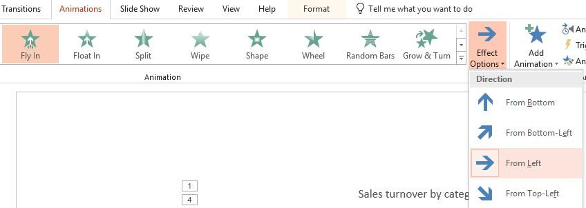
I also changed the animation sequence in Animations -> Animation Pane with the arrow icons and moved label animation right after chart area animation.
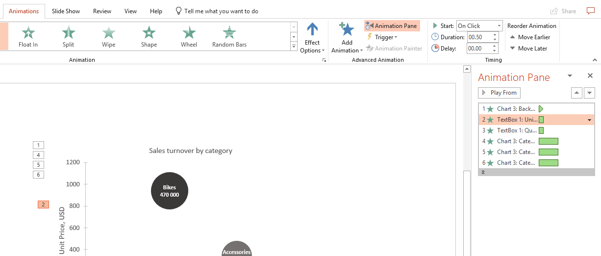
Here is the result. Next example is how to animate the Excel line chart in PowerPoint.

Line chart example.
The same is with Excel line chart animation. Create your chart and follow the steps above. For line charts animation “Wipe” looks great.
You have to change direction in Effect Options to follow the logical movement – usually from left to right – in this case for time series. Play around with “Sequence” options. For time series “By Series” option works great.
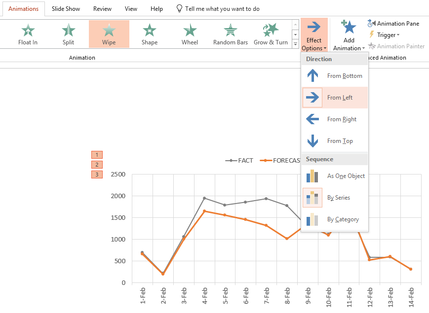
For the chart area, I chose “Appear” animation cause for that element animation doesn’t have to be so dynamic.

You can download Excel and PowerPoint files right here.
You might be interested in how to make an Excel histogram.


Leave a Reply