If you want to create an Excel chart that contains clustered columns and stacked columns altogether, this post is for you.
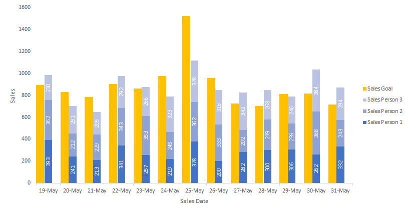
In a few words, to make this kind of chart, you should create a clustered column chart on the primary Y-axis and stacked column chart on the secondary Y-axis. To make them look properly positioned, one of the clustered column chart series is fake and free up necessary space.
Here is my data. You can download that with the clustered and stacked column Excel chart at the end of this post.
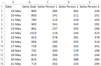
1. In the data table insert column that is dedicated to free up space for stacked column and build clustered column chart.

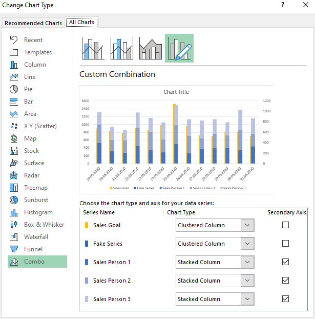
2. Go to the Change Chart Type and choose Combo. Select Secondary axis checkbox for series that will be visualized as a stacked column chart. Choose Stacked Column in the dropdowns.
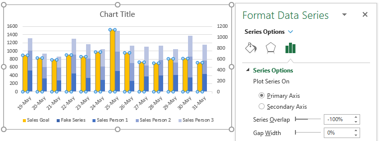
3. Select the visible clustered column series, press Ctrl +1 to open formatting, and adjust Gap Width and Series Overlap as in the picture below.
4. Here is a simple way to synchronize the primary and secondary Y-axis in the same chart. Select the secondary axis and delete it. It will be synced to the primary Y-axis.
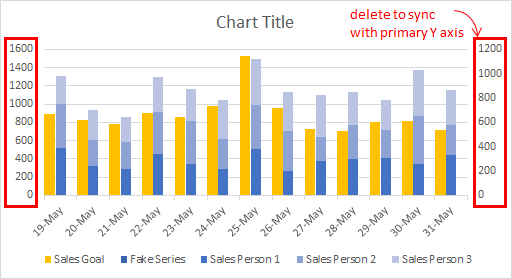
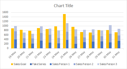
5. Select the name of fake series in legend and delete it.
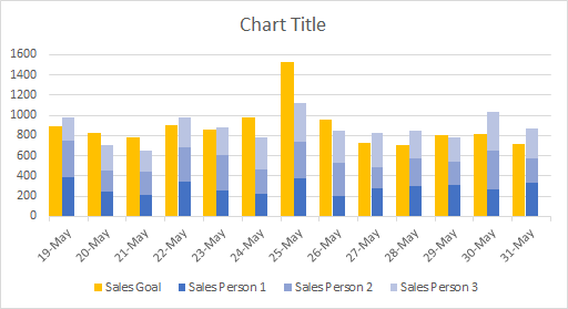
6. That’s it. Make some final adjustments, remove to improve, and you’re good to go.
Here is the file with the data and results.
Take a look at the other Excel posts in this blog. There is also an interesting post about an animated Excel chart in PowerPoint.
Leave a Reply