Category: DataViz
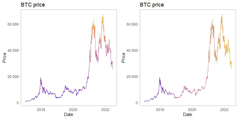
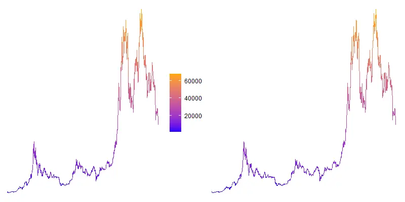
How to create a gradient line chart in R
The gradient line chart in R is a little bit artistic approach to emphasize ups and downs or progression. A gradient line chart will be made with two directions of the color gradient using ggplot2. The first one will be vertical and the second horizontal.
Line chart with gradient color in Excel
If you have a data set with certain characteristics, you might want to take a chance and create a line chart with gradient color in Excel. Sometimes by coincidence, you can tell a better story. For example, if something is suddenly changing over time. Otherwise, color gradients are a rarely used formatting in Excel charts.
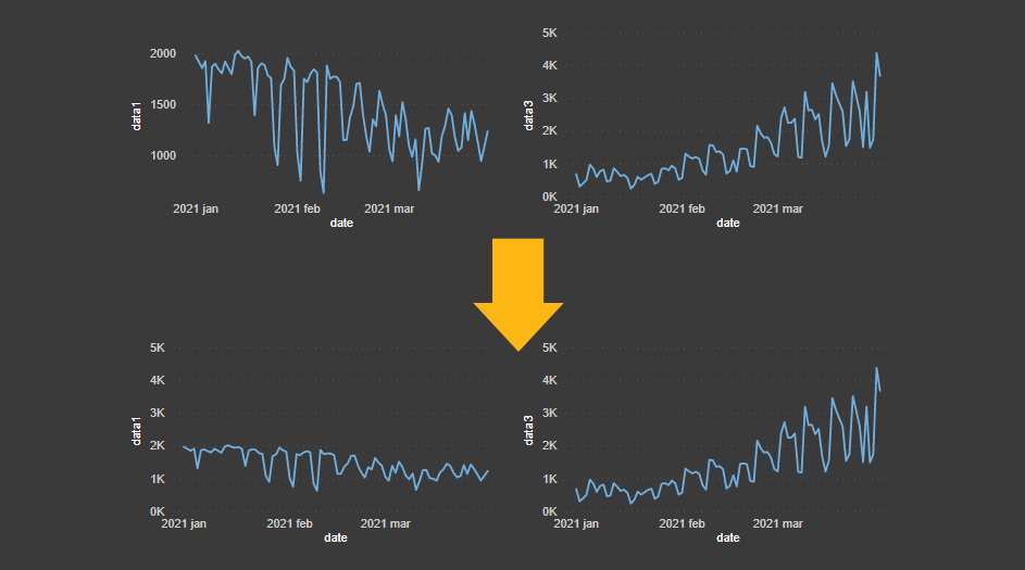
How to create a glowing line chart in Excel
Besides creating a glowing line chart in Excel, here is a possible solution how to deal with seemingly too many series in one plot. There might be different situations where you have to deal with many series. If you have some outliers in your data, this might work for you. Vizualtion has to explain the…
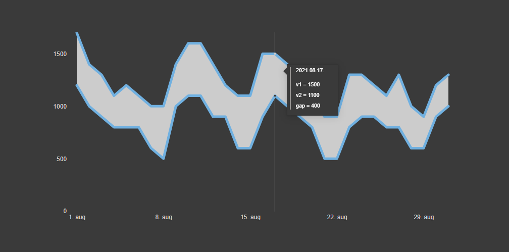
Power BI chart with the accented gap between two lines
Here is how to create a Power BI chart with an accented gap between two lines. With the help of fill color between two lines, it will help you evaluate the difference between two values.

Pac-Man (two slice pie) chart in Excel, rotate Excel pie chart slice
If your data contains two categories, don’t miss a chance to create a Pac-Man chart in Excel. It might not work all the time, but if one category is between 15-25%, then your two slice pie chart might be looking similar to famous gaming hero Pac-Man. There might be several creations in the process of…
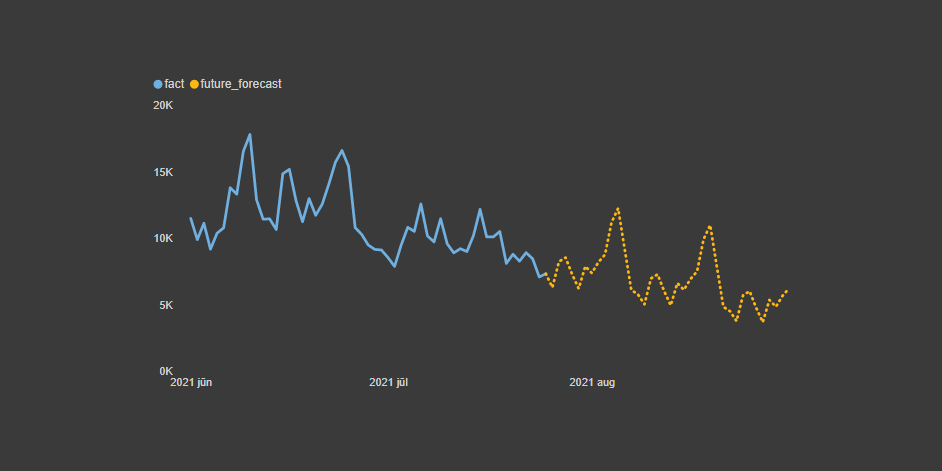
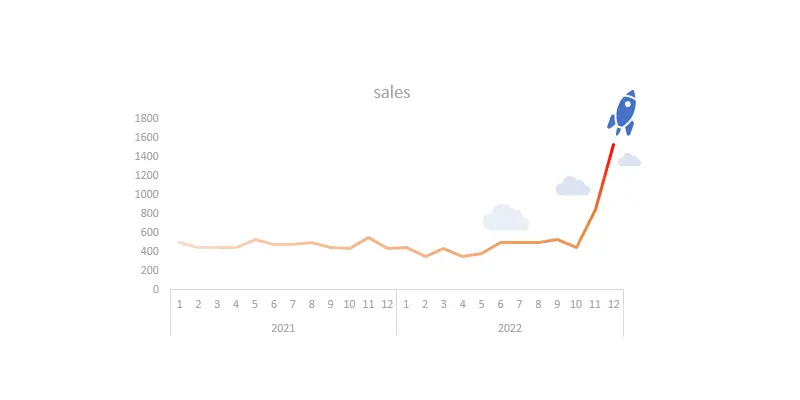
Power BI line chart that conditionally changes formatting
Here is how to create a Power BI line chart that at some point continues in a different design, formatting. For example, it is useful to continue actual data with the forecast but in a different style. In a way, it is conditional formatting for the line chart series in a Power BI.
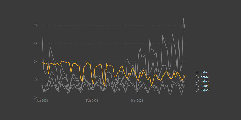
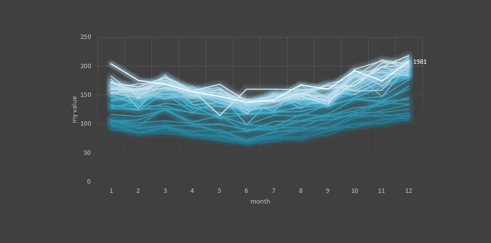
How to highlight one line chart series among many in Power BI
If you have multiple line chart series in one chart, then here is how to highlight one series among many in Power BI dynamically. That will enhance the ability to analyze data and compare one series to others.