Tag: Syncing Y axis across Power BI charts

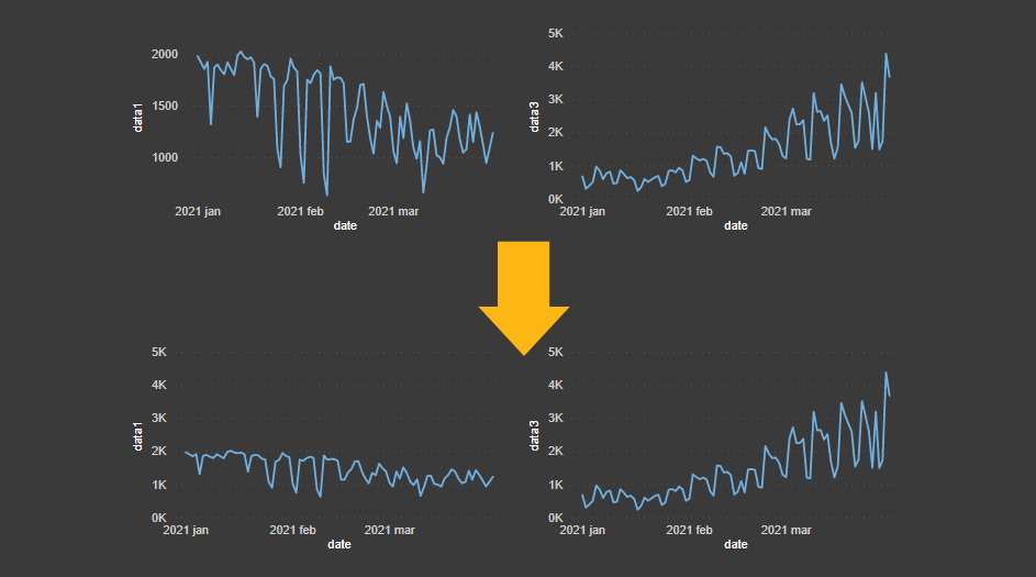
2 ways how to create separate Power BI charts with synchronized Y-axis
It is a great way to compare different data series if you create separate Power BI charts with a synchronized Y-axis. By using this technique, you can better distinguish the volume. Otherwise, it might be that something less important grabs your attention.