
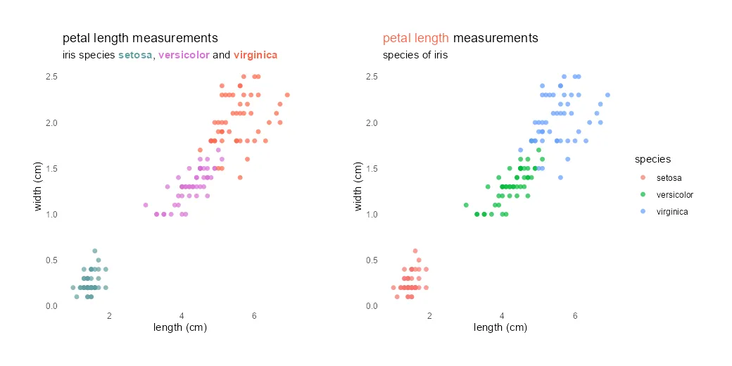
Different colors in the ggplot2 title might be useful to emphasize part of that or as a substitute for the R plot legend. It is not very easy to do, but worth it if it helps to draw the necessary attention.
R programming, Excel, DAX, Power BI
Different colors in the ggplot2 title might be useful to emphasize part of that or as a substitute for the R plot legend. It is not very easy to do, but worth it if it helps to draw the necessary attention.