Here is how to create a Power BI line chart that at some point continues in a different design, formatting. For example, it is useful to continue actual data with the forecast but in a different style. In a way, it is conditional formatting for the line chart series in a Power BI.
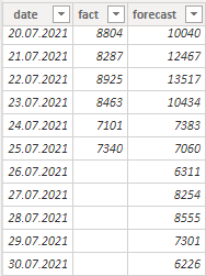
Here is my table “fact_forecast” and the M code is below this post.
First of all, you should know a condition that determines that the data series will appear in a different look. In my case, if there is no actual data, the line chart series will continue as a dotted line that represents the forecast.
Step 1
You have to figure out how to get a date that represents the last available fact. Check out this post that explains how to calculate that.
Step 2
Add a new column to the table called “future_forecast”, where the date for the last fact is in a variable. That will help to return the last actual value, and that will make two different-looking lines connected.
After that, calculate necessary values where the last fact is combined with a forecast for the next available dates.
future_forecast =
VAR date_for_the_last_fact =
    MAXX (
        fact_forecast,
        INT ( NOT ISBLANK ( fact_forecast[fact] ) ) * fact_forecast[date]
    )
RETURN
    IF (
        date_for_the_last_fact = fact_forecast[date],
        fact_forecast[fact],
        IF ( date_for_the_last_fact < fact_forecast[date], fact_forecast[forecast] )
    )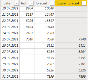
As the result, there is a series that continues when the fact series ends.
Step 3
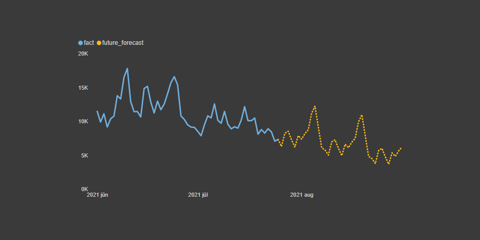
If you combine date, fact and future_forecast in one Power BI line chart and spend some time format settings, you will get the result that looks like this.
Additional Power BI data visualization tips
By knowing how to choose Power BI measures with the slicer, you can provide a solution that users can choose if it is necessary or not.
Power BI line chart marker color conditional formatting and highlight one line chart series among many in Power BI.
Here is the M code for the table that you can use in a blank query.
let
    Source = Table.FromRows(Json.Document(Binary.Decompress(Binary.FromText("XZZbruQwCET3cr+vRjwNrGU0+9/G2MYhJuqW8lFN4io4pP/+/QH8A+MPAeHP7w+iuK8rM4yff79TpkuOANnqAEuVWzEyrSuxcspyF6OP/SsyT1XvYmCHXRyKKY8mm8eWRTRlu2W22DLTONXeZEbbV6dIOW55KO2jDdJ0jXDLZrFle0LBlhmdVIRIUqYeqVCmY5RyD010Hw1c8mgozfcYeZ2flFtq4jOOdQaQjBxbaorm2RE5R2upkUu2BAJSbqnNsHc1AGbmGN23p7Hh2VBqqU27nr49fVNPTW33GyNOdUtNwDh/NjJzaqmp4a6WiPRN0hsaO9TxxEItNeWUKc60UJ81h5HTnh2hFhrQnsRQPwe7MwuJdWx3PqaiETDGmeWMm6GpxNkMPyM887JHddUV9ozcissSJxv7qaZUWNp1pB0VCGlRaZfZ/dgIjKLyUpWy2FiLSrua6NlrBi4qr2q03BeTnKLyPZjlupAnjgWlXWCcARlnQBaUb7HGurUPeZF8w4o9Hc7EBeRbSduSqWnh+IoA2Vy0gvHyQ5hNQC8WrzDQslNDCsU7C1wHNvEoEm8VICeECsS7C/u5Pp71dAflM6Hd5rNe6I7JPXcTgEBB+KrkyYEMKwavFGnvFn7CoDupuTo4x4qlCHwncq2reWF/+XtFlt0BGFD0lTi/gxELvFtwUinmmqCqxdstzMHDQq09gyizZPxUeETh5+1WZ9Us9LydCrywa4KZFXG3gGtfF21NocfiAu1WYk3Xg9gtjHmzgusW1MKKqyaAvES1W80tUDQ17xRUJLUKOIsOP94lBhdBrWLwKHi6j7MkcHxPdV75+HFuilK0tKziTDt+nM8X3XFIH+sWp4n0sS6uLxtNUObC4hbYXIuI3pCzvOlrfb5TioT2DDtLij7WeZwppW/T+VkD8fVxGOePcx3n/cwf5/Pf0Mzq338=", BinaryEncoding.Base64), Compression.Deflate)), let _t = ((type nullable text) meta [Serialized.Text = true]) in type table [date = _t, fact = _t, forecast = _t]),
    #"Changed Type" = Table.TransformColumnTypes(Source,{{"date", type date}, {"fact", Int64.Type}, {"forecast", Int64.Type}})
in
    #"Changed Type"
Leave a Reply