Here is my approach on how to make Microsoft Power BI line chart with accented last data point. It is flexible and can be used with filters.
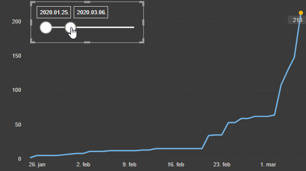
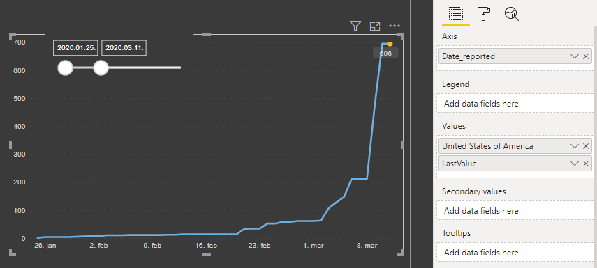
Power BI line chart with last data point marker
This is a line chart with two series. The first series contains all data points, but the second series only measure with the last data point.
This solution is flexible when the number of data points or vertical scale changes.
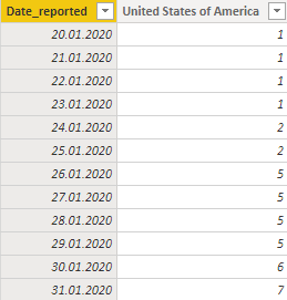
Here is my data with registered Covid-19 cases in the United States of America.
Here is M code for this table that I used for the example.
let
    Source = Csv.Document(File.Contents("C:\Users\jsturis2\Downloads\WHO-COVID-19-global-data.csv"),[Delimiter=",", Columns=8, Encoding=65001, QuoteStyle=QuoteStyle.None]),
    #"Promoted Headers" = Table.PromoteHeaders(Source, [PromoteAllScalars=true]),
    #"Changed Type" = Table.TransformColumnTypes(#"Promoted Headers",{{"Date_reported", type datetime}, {"Country_code", type text}, {"Country", type text}, {"WHO_region", type text}, {"New_cases", Int64.Type}, {"Cumulative_cases", Int64.Type}, {"New_deaths", Int64.Type}, {"Cumulative_deaths", Int64.Type}}),
    #"Extracted Date" = Table.TransformColumns(#"Changed Type",{{"Date_reported", DateTime.Date, type date}}),
    #"Removed Columns" = Table.RemoveColumns(#"Extracted Date",{"WHO_region", "New_cases", "New_deaths", "Cumulative_deaths", "Country_code"}),
    #"Filtered Rows" = Table.SelectRows(#"Removed Columns", each ([Country] = "United States of America")),
    #"Pivoted Column" = Table.Pivot(#"Filtered Rows", List.Distinct(#"Filtered Rows"[Country]), "Country", "Cumulative_cases", List.Sum)
in
    #"Pivoted Column"
1. Detect the last date. Without slicer, it is a little bit easier, but in this case, to be completely flexible and a slicer ready.
LastDate =
FILTER (
ALLSELECTED ( covid[Date_reported] ),
LASTDATE ( ALLSELECTED ( covid[Date_reported] ) ) = covid[Date_reported]
)
2. When it is done, the next measure will return only value on the last date.
LastValue =
IF (
VALUES ( covid[Date_reported] ) = [LastDate],
VALUES ( covid[United States of America] ),
BLANK ()
)
3. Combine the last measure with the baseline chart and done.
Power BI line chart with last data point marker and custom label
Custom label with standard visualizations right now is possible in a scatter chart by using the Details field. If you want that final result will look like a line chart, then I think those are actually two charts – one on top of others. The solution has to provide the same scale of the axis in both charts and there are too many things that go wrong.
For example, in this Microsoft dashboard Understanding and tracking our progress against COVID-19.
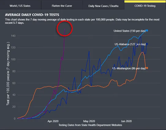
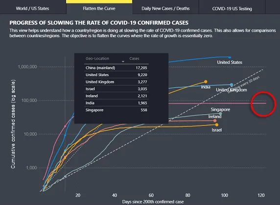
As you see in some of the combinations it is not working very well because of the static X un Y axis.
Here is another post with interesting visualization: Dynamic Power BI map visualization with coronavirus data.
Leave a Reply