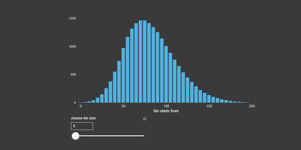
Here is how to create a dynamic histogram in Power BI. It changes with the help of a slicer that regulates data distribution groups (adjustable bins).
Forewords about histogram
A histogram is a great tool to analyze data. If you understand the distribution, then there are benefits in outlier detection or other areas.
Here is a helpful post on how to detect outliers in Power BI. Yes, there is a tool for that, but the math behind that is not so hard, and it will give you more freedom in your Power BI or other solutions.
If you want to check the results and be sure that your Power BI histogram works correctly, you can build one in Excel. For instance, here is the fastest way how to create one in Excel.
Here are dynamic histogram creation steps in Power BI
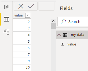
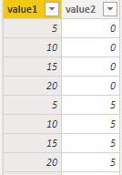
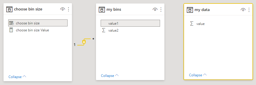
In the beginning, I have a table [my data] that contains one column with values.
From now till the end of this post are 7 steps that will guide you through the dynamic histogram creation process in Power BI.
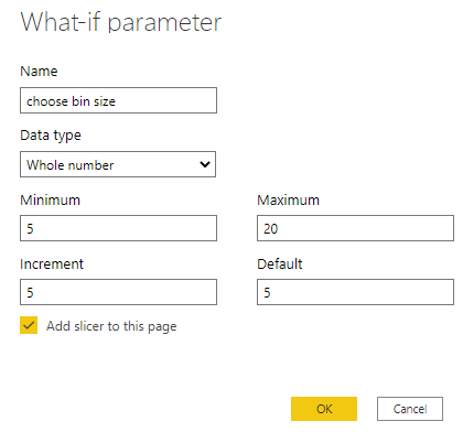
1. Create a what-if parameter for custom histogram bins.
Firstly, go to the modeling tab un choose the New parameter. That will create a slicer that will help to change the step of the bins in the histogram. All the parameters depend on what kind of values you have. What size of the categories will work. However, you can change them later.
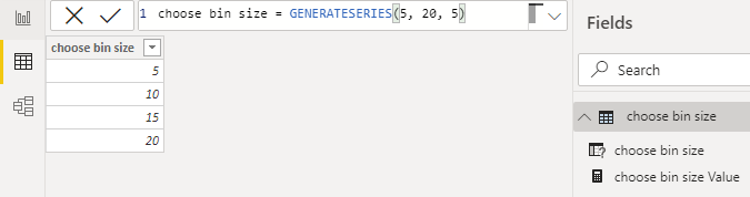
After that slicer and calculated table are created that will contains a column as a result of function GENERATESERIES.
If your data is changing, you can modify the necessary GENERATESERIES parameters by using other DAX functions.
However, it is not possible to change the location of the Power BI numeric input box.
2. Create a new table [my bins] that will use two GENERATESERIES functions together.
The first one will create the same bins that are in the slicer.
Second GENERATESERIES create series with the smallest possible bins that you can select with the slicer. With the help of the function GENERATE, series are combined in all the possible combinations.
my bins =
VAR series1 =
    SELECTCOLUMNS ( GENERATESERIES ( 5, 20, 5 ), "value1", [Value] )
VAR series2 =
    SELECTCOLUMNS (
        GENERATESERIES (
            FLOOR ( MIN ( 'my data'[value] ), 5 ),
            CEILING ( MAX ( 'my data'[value] ), 5 ),
            5
        ),
        "value2", [Value]
    )
RETURN
    GENERATE ( series1, series2 )
As you can see, I’m also using FLOOR and CEILING to cover all necessary data categories.
This table is used to dynamically change histogram x axis categories. I think it is not possible to use measure on the Power BI chart x axis that built with functions GENERATE or GENERATESERIES.
3. Join the what-if parameter table with the table that contains all possible histogram bins (previous table).
That will help to filter necessary bins that are chosen by the slicer.
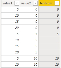
4. Replace unnecessary bins with the blank and create a starting point.
Inappropriate bins for certain histogram binning categories are replaced with blanks. As a result, blanks are not displayed on the chart x axis.
That is done by using the MOD function that will return the remainder of the division by a certain binning category. In short, if the remainder is not zero, that will help to identify unnecessary bins.
bin from =
IF (
    MOD ( 'my bins'[value2], 'my bins'[value1] ) = 0,
    'my bins'[value2],
    BLANK ()
)
5. Calculate the end of each bin.
In the next column, calculate the end of each bin if necessary.
bin to =
'my bins'[bin from]
    + IF ( ISBLANK ( 'my bins'[bin from] ), BLANK (), 'my bins'[value1] )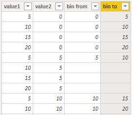
6. Create a Power BI measure that will count numbers in each of the histogram categories.
_histogram values =
CALCULATE (
COUNTROWS ( 'my data' ),
FILTER (
'my data',
'my data'[value] >= SELECTEDVALUE ( 'my bins'[bin from] )
&& 'my data'[value]
< SELECTEDVALUE ( 'my bins'[bin from] ) + SELECTEDVALUE ( 'my bins'[bin to] )
)
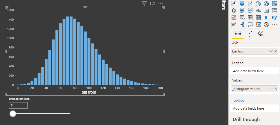
)7. Build the histogram (column chart) that will contain appropriate bins on the x axis and previously created measure.
Conclusion
Big thanks to everyone who created daxformatter that is very helpful to create good-looking code.
During large projects, you might find useful this post: 4 ways how to organize DAX measures in Power BI.
Here is the pbix file if you want to go straight forward to the result.
Please check out other posts with the Power BI tag in this blog. There are other interesting visualizations available.
Leave a Reply