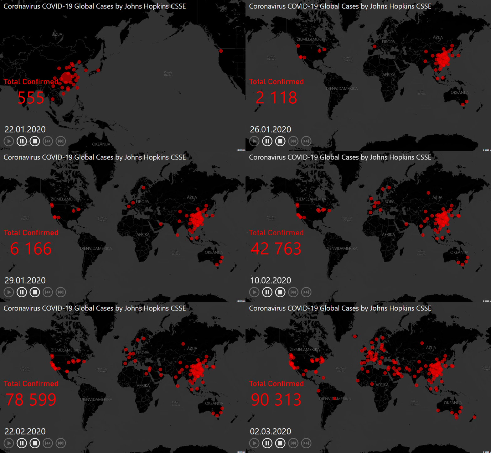
With the help of additional custom visualization, it is possible to create pretty awesome dynamic Power BI map visualization to see how things are changing during a time.
Here is a map with coronavirus COVID-19 global cases by Johns Hopkins CSSE. There is also a link to the data in GitHub.
In this example, I will be using data with confirmed cases and try to get my map visualization as close as possible with the help of Power BI.
Dynamic Power BI map visualization
First of all, I will switch to the raw data and import it like a web data source.
When you get to the Power Query, the source step shows how many columns to import from the CSV file. As days go by, you might want to refresh and take a look at the latest data. I symbolically changed it to 100.

In the Power Query, I will transform this data structure to get an update when needed. After using the first row as headers, select the first four columns and unpivot other columns.

After that, filter Attribute column values that contain only slash symbols (because other stuff doesn’t contain dates yet).
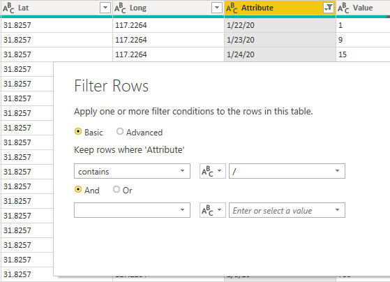
Rename Attribute to Date and value to Confirmed.

I ran into the problems with MM/DD/YYYY date format. I changed that by using locale (last option when you change data type), and in the formula bar changed the type to date. Don’t forget to change the data type in the column Confirmed to the whole number.

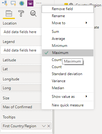
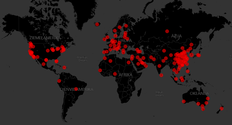
Then with the help of the Power BI map, I visualized the data. Because confirmed cases value is like running total for each country, I chose the max value of confirmed COVID-19 cases. As you can see, I also placed the name of the country in the tooltip.
In the map style, the dark theme was pretty close to original, data colors come with the hex code #ff0000.
After that, I downloaded Play Axis custom visual and added my date field.

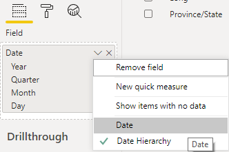
When you are adding the date to this visual, I recommend getting rid of the date hierarchy and adjust the formatting to match the theme.
I also disabled Play Axis visual caption, because it doesn’t work very well in available space.
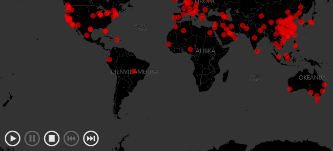
I like to view my map with no data at the beginning. To do that, I made an additional table with the generated date column with the desired range. Here is the previous post on how to do that.
The function of my date column goes like this.
MyDate = GENERATESERIES(DATE(2020;1;21); TODAY() - 1; 1)
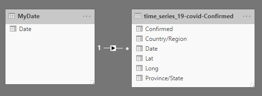
After that, I connected my date table with other data in the data model and changed the date column in Play Axis visual.
The date is also added to card visualization.

To properly show card visualization with confirmed corona cases, I created this measure. If there is not date selected by Play Axis, nothing is shown.
Total Confirmed =
IF (
    SELECTEDVALUE ( MyDate[Date] ) = BLANK ();
    "-";
    CALCULATE (
        SUM ( 'time_series_19-covid-Confirmed'[Confirmed] );
        FILTER ( MyDate; SELECTEDVALUE ( MyDate[Date] ) = VALUES ( MyDate[Date] ) )
    )
)
I also added the title in the separate text box, and the final result looks like this.
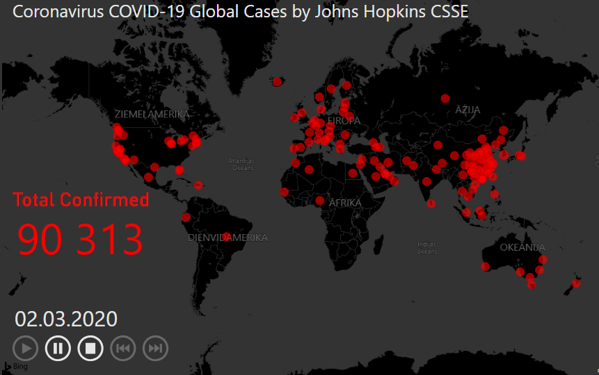
Here you can download the final pbix file with dynamic Power BI map visualization.
Leave a Reply