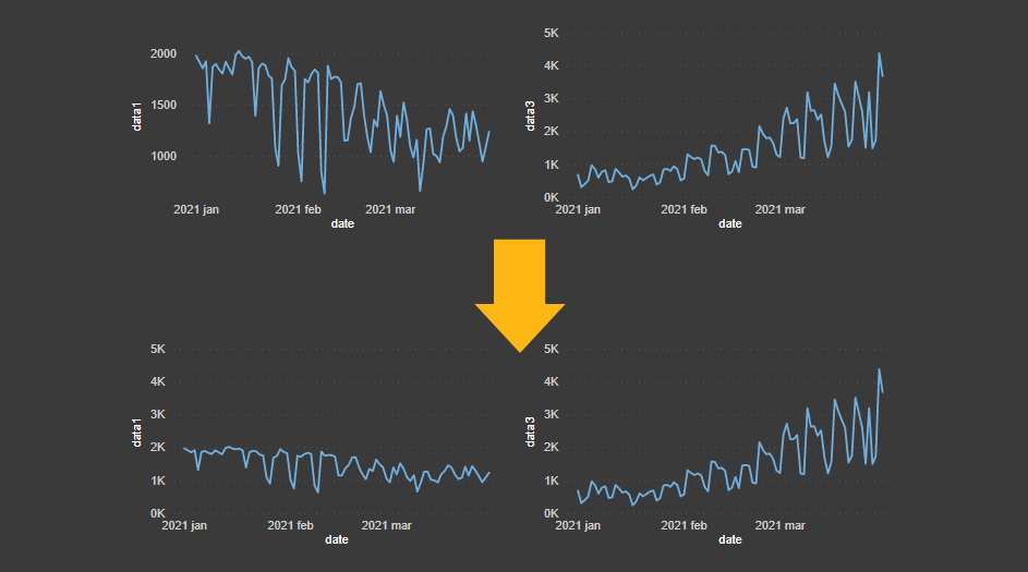
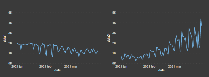
It is a great way to compare different data series if you create separate Power BI charts with a synchronized Y-axis. By using this technique, you can better distinguish the volume. Otherwise, it might be that something less important grabs your attention.
First way how to create separate Power BI charts with synchronized Y-axis
The easyest method is to use small multiples visualization. It will synchronize the Y-axis accross all the charts and is customizable enaugh to meet your needs. Power BI small multiples visualization splits one visual into multiple versions. The hardest part is to prepare your dataset that will work in favor of this ability.
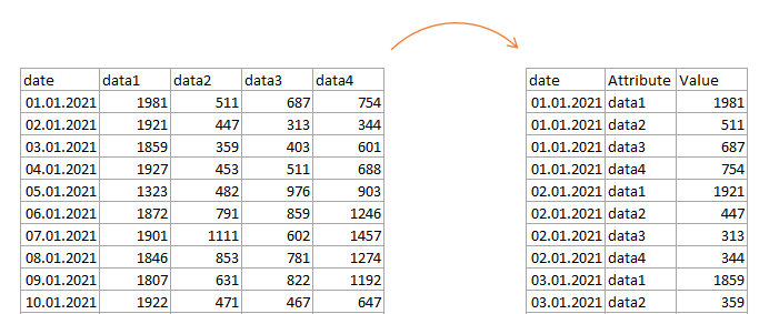
In a few words – every variable should be in the same columns.
If you have data structured like on the left side of the picture, try to transform it. It could be done by unpivot in Power Query or with the calculated table by using DAX.
If you can split values by necessary dimensions, you can easily create multiple line charts with the synchronized Y-axis. You might need to activate this visualization in the preview features section.
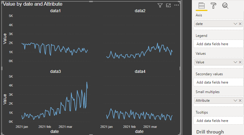
A significant advantage to this method is the greater variety of possible visualizations than in the next method.
Second way how to create separate Power BI charts with synchronized Y-axis
This a little bit harder because you should create a separate measure that will ensure that every chart has the same Y-axis range. Compared with the previous method, this one will have chart-type limitations but might have advantages in conditional formatting. Sometimes your data structure or vision is not suitable for the first solution.
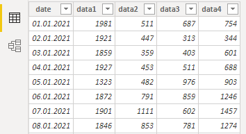
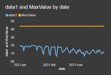
Here is a sample of my data. As you can see, there are data series like data1, data2, data3, and data4.
The next thing is a measure with DAX that calculates maximum across multiple columns. In other words, maximum between multiple data series. In my case, there is a date on the axis that I should ignore during this calculation.
MaxValue =
CALCULATE (
MAXX (
'Table',
MAXX (
{ 'Table'[data1], 'Table'[data2], 'Table'[data3], 'Table'[data4] },
[Value]
)
),
ALL ( 'Table'[date] )
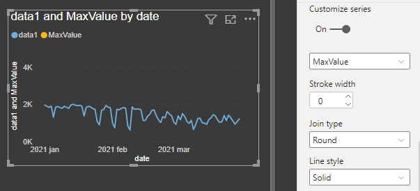
)When done, add this measure to the values in each of the charts. The settings ensure that there is the same starting point for every Y-axis. As you can see in the line chart, it appears as a constant line. Go to the settings and make it invisible.
With the line chart, you can do it like this. Go to the Shapes -> Customize series, choose a series that represents maximum, and change stroke width to 0.
After that, you can copy and modify the first chart as a template to create multiple others.
Turn off chart legend if it is possible. It is not possible to remove all traces of the series from the Power BI line chart.
For example, in the tooltip measure will appear anyway. It is not possible to completely modify standard Power BI tooltip content, but you can build a custom one as a tooltip page.
Additional resources
Here you can download the pbix file that contains these examples.
Please take a look at other interesting Power BI visualizations on this blog.
How to create a dynamic histogram in Power BI with adjustable bins.
How to make Power BI line chart with accented last data point.
Identify outliers in Microsoft Power BI.
Power BI line chart marker color conditional formatting.
Dynamic Power BI map visualization with coronavirus data.
Leave a Reply